Sigma0_VH vs. Sigma0_VHdb

Hello all,
While processing sentinel 1 data I converted terrain corrected data Sigma0_VH intensity band to db. To me it looked like Sigma0_VH gave more information visually than Sigma0_VHdb. Any reason behind this?

As this is a very basic question: If you’re new to SAR I recommend the SAR EDU page which provides lots of information about the SAR principles and theories as well as tutorials and talks: https://saredu.dlr.de/

The visual amount of information is related to the distribution of backscatter information over the given color range: While the VH intensities have an extensive range and only very light objects appear sharp, the db data is logarithmised, meaning that the values are now distributed more evenly over your black/white color range. This leads to a higher presence of grey pixels and less extreme values.

HV (non logarithmised)

HV db (logarithmised)

note how the total range of the image above is nearly 2000 (0 to 2000) units while in the image below the colors are distributed more evenly over about 50 units (db in this case, -40 to +10)

4 Likes

Hello! I’m working with GRD products of Sentinel 1 and I’ve had the same doubt about the db scale. I’ve done the list of processes (orbit file, calibrate, speckle filter, terrain correction), and after the terrain correction I’ve applied the conversion from sigma 0 linear to sigma 0 db. The result was a saturated image, as you can see:

Why does that happens? Can I fix it?

I want to use the values of Sigma Naught in the db scale, but I wanted the image to be as the first one, when it is still in the linear scale… If I fix it in the color manipulation will it save it in the project or is it only for visual matters?

Thanks!

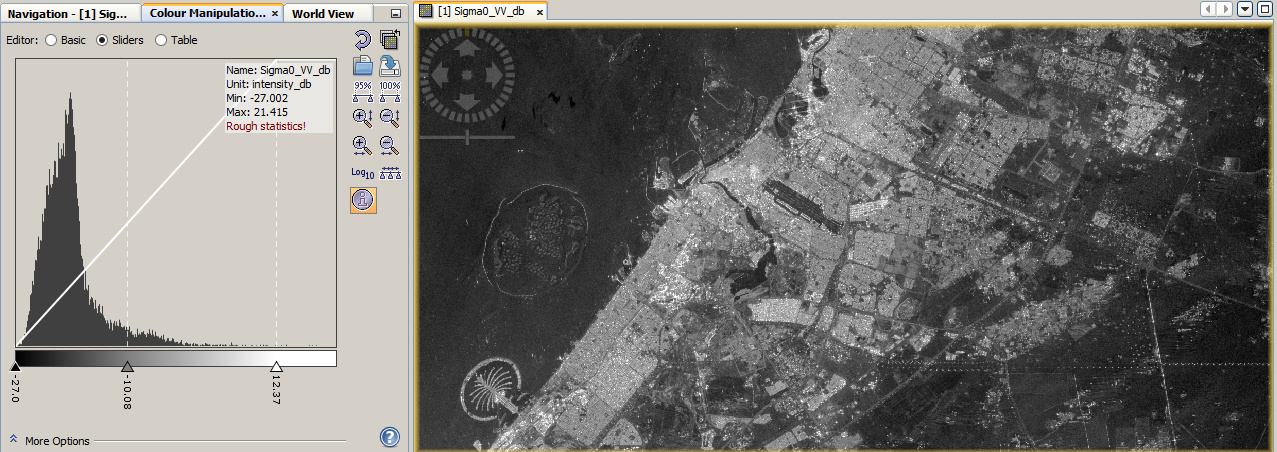
the different colors are a result of the fact that extreme values are now closer together in the db image. They now range from about -40 to +10 instead of 0 to 10000. This reduces contrast in some parts of the image while highlighting structures in darker parts of the image.
It depends on what you want to do with the data. For exampe, if you want to apply a threshold to extract water bodies you won’t convert to db because they appear black already. But if you want to examine land use in the grey spectrum or apply certain filters you transform the data to db in order to enhance other things.

Have a look at the histograms to see the changes.

If you are just missing the contrast, play around with the color manipulation. Move the Min/max values and the mean:

Isn’t it a border noise effect?