So i was reading some paper about inSAR method for ground displacement and can someone tell me what is this black thing that covered the interferogram? im kinda new in this topic so i dont have a clue.
It is likely that areas with low coherence (decorrelation of the phase) are masked out so that the interpretation and processing of the fringes is based on reliable information only.
In your example, there could be noise in the interferogram because of vegetation cover, water bodies, but also atmospheric artefacts.
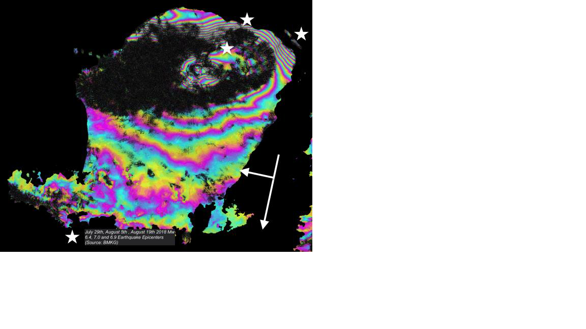
In this paper they said the earthquake cause an uplift up to 70 cm and subsidence up to 25 cm. can you explain it to me? i’m kinda new on this remote sensing thing so i don’t really know how to interpret this picture. how did we know the northern island got 70 cm uplift and the west side got 25 cm.

Each color cycle corresponds to an amount of displacement (when topographic phase is removed before) in the dimension of the wavelength of the sensor. They are often added up (unwrapped) to a total amount.
These resources provide help to understand the concept of an interferogram:
so from the picture it indicate the northern side have 40 cm of total displacement am i right?
That depends on where you start to count. It the presented form, the fringes simply show relative motion between different pixels. You usually define an stable area where you expect no change and calculate the subsidence or uplift relative to this point.
Knowledge on the type of motion is required to define such a stable point.
What data was used in the study? Maybe you can link to the source of the image.
it was from this paper
The authors do not explain how the interferogram in figure 7 was generated. It does not match any of the ones shown in figure 6. Also, counting interferograms as they did is not the most elegant way. Usually, phase unwrapping is performed to convert cyclic fringes into continuous metric units. I agree that the study leaves many questions open.
so we cant really identified where the 70 cm uplift and 25 cm subsidence just by interpreting from the figure 7 or even figure 6?
To me, the article is not written in a transparent way, I cannot really follow the drawn conclusions.