Hello,
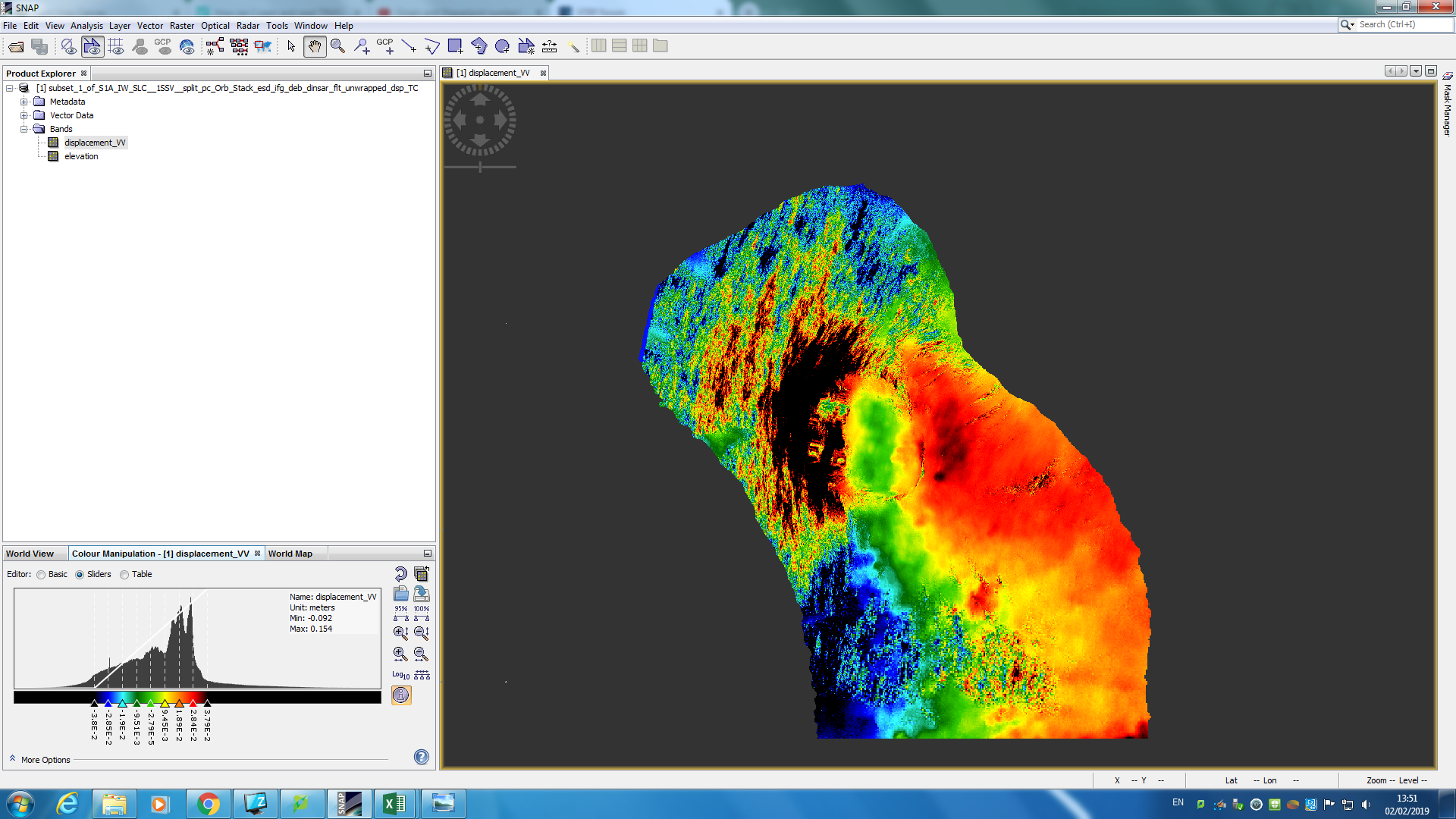
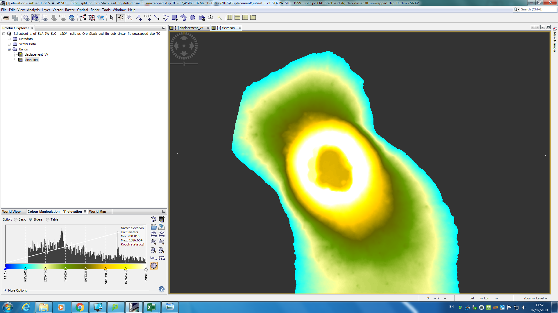
Over the past two months or so I have taught myself how to create and use interferograms to analyse ground deformation for my dissertation. I have now created a series of DEMs using the following technique:
Split> Apply orbit files > s1 tops back geo-coding > enhanced spectral diversity > interferogram formation > deburst > topographic phase removal > goldstein phase filtering > unwrapping in snaphu > phase to displacement > range-doppler terrain correction (+DEM).
So I now have two maps: elevation and displacement. I’ve set the valid pixel expression to elevation>200 seeing as I’m looking at volcanoes and the surrounding area is of no interest to me.
I’ve successfully used the data to conduct various statistical tests. So I’m now at a point where I’d like to be able to present these maps in a professional way. I’ve tried everything!
Exporting to ArcMap (as a GeoTIFF) and overlaying onto an ESRI map worked but it completely changed the colours and now includes ALL pixels, rather than those with elevation>200. I also couldn’t create a full colour ramp legend, only a little one with maximum and minimum values. I just can’t seem to find a way to create a nice looking map (either on top of another map OR with grid lines and coordinates would be fine).
If anyone has any tips or good tutorials, you could be a real life-saver!