I’m trying to get best possible L2A image from L1C source, but the picture I get from Sen2Cor 2.8 differs significantly from downloadable L2A.
Have a look at two images
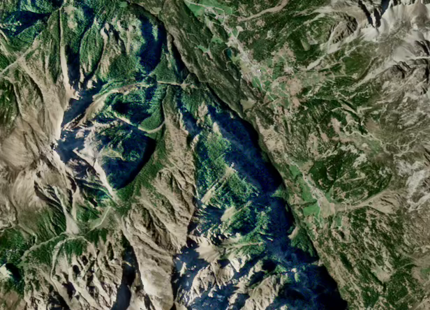
The first images is L2A tile that I’ve downloaded at scihub.copernicus.eu. The area is somewhere in Switzerland, the date is 2018-09-27.
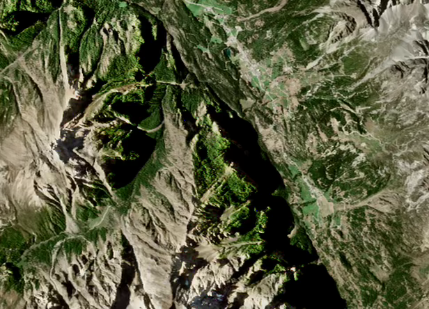
The second image is L2A that I get from Sen2Cor processing correspondent L1C image for the same date. I’ve used DEM Terrain Correction with SRTM 90m DEM.
The difference between 2 images are:
Obviously different green color.
Much more information in the shadowed areas on the first image.
I wonder how to tune current (2.8) Sen2Cor version to get the result closer to the first image.
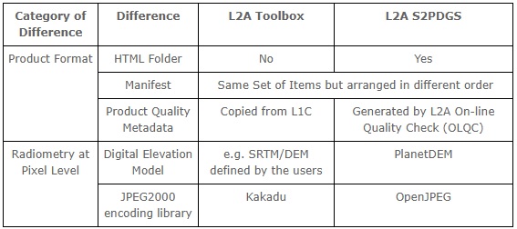
I believe your issue is highlighted in the Level-2 Data Quality Report (5.3 Terrain over-correction on shaded areas):
Due to inaccuracies of the Digital Elevation Model, a strong terrain correction may be applied in totally or partially shaded areas. This results in a bluish colour in colour composite and inaccuracy in the surface reflectance.
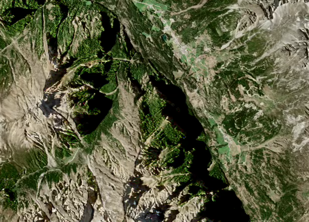
I also tried another DEM. Not DTED, but ALOS 30m DEM. See the image attached.
It differs significantly, still the green color is the same and big shadows are as black as they were with SRTM DEM.
Are you sure the colors are stretched over the same range? You can check in the color manipulation tab and compare the min/max values used for display, because SNAP applies a predefined stretch which might be different for both images because of overall adjustments.
Both images are build from separate bands (02, 03, 04) of L2A sources using the same logic. I apply Adaptive histogram equalization to 16-bit images, but it does not change the hue. So, I believe that original L2A tile has different data in green channel.
I also checked recent (September 2019) L2A S2PDGS tiles and comparing with correspondent Sen2Cor L2A tiles there is no such difference in colors. So, it looks like older versions of L2A algorithm produced slightly different colors. And, as @Jan mentioned above that bluish color is an issue.
So, I cannot get exactly the same colors with actual Sen2Cor 2.8 as S2PDGS produced 1 year ago. Is it reasonable explanation?
Yes, different versions of L2A algorithm may result in (usually slight) differences in the resulting data, especially in difficult areas like steep mountains and resulting terrain shadow, or near clouds or under thin high cloud. When they do updates of the software involving changes in processing algorithm, it is usually mainly to improve results of correcting such areas.
But what ABraun wrote is also possible explanation of the overall color tone difference in the images. He mentioning SNAP supposed you used it not to process, but display the compared L2A images and create the pictures you posted. But regardless the software you used to visually compare the images, using a color stretch on both images based on the image data, you would get different overall color if one of the images contains bluish shadows and the other does not (even if outside the shadows the images have exactly the same pixel values), because this will shift the stretch done to the blue channel in one of the images. To visually compare images, you stretch one of them and copy the color table/style to the other one. I use QGIS and there you do that by right clicking one image with colors already set and select Styles/Copy style, then right click image to compare and select Styles/Paste style. Maybe you did that, but it is not apparent from what you wrote.
It is also possible there really is noticeable difference between the images. I have seen even more profound general visual appearance differences in certain images processed by different major versions of SNAP, this mostly in case of quite cloudy ones - but then my AOI is mostly flat terrain.