Hello, i have created several interferograms wich after unwrapping I converted to displacement maps. What calls my attention is that they show high displacement in big areas wich sieems to me a bit weird.
Wrapped Interferogram:
Hello ABraun! Someone else also mentioned that to me. I did remove the topographic phase but the topography still looks very present in the interferogram.
Maybe the DEM was not downloaded correctly? Please try again with a different DEM (SRTM 1Sec or 3Sec)
Depending on when you did it: There were problems reported on the automated download of online data at the moment.
You can also manually download one and input it as an external DEM (SNAP needs GeoTiff in WGS84)
the fact that both look alike indicates that the topographic phase was removed correctly.
To go 100% sure, you can first calculate the interferogram without topographic phase removal, then apply this as a separate step and include the topographic phase as an output. Then you have
the interferogram before removal
the interferogram after removal (should look different)
the topographic phase itself (should look like a DEM)
Thanks ABraun for your insights and knowledge. Then I only need to make sure now that i properly unwrap. This last proccess has given me trouble with this particular image but as soon as i have it i will upload it.
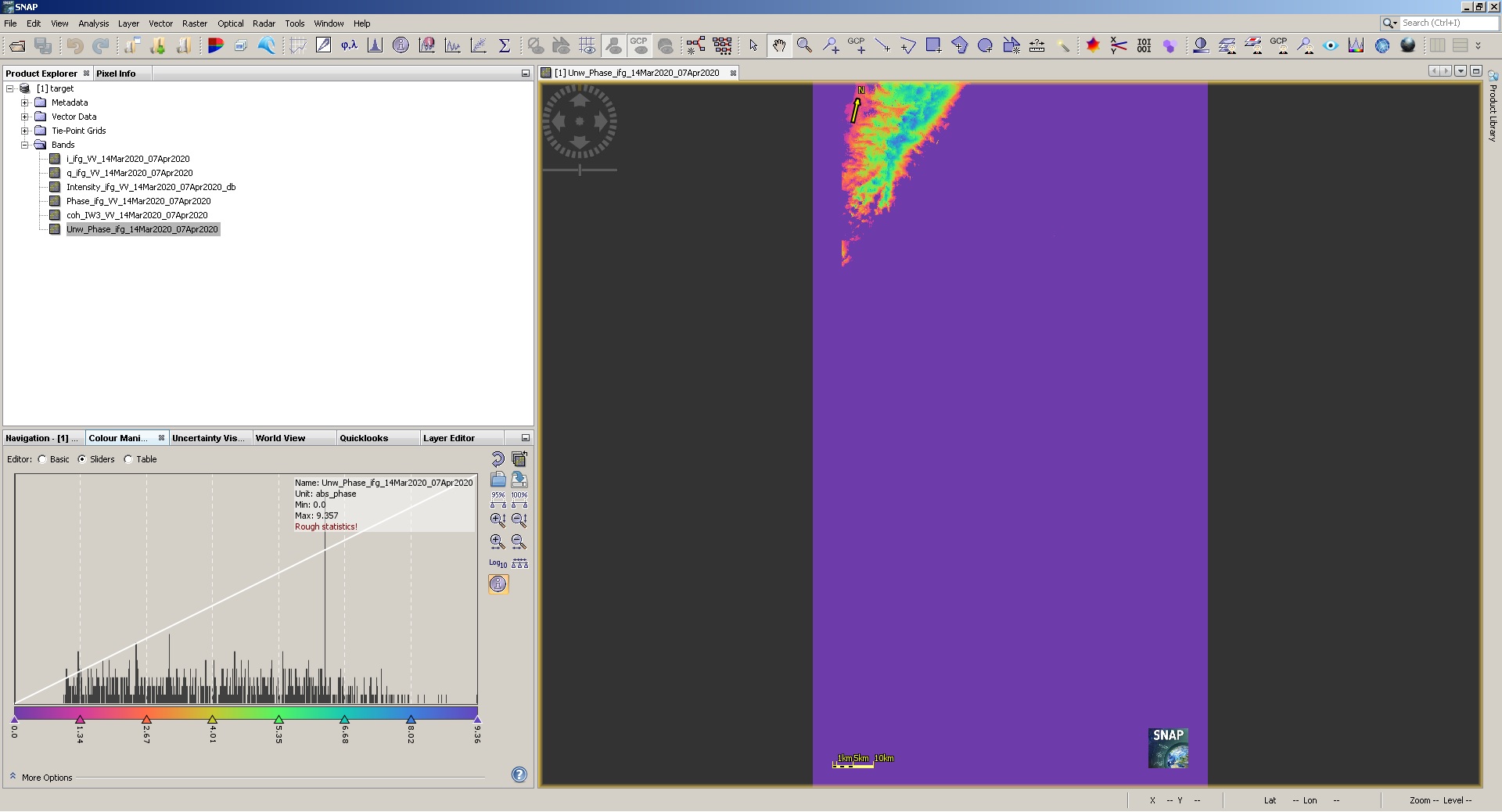
After unwrapping the interferogram i got an almost empty image. I repeated the process several times in case it was a RAM problem or something else, but always ended up with the same result.
Beyond that what I really want to ask is the following:
Did the surface that I marked on the interferogram rose? I mean, did it get closer to the satellite?
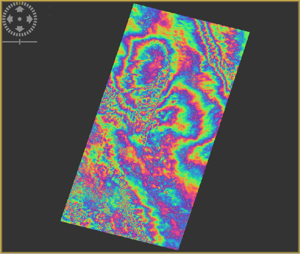
I concluded this because the fringes are, from outside to inside, blue-green-orange wich in the color scale means that the phase decreased in value.
Is my interpretation correct?
Thanks a lot!
can you please show an example? Based on the interferogram you showed, unwrapping should be possible.
Can’t tell much about the direction of movement by looking at the interferogram alone. @EJFielding surely has a more experienced view on this and maybe can shortly comment on your interpretation.
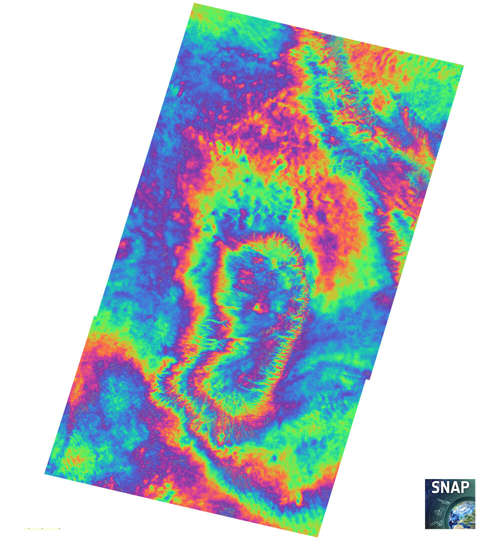
Hola @AlejandroDInSAR, I don’t know what is the problem with your phase unwrapping results. It looks like most of your InSAR phase is tropospheric water vapor variations. This is often highly correlated with topography due to changes in the distribution of water vapor with height between the two dates. I don’t think you can interpret a single interferogram unless you have a very large signal.
By the way, I recognize this area. I worked on geology in San Juan province back in 1983 and 1984.
Hola EJFielding! Then topography height can be the problem because of the water vapor difference. I really don’t know what a very large signal means.
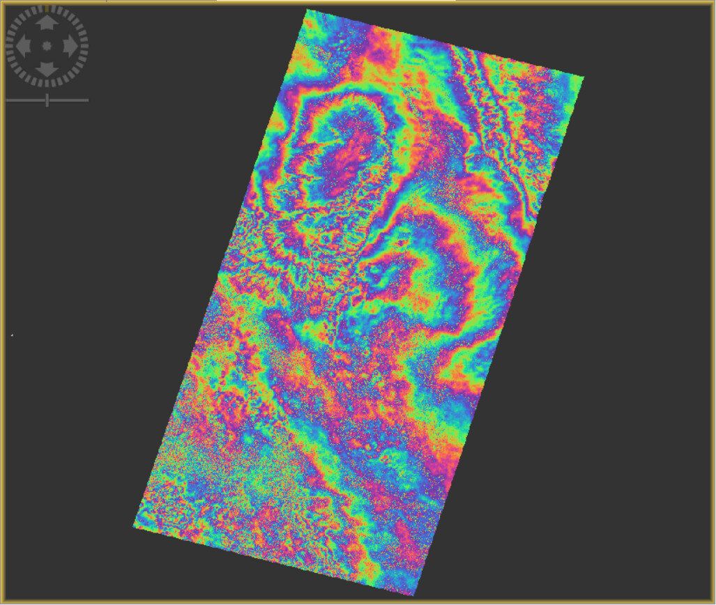
It is great that you are familiar with my ROI! I have read that troposferic effects are very noticeable in this area. I also have other interferogram that could help me interpret the posible effects of the seismic event am studying. Here is a pre-seismic one:
Fringes in any one interferogram pair can be due to atmospheric effects. To be sure of a ground deformation signal, you need to see the same feature in multiple pairs that use data from different dates or do a full time-series analysis.