Regarding the question 1, I ve realized that I was opening the data project in a incorrect way, once I choose from native resolutions to resampled resolutions, I ve started to see a RGB image color profile.
But regarding the question 2, I am still confuse if should I accept the bands suggested at window, or if I should to use other bands as for each color channel.
I had the same problem with opening the file. I received maps in files with different formats (.xml, .gfs, .json and. .tiff) from PlanetScope 4-band and could open it in QGIS. Now I have to convert it into RGB and when opening the windows I can’t enter a RGB profile. There are no options.
I proceeded like this:
Open the project
Open RGB Image Window
Select RGB Image Channel
How did you open it exactly? Which format, etc.? The bands seem to be selected already (R=1, G=2,B=3). So this is not a problem.
Thank you so much for your help (I hope the forum gets active again)
k
This is a bug (reported here) when no profile is available for a raster.
Actually, you can directly open the tiff in SNAP and select band3, band2 and band1 for red, green and blue to have a true color image. No need to convert it to an RGB in QGIS:
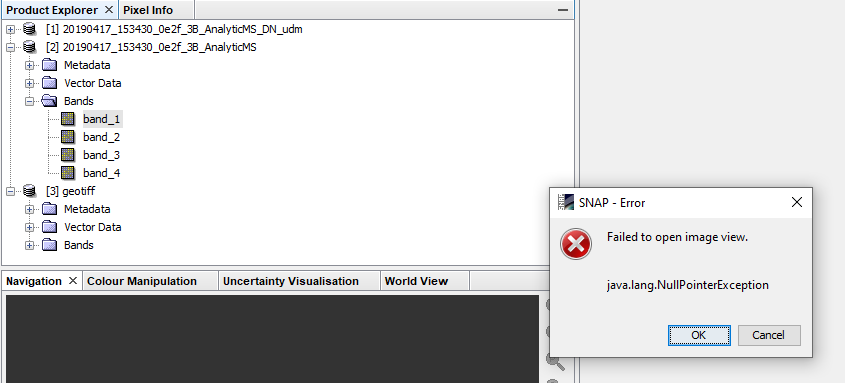
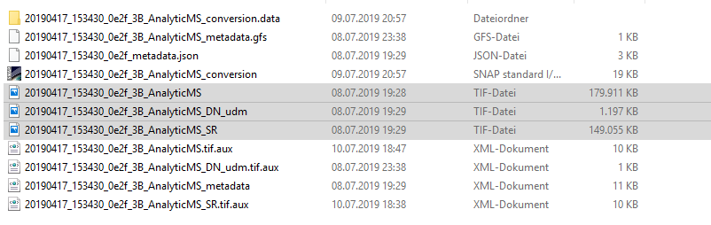
I actually tried to open the bands but I can’t (a warning pops up: failed to open image view java.lang…). I have three different tiff-files which are shown on the screenshot.
The problem with the reading of the tiff files is an issue in SNAP 6 and also in the public 7-beta, but for the release it should be fixed. Still working on it. Solving it has more implications as first thought.
I was able to reproduce it with Planet data. As a work-around by now, I managed to get them in SNAP by opening them in QGIS and saving them again as a tif. Somehow the original structure is different than what is exported from QGIS.
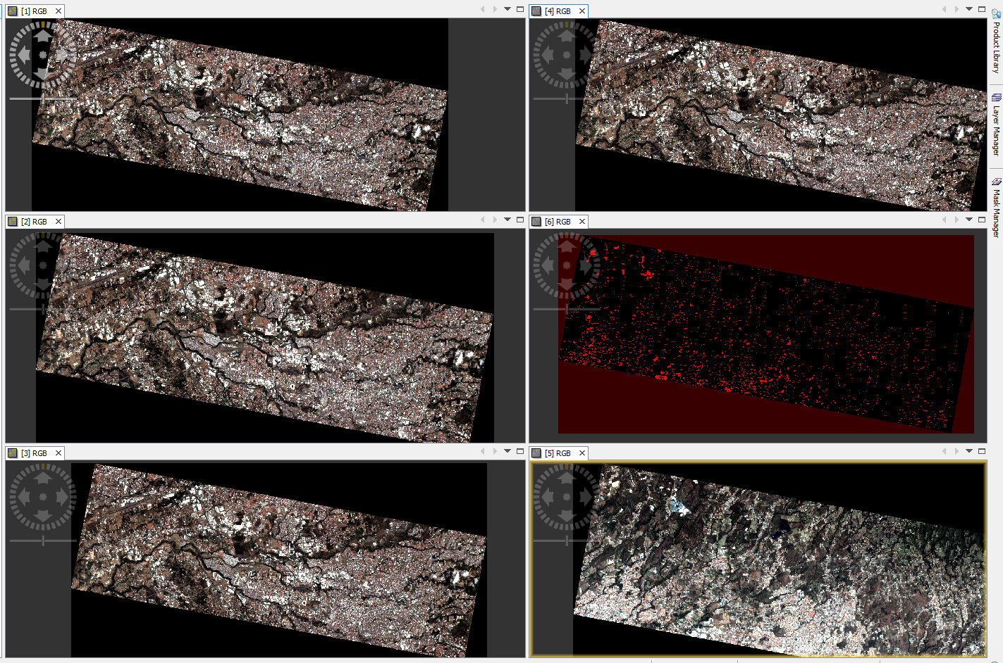
Thank you very much for your answer. It is getting there. Now I have saved each of the six different layers as a tiff and could open it in SNAP (they where already a tiff). I anyway think that the colours don’t seem to be the right ones yet. It doesn’t look as a normal picture and they are 2 pictures with 3 “layers” each. I suppose I will have to build a mosaic.
I finally achieved it with the your recommendations. The colours look eventhough the same as in the non mosaic one. Shouldn’t it look as a picture/screenshot from google earth but with better resolution?
A lot of remote sensing RGB exports can look different depending on whether the software assumes sRGB, linear RGB, or no embedded profile at all. I’ve noticed that once the image leaves SNAP, some viewers/editors interpret the channels differently which can shift the overall appearance quite a bit. It’s also worth checking whether the stretch or normalization was applied before export, since that can affect the perceived colors more than the actual band combination.
For quick checks, I sometimes use https://colorpickerimage.org/ to inspect pixel values from exported images and compare how different viewers are rendering the same RGB areas.