Hello all,
I am a beginner in remote sensing and Sentinel 1. Most publications I have read about so far use SNAP to create interferograms. However, I am interested in creating a time-series chart that shows differences in coherence-values in my plots for the span of about 4 months. Maybe there is a graph that (after all image corrections are done) takes the coherence value from X and X+1, then the coherence value from X+1 and X+2 and so on to make the time-series chart?
I am looking for something like this (Komisarenko et al., 2022):
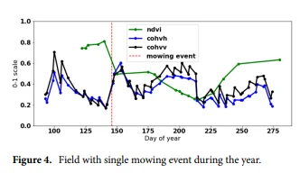
How can I reproduce such a chart (ignoring NDVI-value) in SNAP?
Thank you.