Hi everyone,
I’m trying to create an interferogram of Lower Austria for my bachelor’s thesis and have been following the NASA tutorial to do so:
After some trial and error, I was able to generate a somewhat promising-looking deformation map. Unfortunately, I later realized it was based on the wrong date pair, so I started over using the correct dates.
I followed the same steps as before:
- Used 4-1 multilooking
- Set the Goldstein filtering parameter to 0.6 (based on a paper suggesting it helps reduce cross-like artifacts)
Then I exported the wrapped interferogram and ran it through SNAPHU with the following parameters:
NTILEROW 5
NTILECOL 5
ROWOVRLP 100
COLOVRLP 100
NPROC 6
TILECOSTTHRESH 500
These are the same settings I used the first time.
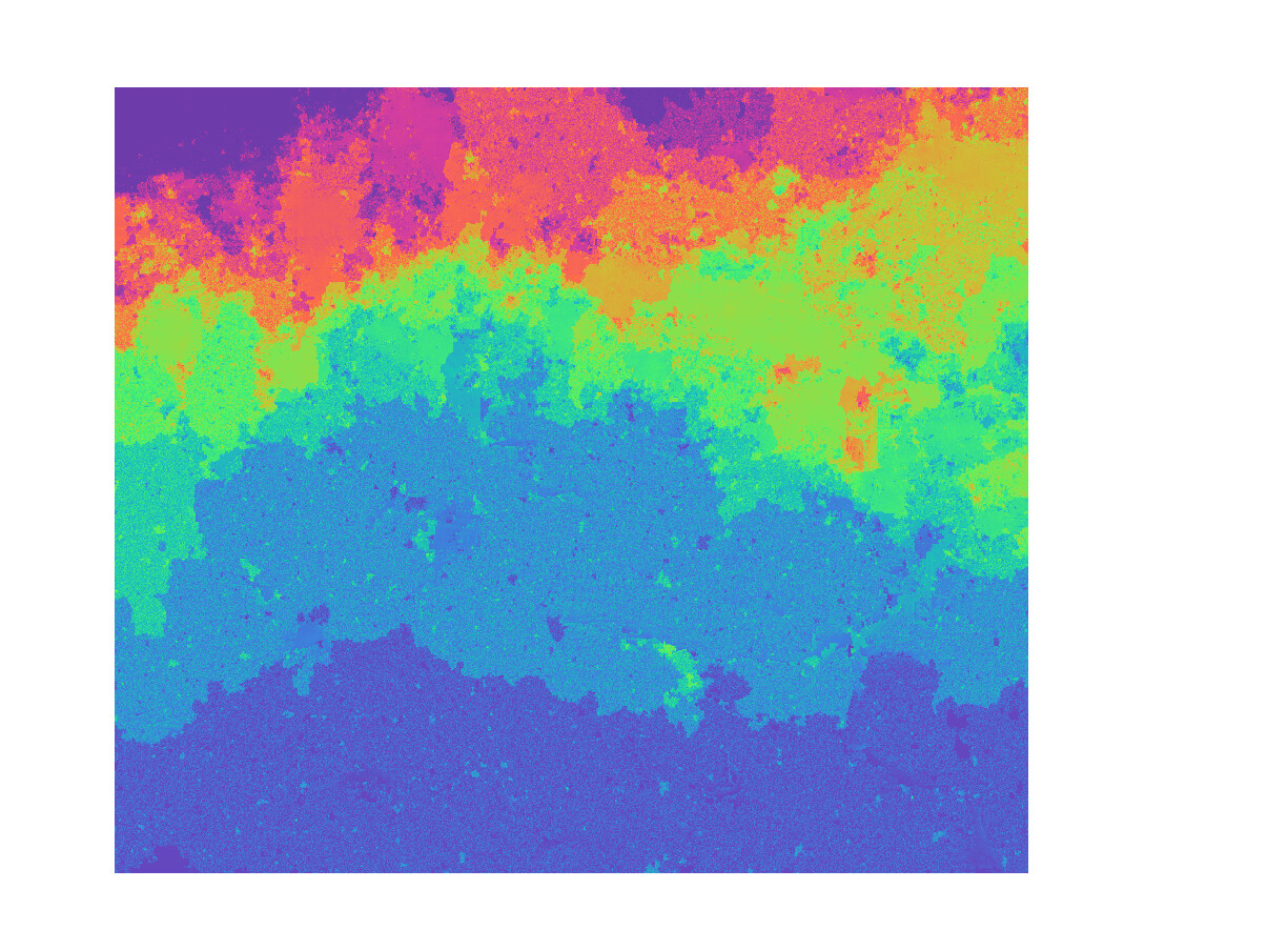
However, the result from SNAPHU this time looks very similar to the wrapped interferogram
just with the colors changed. So now I’m unsure:
Was there an error in the SNAPHU unwrapping, or did something go wrong earlier in the processing chain?
I’m still new to interferometry and could really use help from someone with more experience. I’m aware that the area might not show much deformation, as there was no major event at that time except for heavy rainfall, but I want to make sure I’m at least processing things correctly.
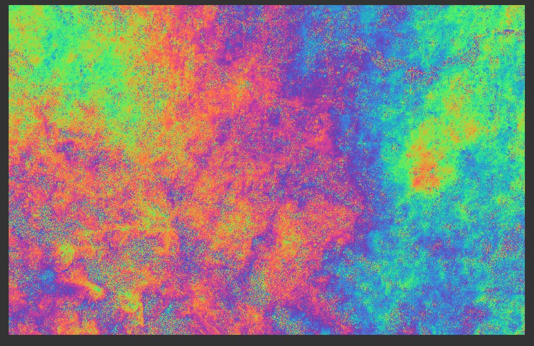
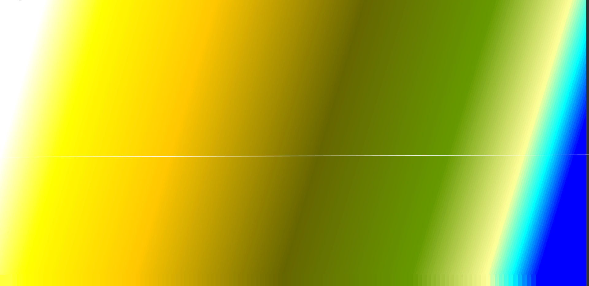
This is the wraped Interferogram:
And this the same one unwraped:
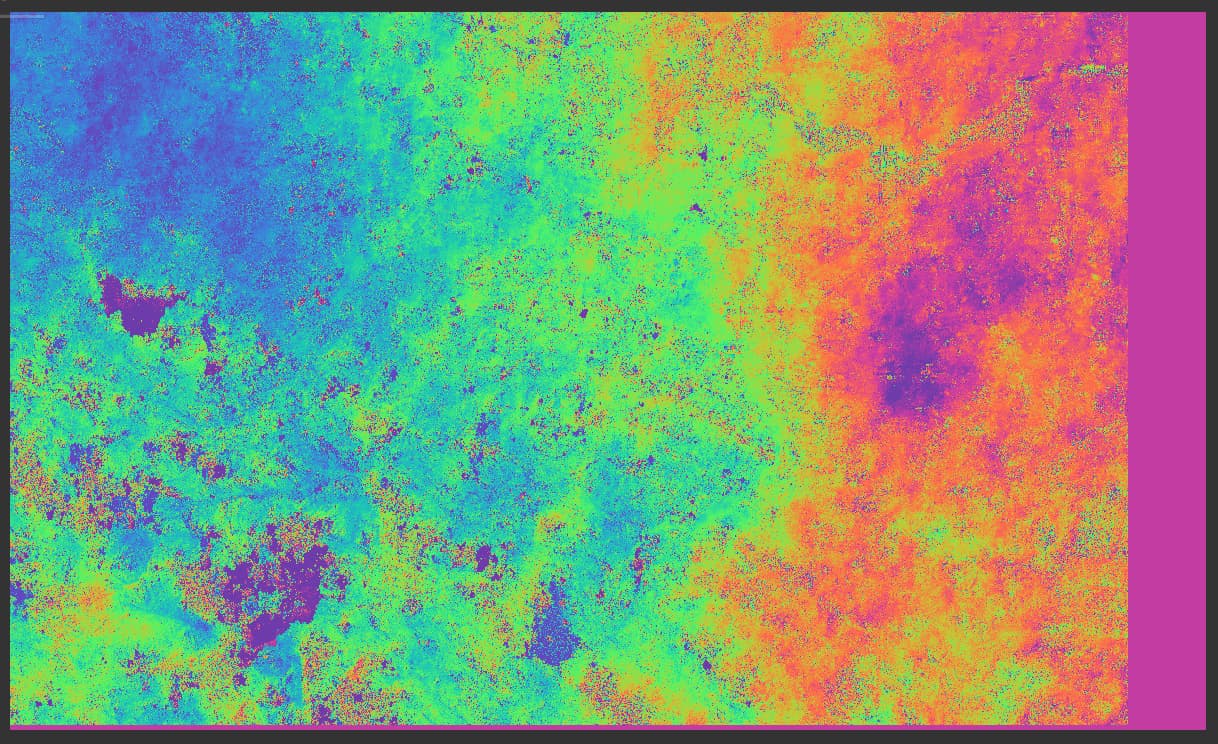
I’m also attaching my first interferogram (from the wrong date) in case that helps evaluate whether it was even correct in the first place.
Im using the newest Version of SNAP (11.0) on a Windows PC and the SNAPHU is done on a linux server with 64 gb ram
Thanks in advance! If I need to provide screenshots or files for troubleshooting, just let me know.
Best regards, Oceanman
Hi Ocean man,
I am trying out inteferogram as well. I am sorry, I do not have an answer to your question. I am posting here to seek your help.
i am trying out interferogram on downtown Toronto using sentinel-1 data. The two images are from June and September.
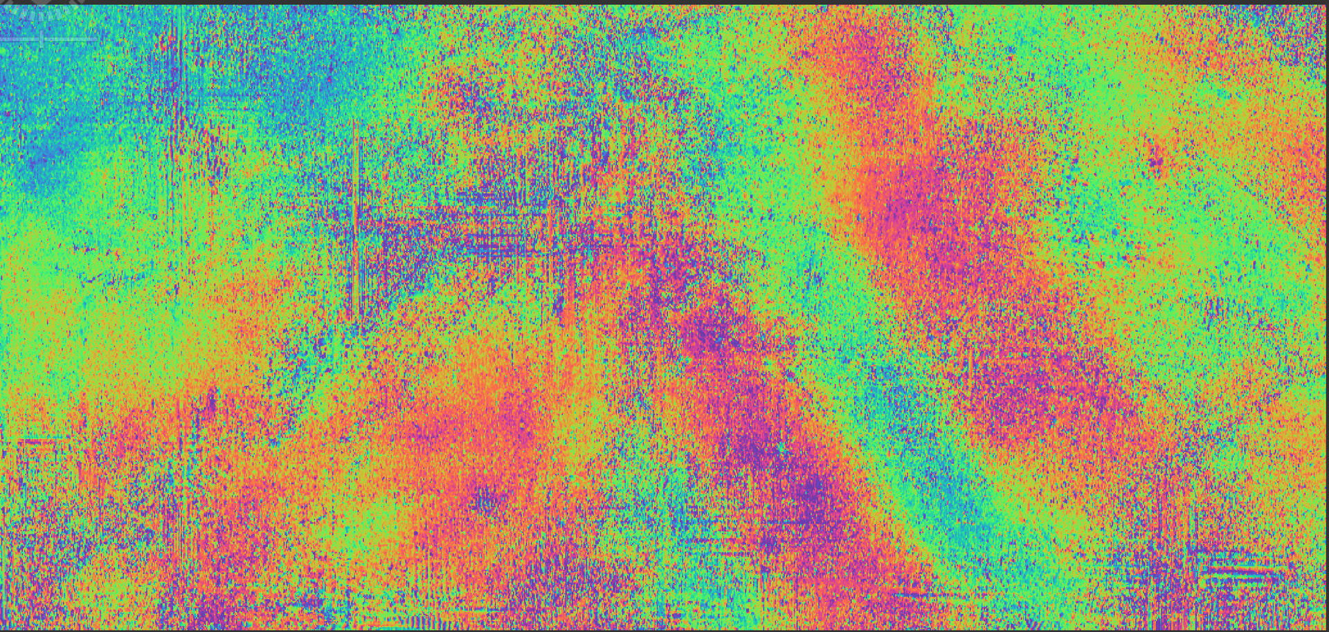
This is Phase_ifg_IW3_VV_26Jun2025_30Sep2025:
When i unwrapped and converted phase into displacement, this is how it looks.
I drew the line in horizontally to generate a profile plot. It is a line with negative slope.
- Total Change in Displacement : -3.9 - (-0.3) = -3.6 meters
- Slope (m):-3.6/1250 = -0.00288 meters per pixel, where 1250 are the number of pixels
So looking at the profile plot, it leads me to believe that the terrain is tilted, but this amount of tilt is impossible, so it must be because of the errors in the satellite positions when the two images were taken.
I am using Snap 13.0.0 version. And I do not know how to adjust each pixel for this slop due to error in satellite position. The band math does not allow me to add an expression where I can reference each pixel value.
Is my analysis correct or is it completely off? any help is appreciated.
Oceanman:
I don’t see anything wrong with your unwrapped interferogram. The colors themselves don’t really matter. You remember that in your wrapped interferogram, your values will cyclically repeat, so will the colors. In your unwrapped interferogram, there will be a minimum and maximum value of the unwrapped phase, and the colors will not repeat.
Regarding deformation, you need to be aware that the unwrapped interferogram just mathematically converts the wrapped phase into an amount of phase cycles and, from there, into metric units. The output may show displacement values in metric units for the entire image, but that doesn’t actually mean the ground has displaced at all, most of the interference fringes, just come from atmospheric artifacts or other phase components.
Usually, if there is real displacement, while looking at an optical image, assuming the resolution is enough, you may find oddities in the area where an interference pattern is located. Are there cracks? Does it have a lobulated/flowy shape? Does the soil happen to change in color or texture? If it has none of those, is there persistence in different interferometric pairs at least? If you spot something along those lines, try to find a stable area outside the region where it would seem there should have been no displacement at all, the difference between both will be your displacement.
Dhiraj:
That displacement raster looks extremely odd. It has no resemblance at all to the original interferogram and appears to be a raster with values that change neatly in a linear fashion. Areas with low coherence should also be noticeably distorted in a displacement map derived from an interferogram.