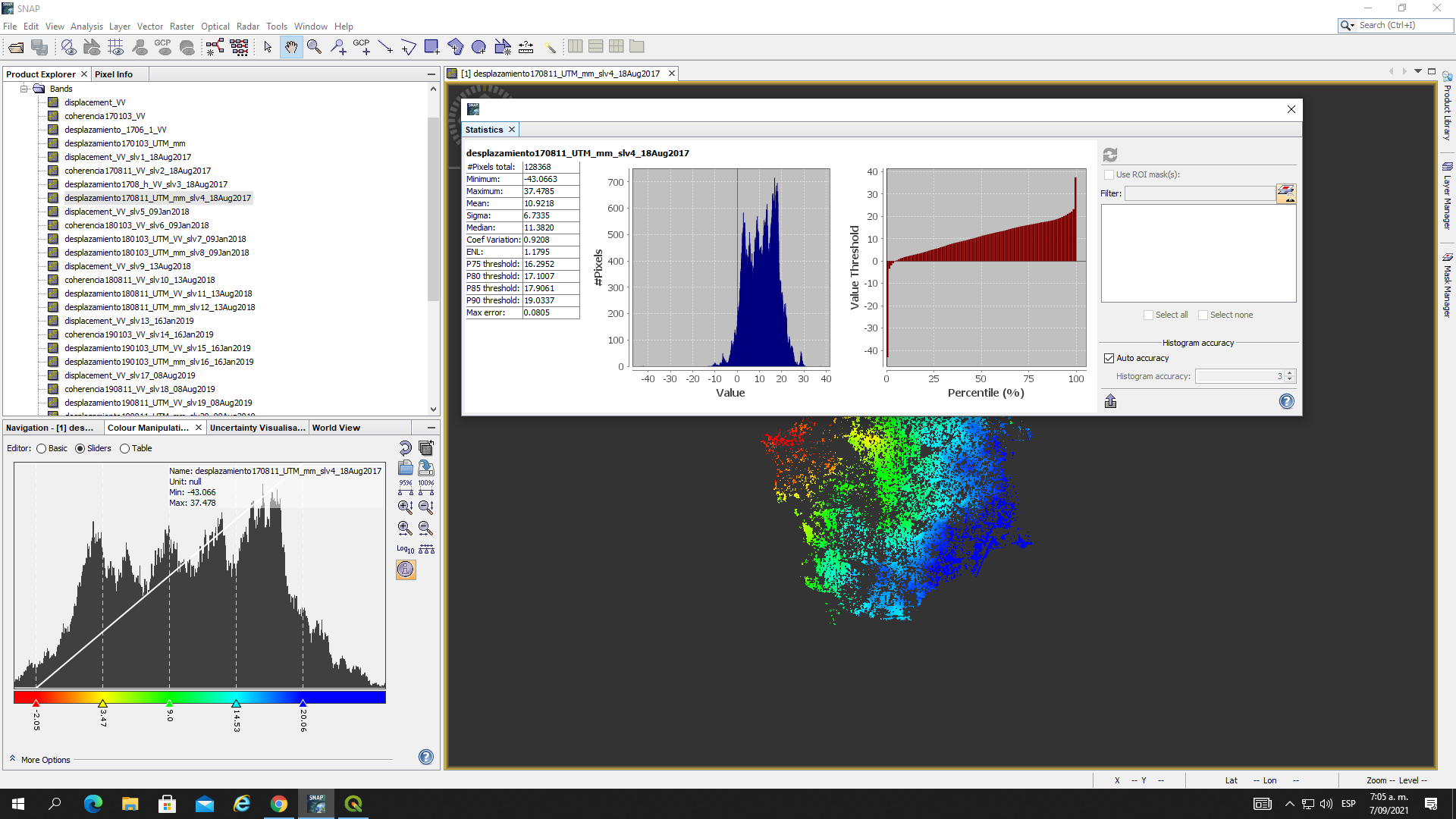
Unfortunately, the screenshots are a bit small, I cannot read the numbers.
To me this is not surprising: if you average multiple values, the mean will always have less extreme values.
Well how did you create the mean displacement map in the first place?
The max error is just a statistical measure, not related to displacement in particular. It’s the width of the bars of the histogram.
If you want the low coherence areas removed from the statistics you can create a mask (coherence_mean > x) and use it as a ROI at the right side of the window.
Also, you should remove the value of the blue area, it obviously distorts the results, especially the mean.
Thanks for your quick answer Mr. Does SNAP give a value related to the uncertenties results in the displacement maps? like: 0.05 m ± 0.004. In addition, Is there any error in the radar signal that limit the technique although the interferometric process be good? I mean, a limitation that does not allow the results be 100% acurrate with the reality.
no, this uncertainty cannot be given automatically, you have to interpret the input data, the interferograms, the coherence to estimate how good it all worked. But for sure, every DInSAR results contains errors, you shouldn’t blindly trust these pixel values. There are good materials on this here: Echoes in Space - InSAR error sources
Hello Mr ABraun, hope you are fine.
I have a question.
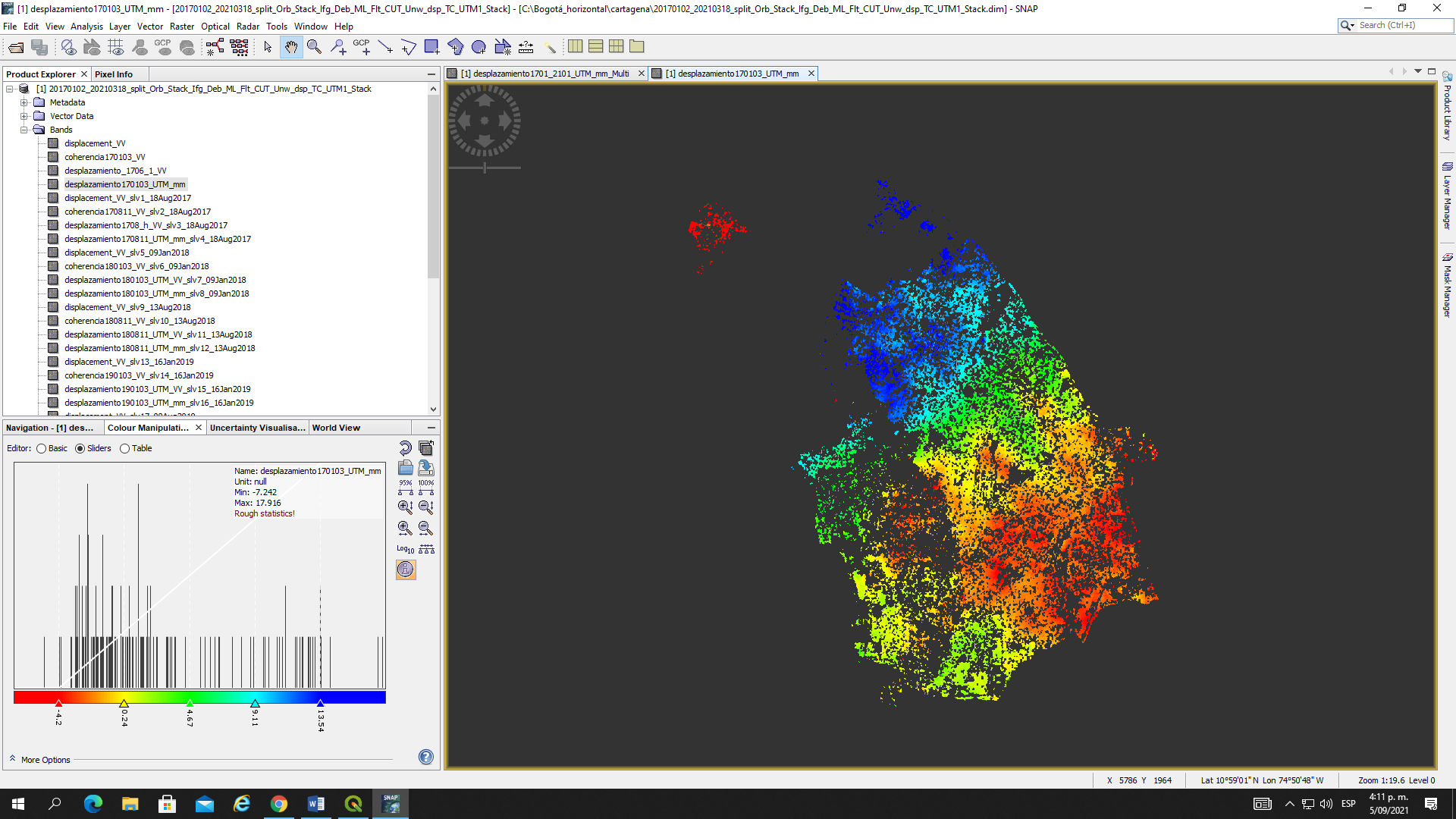
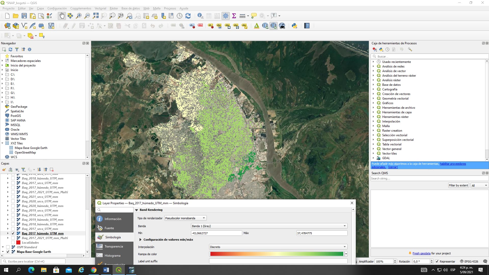
I have created a displacement maps just with pixel values > 0.6 in coherence by IF coherence < 0.6 THEN NaN ELSE displacement_VV. So, when I export those maps in geotiff, and open them in QGIS, the displacements values change. I give some examples below.
Min value: -7.24 mm Max value: 17.9 mm (Displacement map in SNAP)
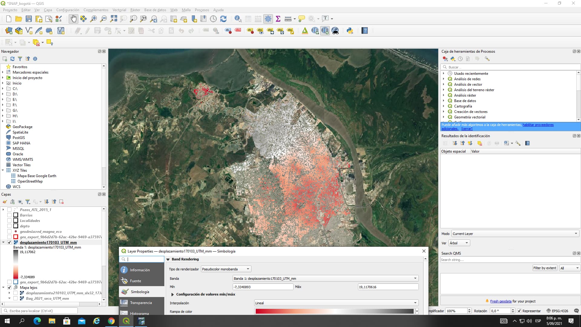
I also used the img files inside the data folder rasters in SNAP and the values still keep changed
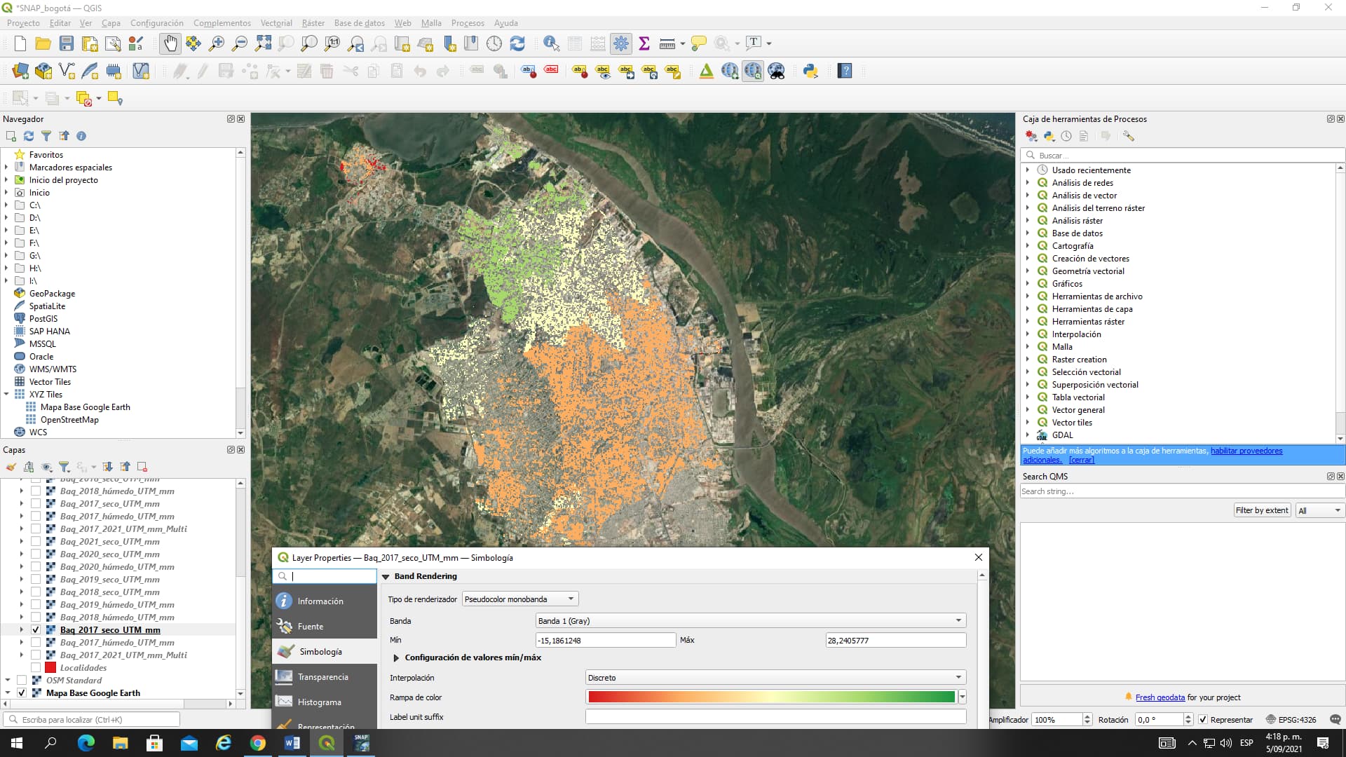
Min value: -7.33 mm Max value: 19.11 mm ( img files inside the data folder opened in QGIS in QGIS)
QGIS uses a different color stretching than SNAP, both differently compute the min/max values for visualization. The actual values did not change, please see here: Export of products from SNAP
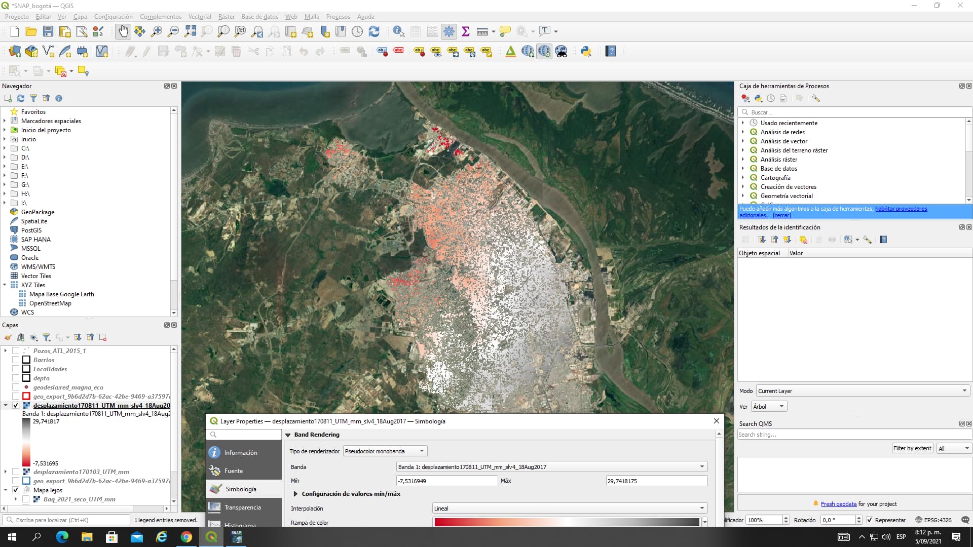
Thanks Mr for your kind help. However, I applied your recommendations selecting “Stretch to MinMax” and
select “Cumulative count cut” (2,0 - 98,0 %)as under Min / Max Value settings as indicated in the “Export of products from SNAP” tutorial.
Min value: -1.90 mm Max value: 23.29 mm (Exported (GEOTIFF) displacement map in QGIS)
These values are only a rough estimate in both programs.
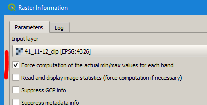
Please check the actual statistics for the unclipped (absolute) min and max values.
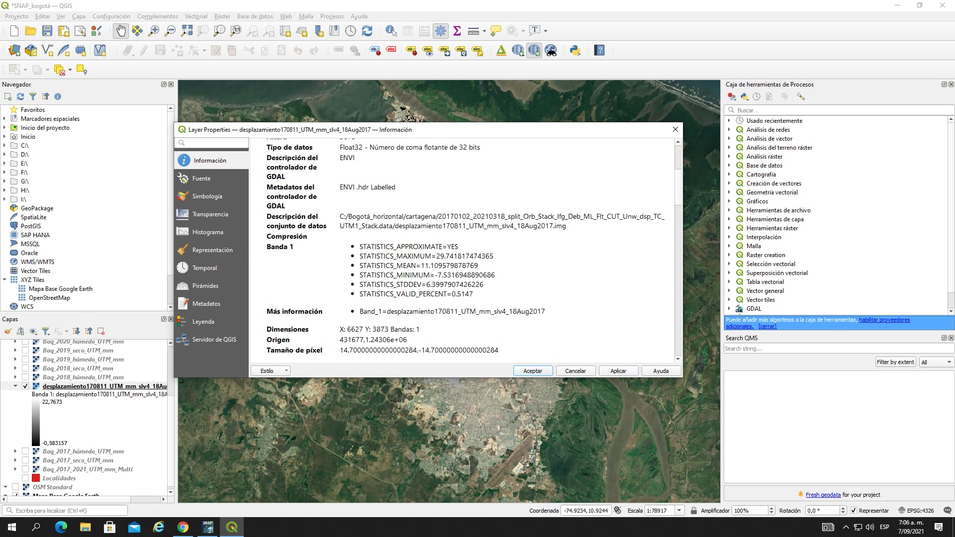
You can see this using the Statistics tool in SNAP and in the layer properties in QGIS
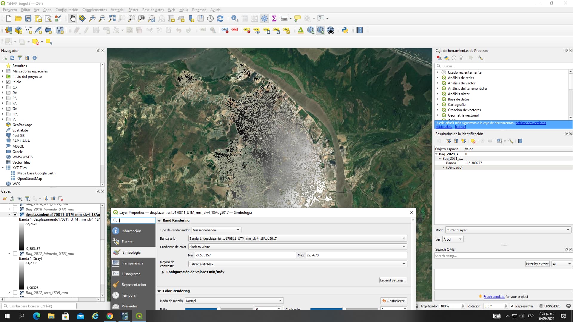
Mr Braun once again thank you so much for your guide. What I really do not understand is that If a gave NaN to those pixel with coherence < 0.6 (If coherence < 0.6 then NAN else displacement_VV) Why does SNAP calculate statistics for all the pixels in the band?
In SNAP using the statistics tool for the band with just pixels > 0.6 the min is -43.06mm and the max is 37.47mm. But in QGIS is different: min -7.53 mm and max 29.74 mm
maybe @marpet can tell us if pixels masked by the “valid pixel expression” are included by the Statistics operator.
Additionally: The statistics in QGIS are still just estimated (APPROXIMATE=YES). If you want to go 100% exact, you have to execute Raster > Miscellaneous > Raster Information
Also, in theory I became in NaN the displacement pixels with coherence < 0.6 in the band maths. I mean, a created another displacement map with that. I did not use the “valid pixel expression”
Dear Mr Braun, hope you find well
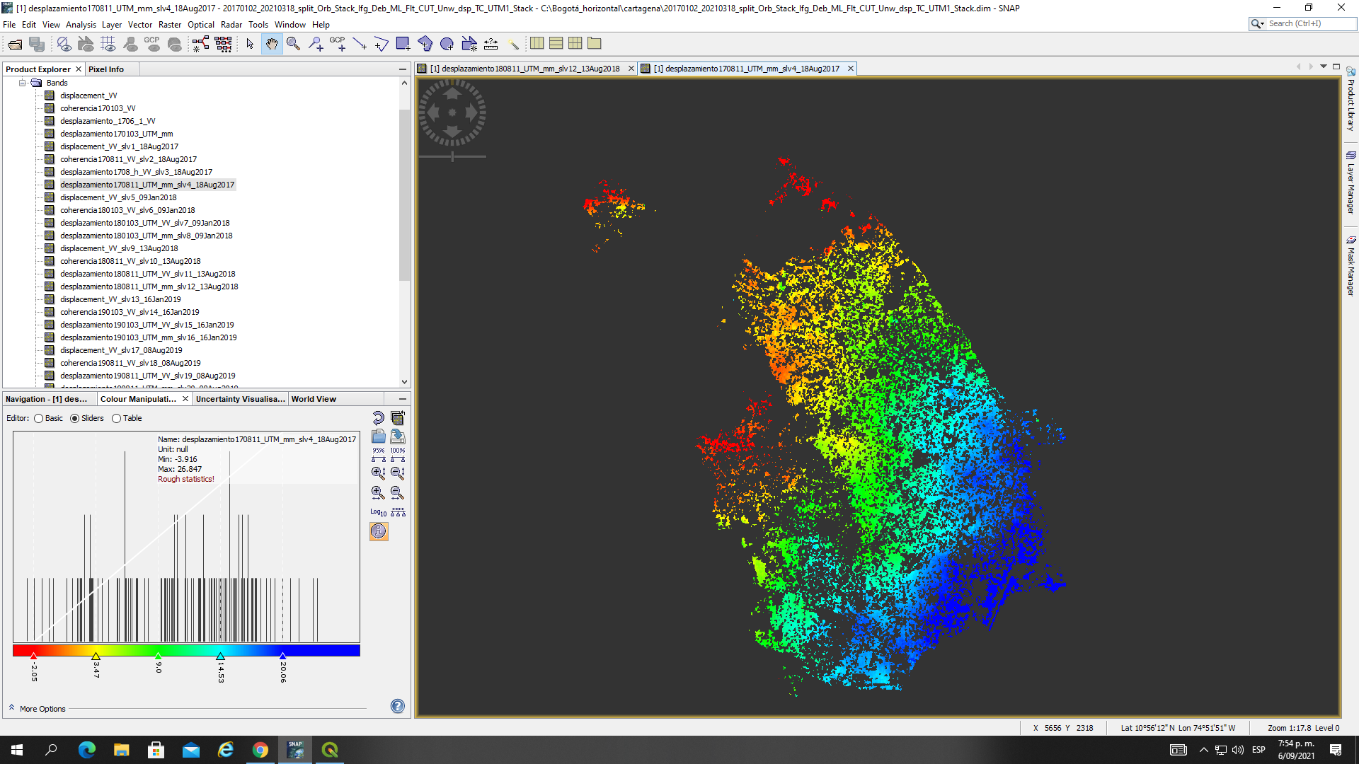
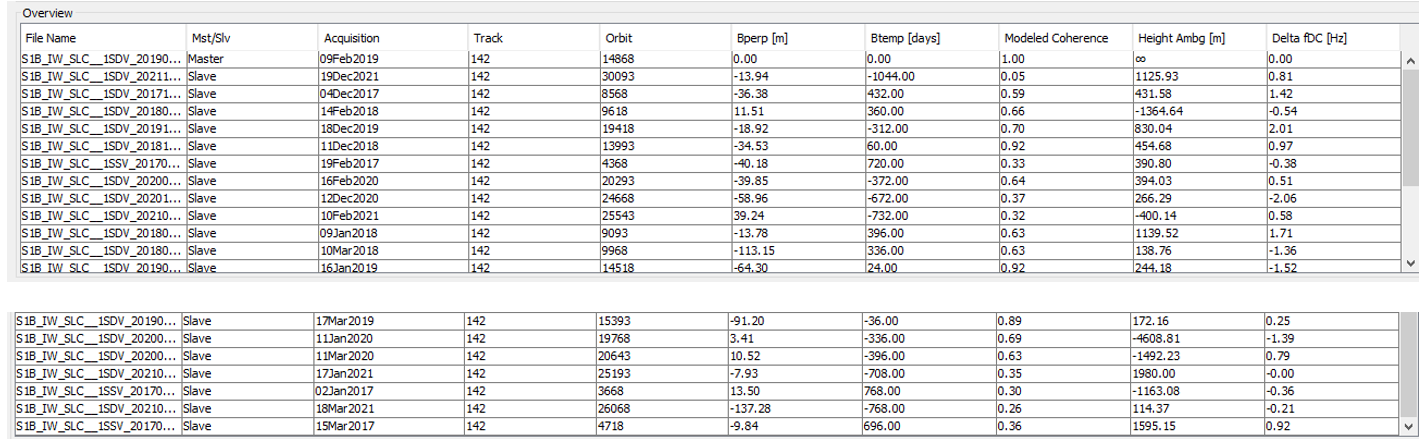
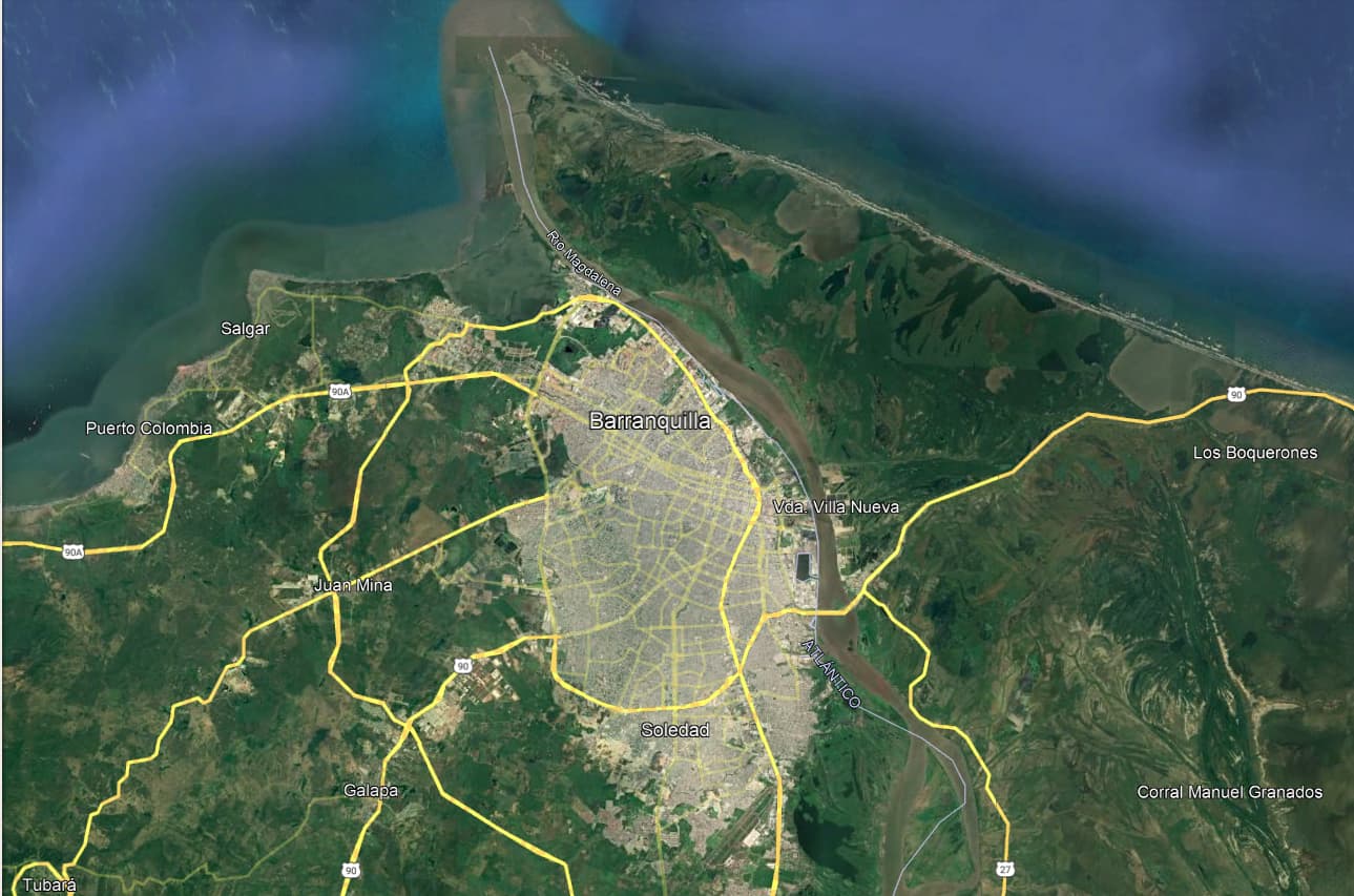
I have selected a group of SAR images from the dry period in my city (Dec - Mar) during 2017- 2021.
Then I used InSAR Stack Overview tool for estimating the potencial master in all my data and check those pairs with a modeled coherence > 0.59 in order to have “better” corregistration results. After aplaying all the steps for creating the interferograms (Split, orbit information, back geocoding, ESD, interferogram formation, deburst, topo phase removal, multilooking, goldstain filter) I would like to know if my results look good. In addition, I would like to know how I could identify artifacts in the interferogram due to atmospheric or topographic contributions, and other errors.
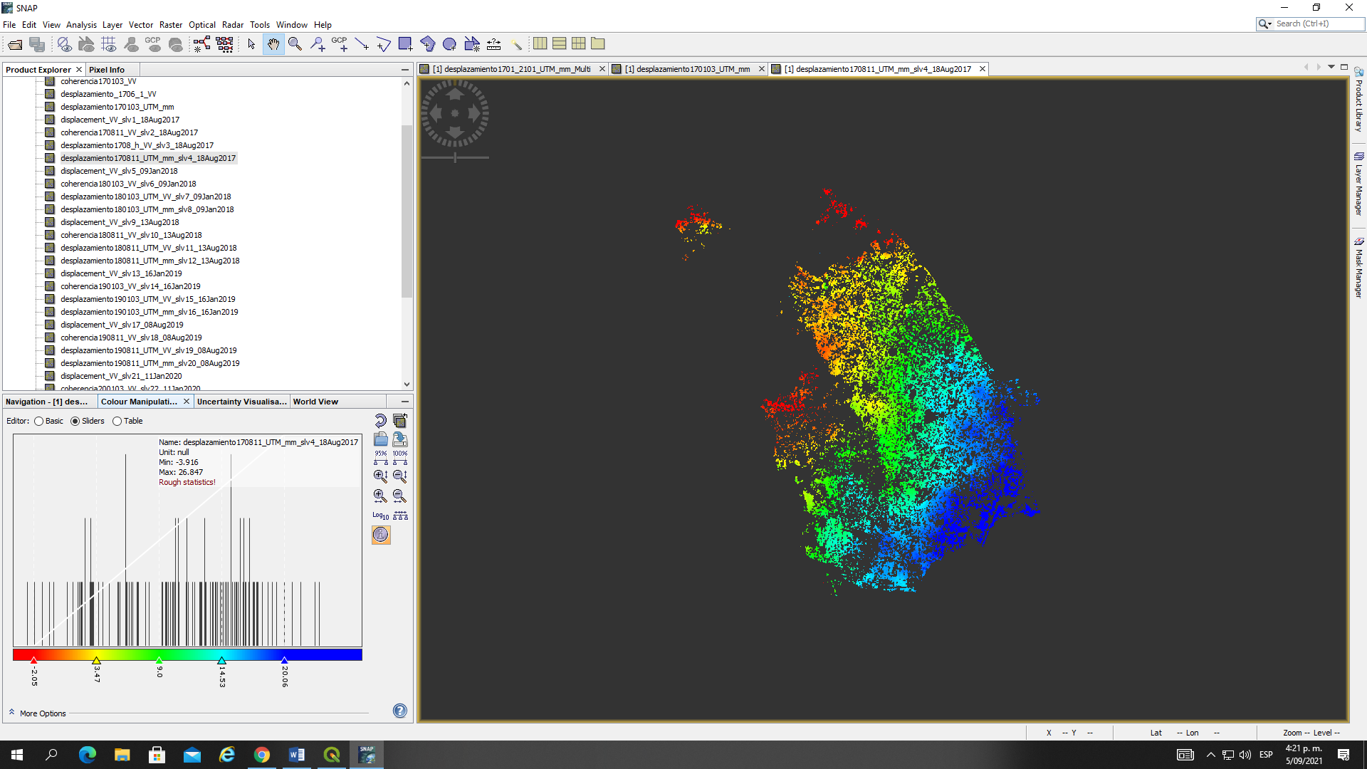
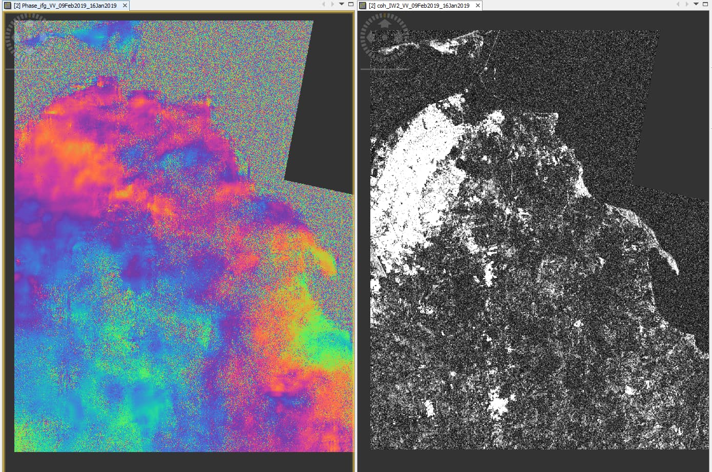
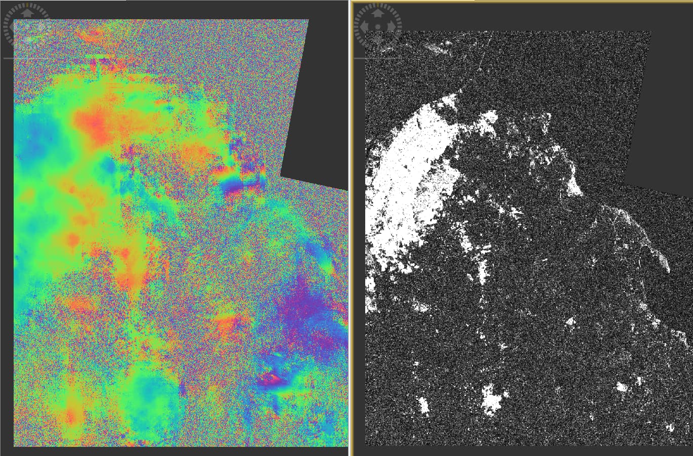
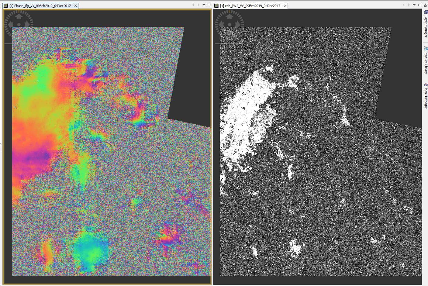
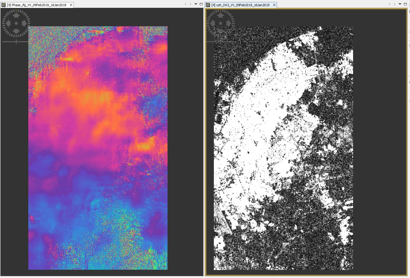
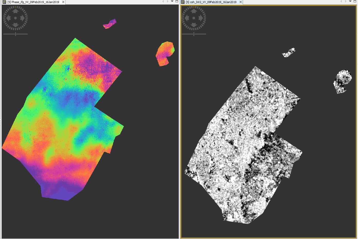
You can see some examples with the highest (2 and 3) and lowest (4) modeled coherence values selected
The study area is the big part with the highest coherence located near to the top left corner.
Additionally, I want to cut the study area using a shapefile or a subset before the unwrapping process. What do you recommend me? shapefile or subset? When I use shapefile in order to cut the image for my study area the interferogram color literally change.
Shoud I consider something to do an accurate cut taking into account the fringes?
shapefile (In this case the fringes were preserved) But sometimes the new interferogram after being cut with a shapefile has just one color (i.e, all with purple color)
The stack overview shows that none of the image pairs has a perpendicular baseline above 150 m. However, this is (among other factors) required to retrieve detailled DEM information. The fact that none of your interferograms look alike indicates that the contribution of atmospheric variation is dominant. Also the fact that only a small fraction of the study area is of high coherence shows that large parts are characterized by phase noise or random patterns. These lead to errors during the unwrapping and the observed blurry patters which are barely related to topography.
You can add a DEM to the data (right-click > add elevation band) to compare if any topographic fringes are contained, but based on these image pairs, I’m afraid, you won’t find any.
Thank you so much for your answer. However, I want to estimate land displacements. In the ESA tutorial and guide for DInSAR interferometry, they recomend to use images in the dry season and with a small perpendicular baseline in order to cauculate for example, subsidence. Additionally, I used the SRTM 1sec HGT for extracting the topographic contribution. Finally, before unwrrapping, I want to cut the image and jut preserve the study area (which has high coherence).
My study area is located in the tropics and very near to the sea and river, how can I avoid atmospheric contributions with this traditional method? I have used all the filters and steps needed in order to have a good performance.
I really apreciate your help.
The study area is the urbanized part.
Sorry, I was thinking you want to generate DEMs because I was only looking at the topic’s title.
So for DInSAR the perpendicular baselines are good, but probably the time between the image pairs is too long for the extraction of reliable displacement.
Masking low coherence areas before unwrapping sounds a good idea to me. You can follow this guideline: Filter out low coherence pixels before phase unwrapping
But as your study area is in the tropics, there might still be large atmospheric contributions. Did you consider using persistent scatterer interferometry using StaMPS or PyRate?
I am actually trying my best to understand how DInSAR with SNAP works (traditional method) in order to analyse land displacements. I would need to study how StaMPS or PyRate works.
What do you think about the modeled coherence? Does it help or not?
It helps to compare the suitability of different pairs, but does not say much about the overall quality which can be achieved because it doesn’t include atnospheric conditions and volume decorelation, for example.
Hello Mr, I would like to confirm if the displacement band is given in displacement/time units (e.g mm/yr), or displacement only (mm). I mean, if I have a displacement band created from two images separated 24 days, Should I have to operate: displacement band/24 days in order to obtain the displacement per day?
Thanks for your help
If you used “phase to displacement” the value refers to the period under investigation. You could theoretically divide by the number of days in between but this would assume constant linear movement.