Interpretation about result of StaMPS(PS-InSAR)

I conducted a PS-InSAR analysis using snap2stamps and StaMPS. Since I used Sentinel-1 SLC data, the resolution is about 5x20 meters.

The picture below is a visualization of the velocity results using ps_plot(‘v-dao’).

I understand that each pixel represents a PS (Persistent Scatterer) point and contains velocity information for each PS. I notice that the PS points are very densely distributed, and some PS points are located very closely together. Given that Sentinel-1’s resolution is 5x20 meters, it’s difficult to comprehend why they are so densely packed. Additionally, the data used for the analysis is in raster format, so I would expect the results to also be in raster format, but they appear as if in a shapefile, and I can’t understand why.

  1. The reason why PS points are positioned even closer together than Sentinel-1’s 5x20-meter resolution.
  2. The reason the results of the Time-Series InSAR analysis, conducted using raster data, appear as a shapefile-like grid.

Thank you.

Sentinel-1 pixel size is about 15x4 meter and the pixels are distributes irregularly in geographic coordinates. That’s easy to investigate in PyGMTSAR (Python InSaR), see the details in this short YouTube lesson: https://m.youtube.com/watch?v=kebvF_QYB8E
Most of the pixels are not stable and there is no reason to output all of them as a huge raster. The shapefile provides PS pixels only.

1 Like

Thank you for your answer. @MBG

I saw through the image and a picture like the one below came out,

  1. How can a raster data with different pixel sizes like the picture above come out from the raster? I know that raster has the regular grid pixel. Is this data call HDF data?
  2. Initially, you can see that all Pixel sizes are the same raster when viewing the SLC in SNAP, but at what stage does it transform into a raster with an irregular grid like above image?
  3. The relationship between a raster with a regular grid and a raster with a non-regular grid is very confusing, can you explain it? Or reference materials are also good!

Thank you.

The answer is simple – this is the result of topographical correction. In fact, it’s just basic geometry. When a radar pixel on the topography is perpendicular to the radar beam, its area is equal to the grid spacing. However, when the pixel is parallel, its area becomes infinite.

1 Like

I think I understand the reasons for the differences in pixel sizes now! @MBG

So, if data with different pixel sizes is not raster but a different data format (e.g., HDF), how should we explain this to people who are unfamiliar with this field? I’m wondering how to explain it to those who are not familiar with this topic.

PyGMTSAR allows you to export the grid data when the radar pixel shapes are clearly visible. Simply plot the output grid on a DEM using Google Earth or ParaView to visualize it, and the 3D map becomes quite evident.

Thanks for your answer, @MBG

I have one more question.

I understand that in Time-Series analysis, DEM (Digital Elevation Model) is a very old version. I still know that analysis is conducted using past DEM data, does it not affect the results?

Even a small difference could lead to significantly different results, so how is this issue addressed?

There are many sources of errors in remote sensing data processing. For significant displacements, such as those caused by seismic events, we can detect clearly recognizable fringes and estimate event epicenters and amplitudes. However, for small movements, we rely on various types of timeseries and spatial distribution analyses to estimate the movements and their probabilities. When StaMPS returns only a few pixels, it means that the most accurate estimation is possible for them (depending on your PS selection), but it does not guarantee that the results are always accurate.

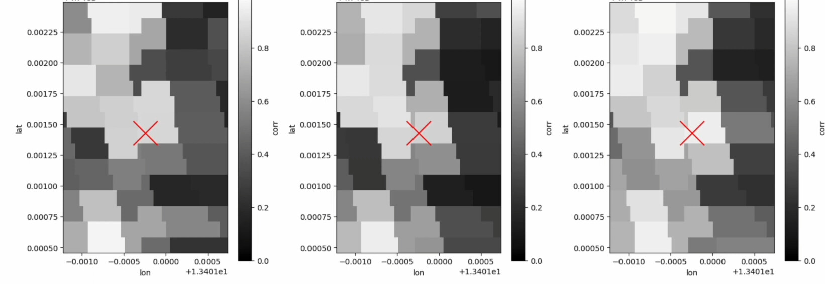
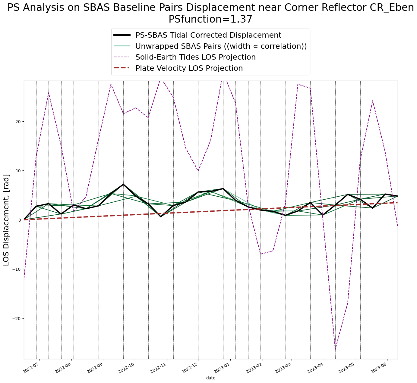
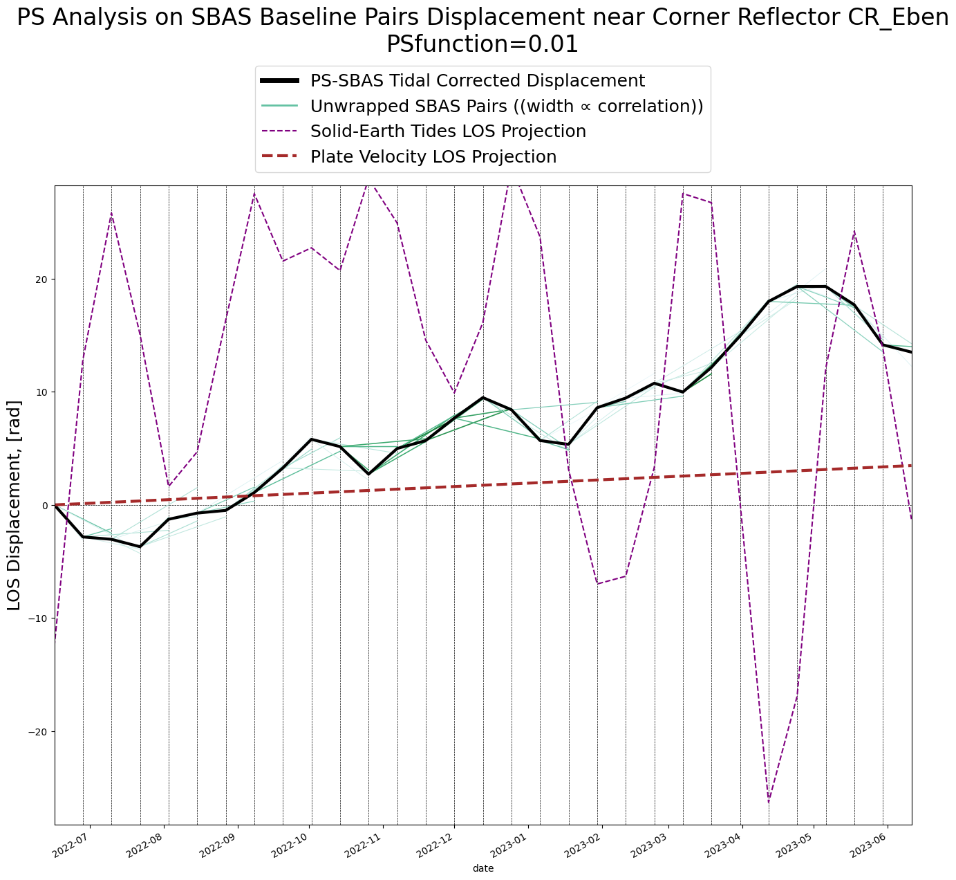
Let’s compare the Line-of-Sight (LOS) displacements in radians for two pixels. One pixel is calculated for a known corner reflector from PyGMTSAR examples, while the other is a random pixel with low stability. In this comparison, we use the Persistent Scatterer (PS) function, where higher values indicate better stability, following GMTSAR approach (the code is hidden in GMTSAR sources and is not easy accessible). This is in contrast to the more widely used Amplitude Dispersion Index (ADI), where lower values are considered better. (If you want to investigate ADI further, we can also calculate ADI in PyGMTSAR). By the way, we normalize the average amplitudes of Sentinel-1 scenes for calculations.

For the PS pixel, all the phase pairs are consistent, and there are no outliers. It means the numerical solution is accurate. However, for the randomly selected low-stability pixel, we observe phase pair inconsistencies, which can lead to inaccuracies in the unwrapped phase and displacements.

StaMPS cannot process SBAS pairs and has no ability to fix the inconsistencies so you should select the most stable pixels for the analysis. Technically, we can analyze almost any pixels, excluding extremely low-stability ones, to provide better coverage:

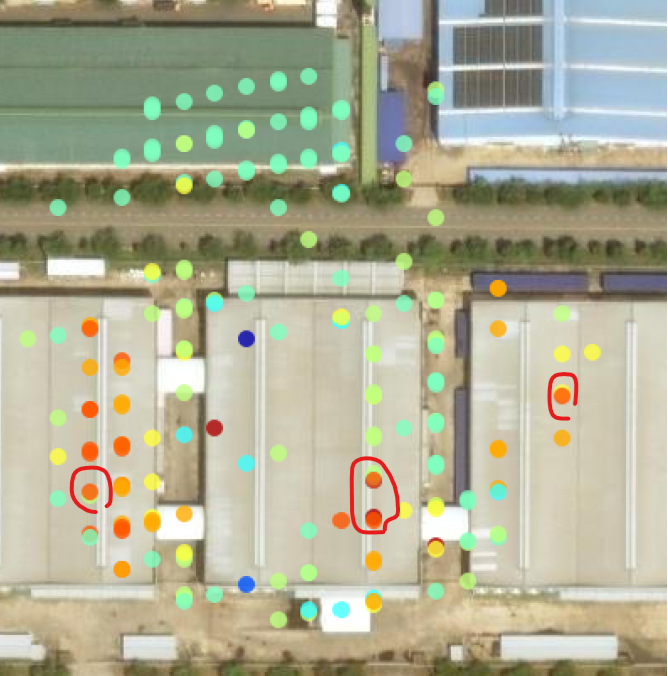
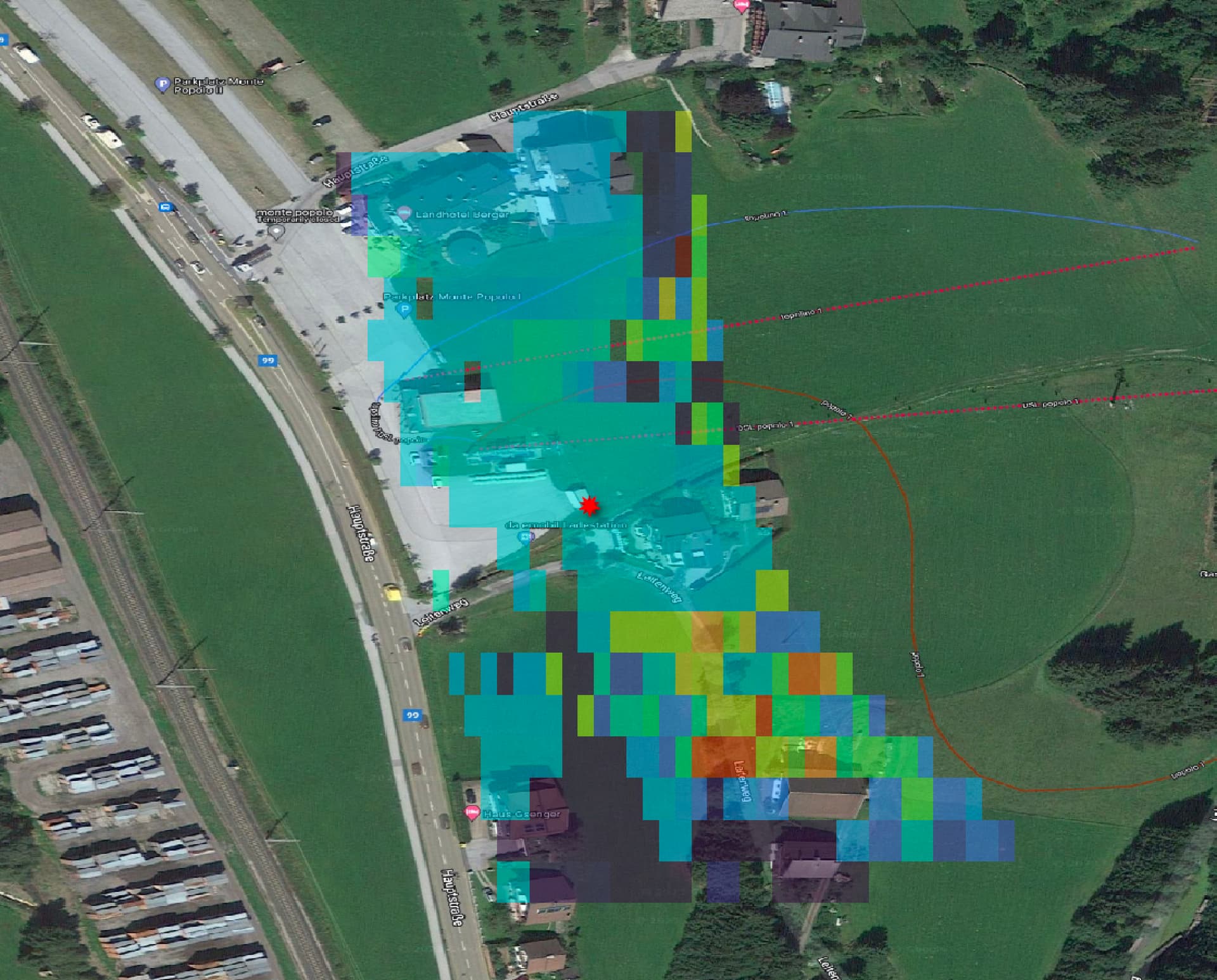
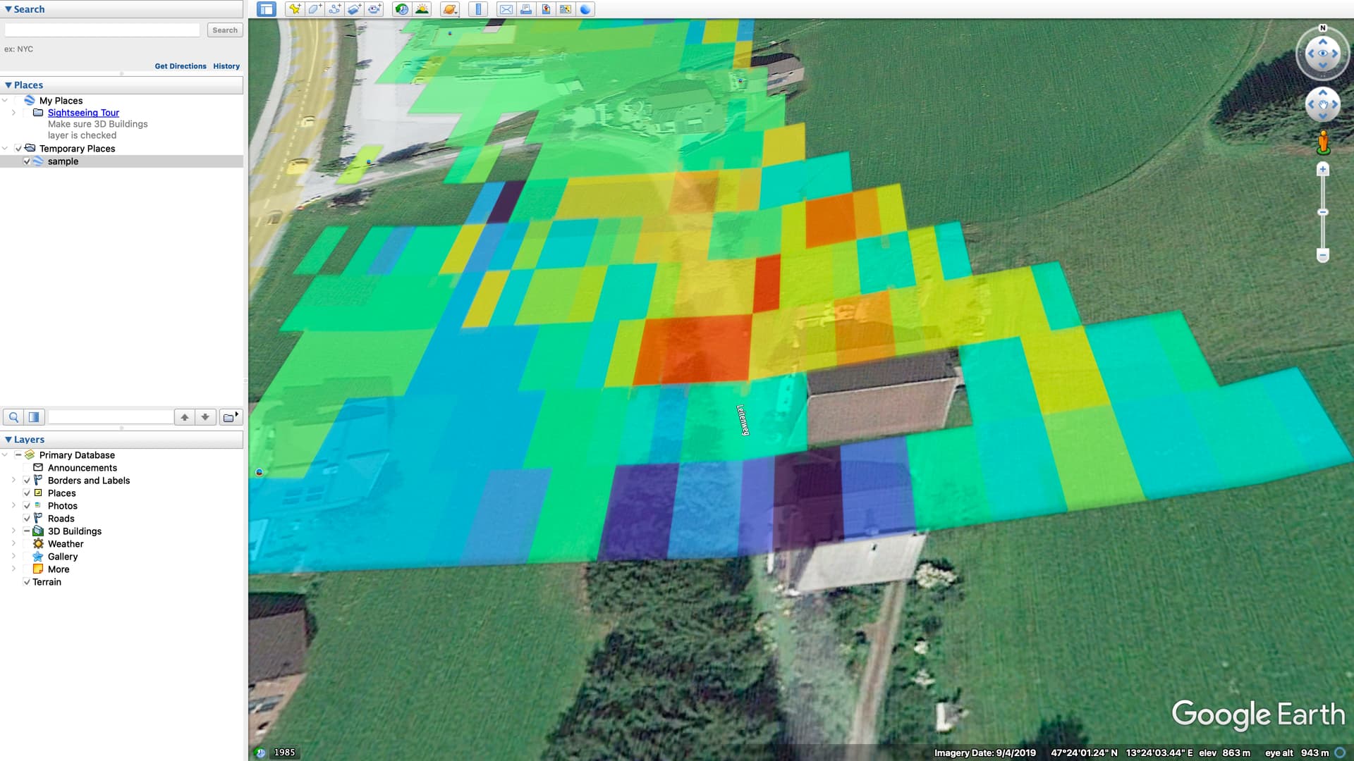
Here, we observe stable areas around the corner reflector, as well as on well-reflecting building roofs and roads. In contrast, grass-covered areas exhibit high displacements, leading to lower expected result accuracy. We can still validate the unstable pixels (those with low coherence, as determined during SBAS pair calculations) using 2D SNAPHU unwrapping and other methods (like STL decompose, as mentioned before). However, these validation processes are beyond the scope of the StaMPS method.

2 Likes

See the previous map as a Google Earth overlay where the variations in pixel sizes are clearly visible (especially, pay attention to the building below the picture center):

1 Like

what does it mean “pay attention to the building below the picture center”? @MBG
Does it have any meaning?

Here are two neighboring pixels with significantly different sizes, depending on the surface slope.

1 Like

Oh, that’s really interesting! @MBG
When visualizing pixel sizes on a map, you can clearly see the differences.

By the way, does PyGMTSAR have this visualization feature?

PyGMTSAR can export the 3D surface to visualize it in Google Earth, QGIS, ParaView, etc. Additionally, we can create 3D maps in Jupyter Notebooks. However, it’s not safe to display large interactive 3D rasters on a web page. For an example, you can refer to this Google Colab notebook where I visualize 3D gravity inversion processing: Google Colab
For an example, the same map in ParaView looks as:


You can add a Google Satellite Map overlay and more according to your preferences. PyGMTSAR offers a wide range of possibilities, but not all of them are available within Jupyter notebooks and console Python scripts. Some options require external open-source software.

1 Like