Hi - I currently have AATSR SST images that I would like to visualise more clearly than SNAP is allowing me to (for example, I want to put colder temperatures in blue and hotter ones in red). Is there any way I can do this in SNAP, and if not is there an easy way to do this using Python?
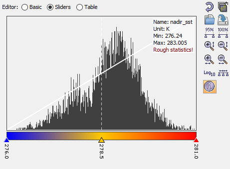
In the lower right (by default) you find the Colour Manipulation window.
There you can select from predefined colour ramps or you can set specific colour for specific values if you choose the sliders option.