the “ts” flag does not change the output, it simply offers the option to click in the map and extract a time-series plot of a group of scatterers.
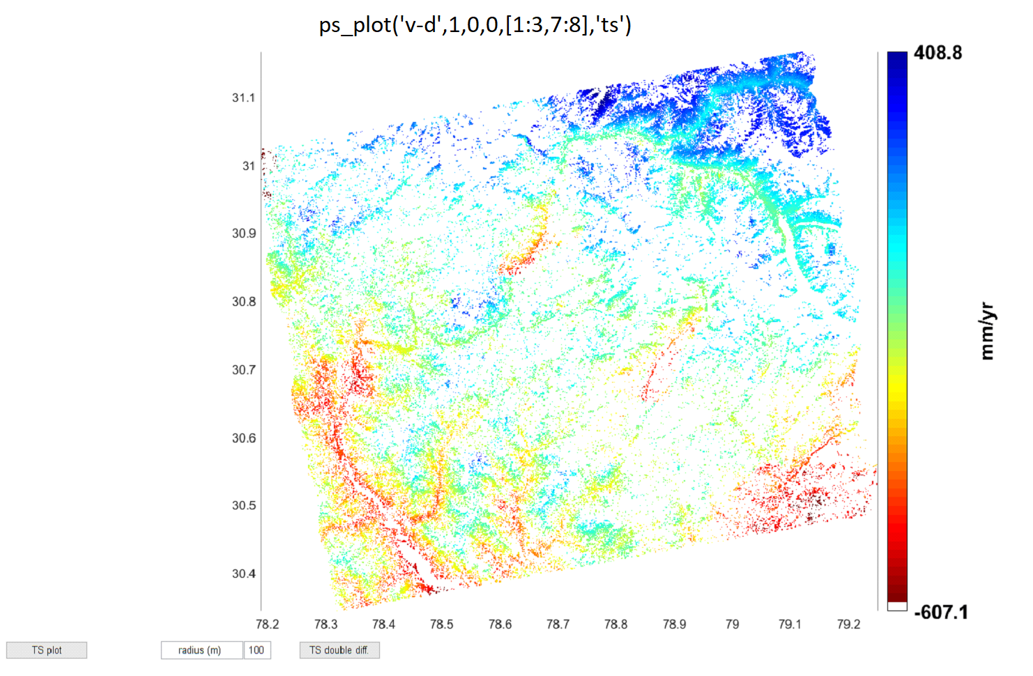
The larger value range of the first map could result from a higher impact of outliers in the data (only 5 interferograms are averaged instead of 8).
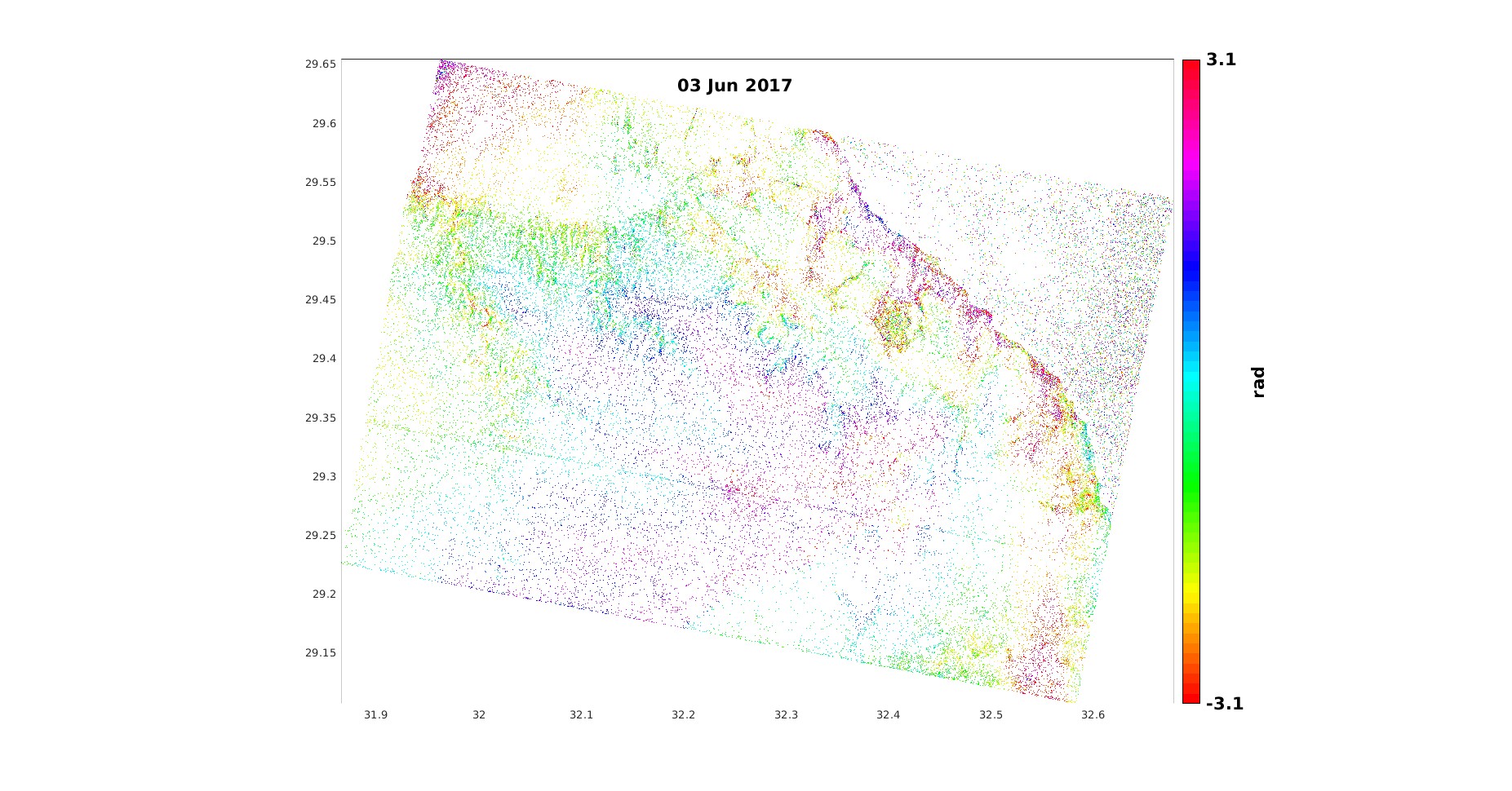
But I wonder why your displacement map is basically a representation of topography. Did you apply topographic phase removal in the preprocessing? It does not look reasonable as it is now to be honest.
Thank for reply @ABraun
Yes i applied topographic phase removal while processing interferograms in SNAP (preprocessing).
I had 40 images so I made 4 patches of 10 images in each group.
Isn’t is bcoz in one result it is including 39 interferogram based velocity and in other only 5 are consider (including i didn’t filter the outliers, few interferograms have baseline over 80).
I didn’t know how much interferograms you had in total. So the discrepancy between 5 and 39 makes it even more plausible that the average velocity of the 5 ones has more outliers than the entire stack.
ps_info
1 02-May-2018 89 m 47.592 deg
2 14-May-2018 8 m 47.107 deg
3 26-May-2018 -8 m 47.975 deg
4 07-Jun-2018 15 m 41.210 deg
5 19-Jun-2018 17 m 40.813 deg
6 01-Jul-2018 96 m 40.657 deg
7 13-Jul-2018 104 m 40.560 deg
8 25-Jul-2018 52 m 42.128 deg
9 06-Aug-2018 30 m 47.377 deg
10 18-Aug-2018 -36 m 46.719 deg
yess just checked, biggest outliers total 5 (more than 80 m) 2 are in this subset [1:3,7:8].
plus the area is prone to landslides (Himalayan region).
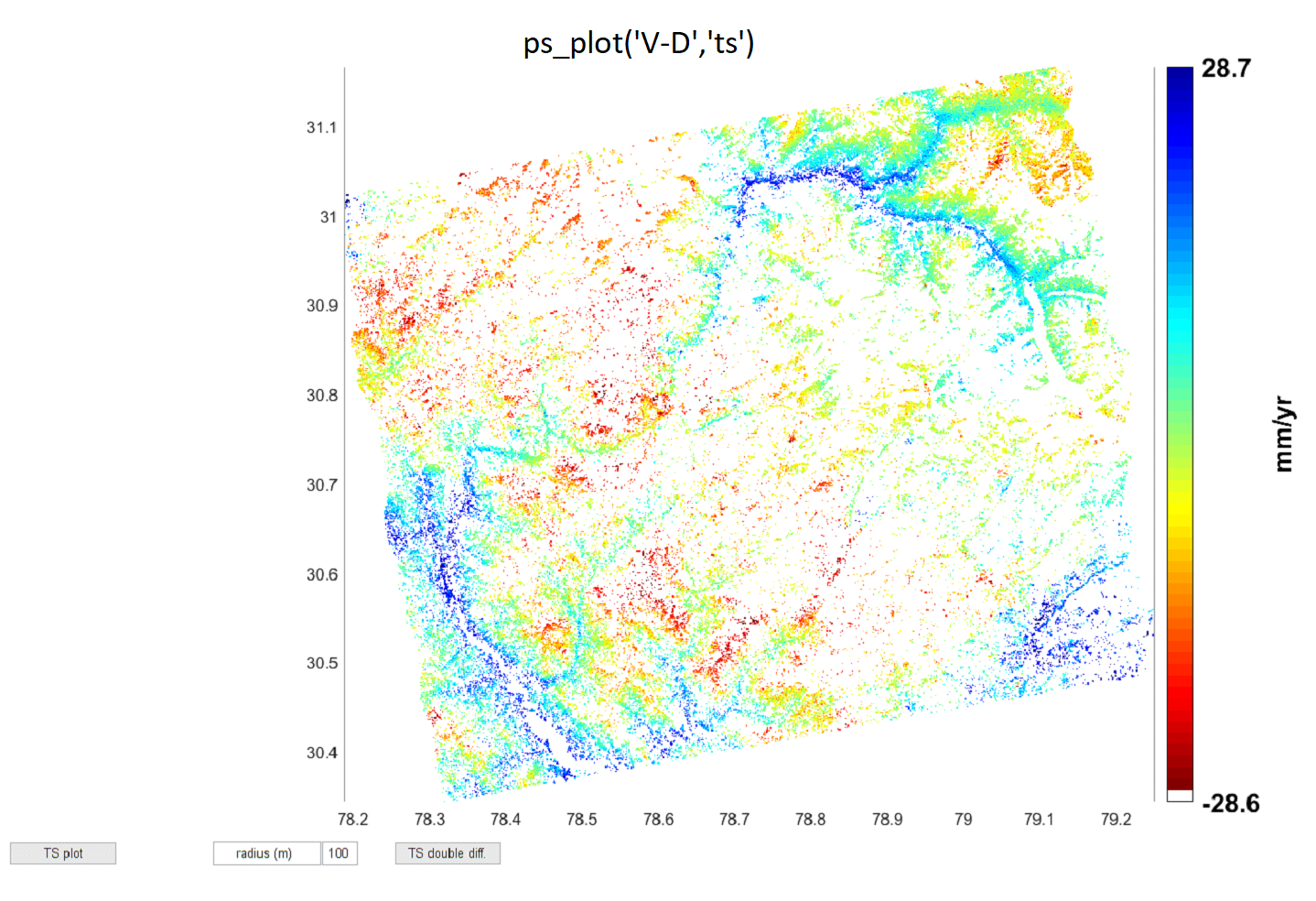
Does mean velocity of 39 interferograms i.e. -28.6 mm/yr to 28.7mm/yr makes sense?? please suggest.
Dear @ABraun, The sentence “Using the ‘V-D’ option (rather than ‘v-d’) forces the use of single master interferograms for the estimation, even for SB or combined processing” in Chapter 7, StaMPS/MTI Mannual (version 4.1b), what does the meaning of “single master interferograms for the estimation” if I use the SBAS-InSAR method, but in fact, there are more than one master image in SBAS-InSAR method, Thank you for your help.
Edit*
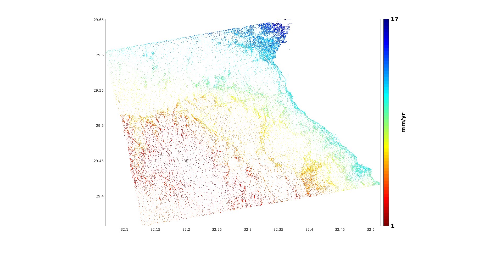
And this is the MLV standard deviation from a previously selected reference and but I cannot quite understand the result. The area covered by red ps points is relatively high and there’s a cliff located at the transition from red to yellow points northwards, while the white region due east is just a huge water body
Could that be because I used the old get_modis.py script while configuring the APS_CONFIG.sh file in TRAIN, therefore the atmospheric correction is undependable? I used the most basic linear method for aps removal even though the study area isn’t flat, nor is it dominated by urban settings. And yes, unfortunately the distribution pattern of PS points seems to conform to the topography even though I have applied topographic phase removed during the automated pre-stamps processing
I think the reason why it is noisy is that there are only 4 PS in a radius of 100 m and they show different patterns. Select a more dense area and you will probably get clearer trends.
The density of PS depends of many factors during the procesing, starting from amplitude dispersion given in mt_prep, then the amount of random phase pixles and the intensity of weeding and so on. We discussed how to deal with low density areas in this paper: https://www.tandfonline.com/doi/full/10.1080/22797254.2020.1789507
If I understood this correctly.
Step 3 selects separate groups (each subset contains a pre-determined density of pixels per square kilometer) from the initially selected PS pixels in step 2 that was based on their calculated spatially correlated phase, spatially uncorrelated DEM error that is subtracted from the remaining phase, temporal coherence.
Then, in step 4 (weeding) those groups of pixels per unit kilometers are further filtered and oversampled and in each group, a selected pixel with highest SNR is taken as a reference pixel and the noise for the neighbouring adjacent pixels is calculated, then based on a pre-determined value of (‘weed_standard_deviation’), some of those neighbouring pixels are dropped and others are kept as PS pixels.
Am I correct? if so, why is the value of (‘weed_max_noise’) is set to infinite?
I would love if you clarify what I may have misunderstood
Also I am not quite sure what the difference between spatially correlated DEM error and spatially Uncorrelated DEM error.
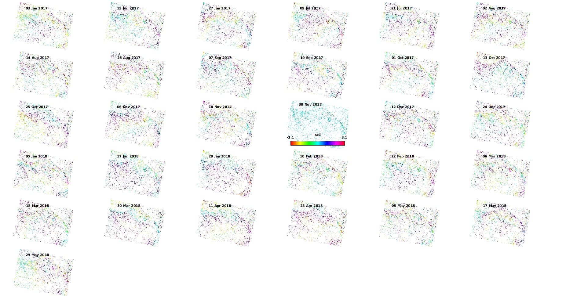
I have tried a different time series and This is how the interferograms look like after step 5 with more forgiving weeding whose noise standard deviation I set to 1.5 instead of the default 1, and the density of random phase pixels was set to 30 and amplitude dispersion 0.4. and still, the final density of ps points is low. I am afraid that increasing the amp dispersion index and the density if random pixels will dramatically increase the inclusion of noisy pixels at the cost of having numerous PS points, which will eventually render the displacement velocity map completely impractical