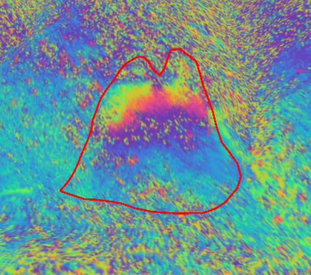
Hi all. This is probably a really obvious question, but I am having trouble interpreting SNAP’s colour legend for my wrapped interferogram. Here’s an example below:
The image shows a wrapped interferogram for a landslide I am looking at (contained within red line) exported into .kmz format and viewed from ground level in Google Earth. My question is: what units is the colour legend in? I am assuming it is pi radians, but if that is the case why do the phase values extend to +/- 2.83 rather than +/- 2.0 as I would expected to see for a wrapped interferogram? How should I interpret this?
Hello everyone
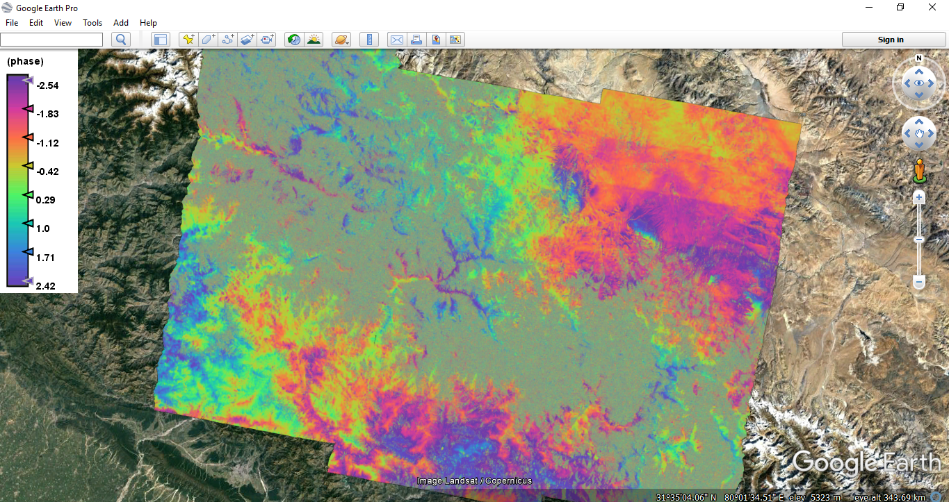
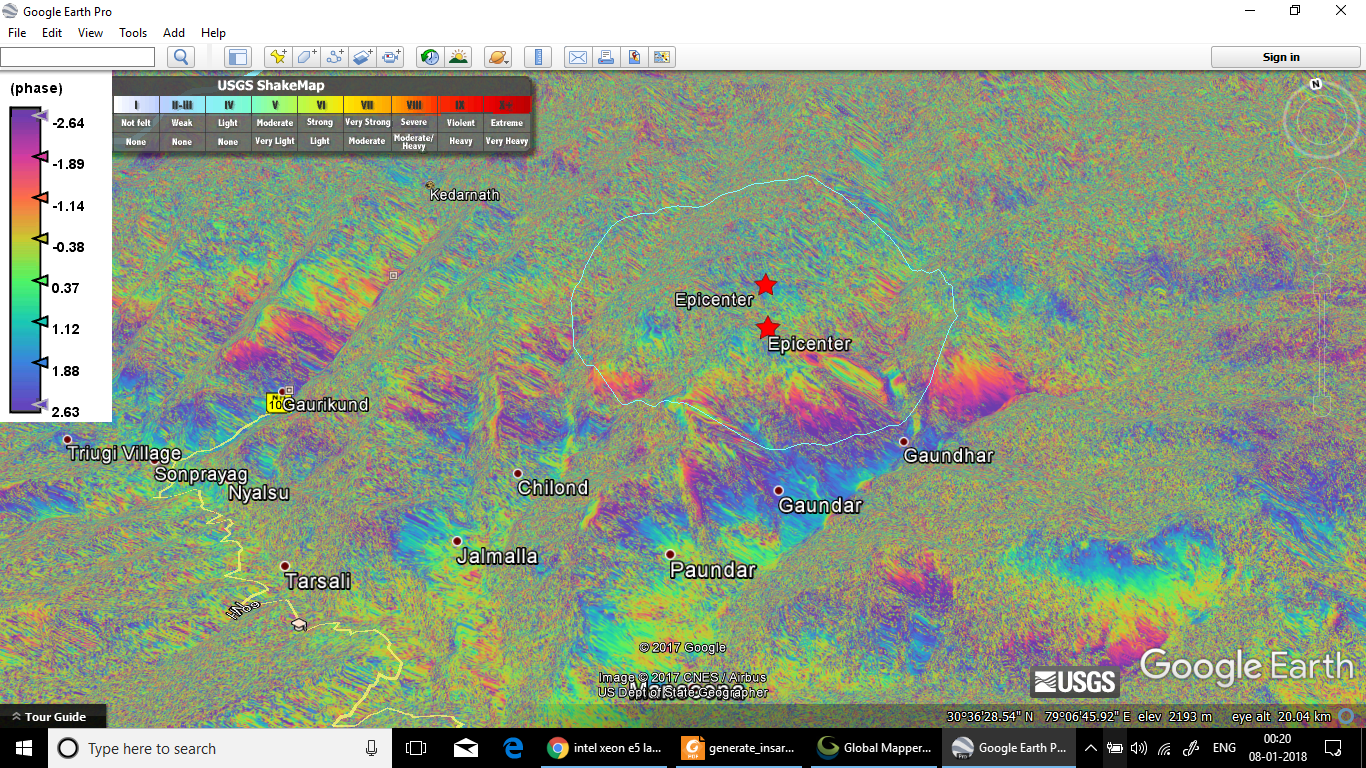
Can anybody suggest me what information can be derived from this interferogram, as i am unable to get some sort of fringes. What do these color gradients on mountain slopes indicate.
This is not easily possible.
You can export the legend as image (right-click on scene and select export color legend as image) and then import it as a layer.