Hi,
I have made a stack of preprocessed S1 to do change detection. As for the the preprocessing pipeline I followed the SNAP tutorial . As the result I have calibrated coefficients beta0, sigma0 and Gamma0 (all in dB) for 15 days.
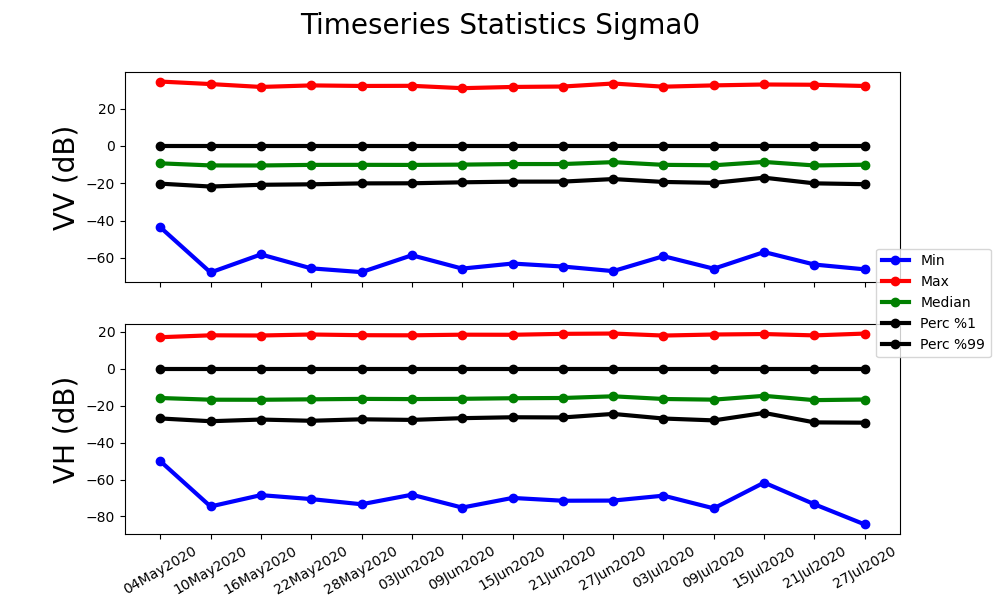
In order to see and compare raster dynamic ranges across the TS, I calculated min, max, median, percentile(1) and percentile(99) of each raster. In Image bellow you can see the values calculated over Sigma0 and across VV/VH polarizations :
The difference between the ‘Min’ and the 1% Percentile and between ‘Max’ a 99% Percentile curves is quite large, despite all the radiometric correction that has been done. Here one can see the nominal distribution of data lays in the range ~(-25, 0) dB for both VV and VH rasters.
As I am trying to use the TS for change detection using a thresholding method (and I want to calculate those thresholds automatically) I wonder if It would be OK to transform/replace all the extreme values with the 1% and 99% percentiles so that the Min/Max of the raster intensities represent the real distribution of the data ?
If I understood you correctly, you calculated these statistics on all pixels in the image, right?
Depending on the type of change you want to detect (e.g. urban growth, crops, water…) it might be worth to calculate these statistics class-wise by defining masks (e.g. one digitized polygon per class) and see if these differences between p99 and max (and p1 and min) are constant throughout all surfaces.
Global statistics based on all pixel values might obscure larger dynamics and/or overemphasize the impact of min/max values in the image.
Thanks Anrdeas And I very much appreciate your helpful responses.
You are right at this time I calculated the statistics per raster so that I understand the global variation of intensities within each raster. The AOI represented by those rasters cover an area dominated by grassland and agricultural fields. I guess those few (but dominating) outliers must be the effect of some urban area which are scarce but anyway are there.
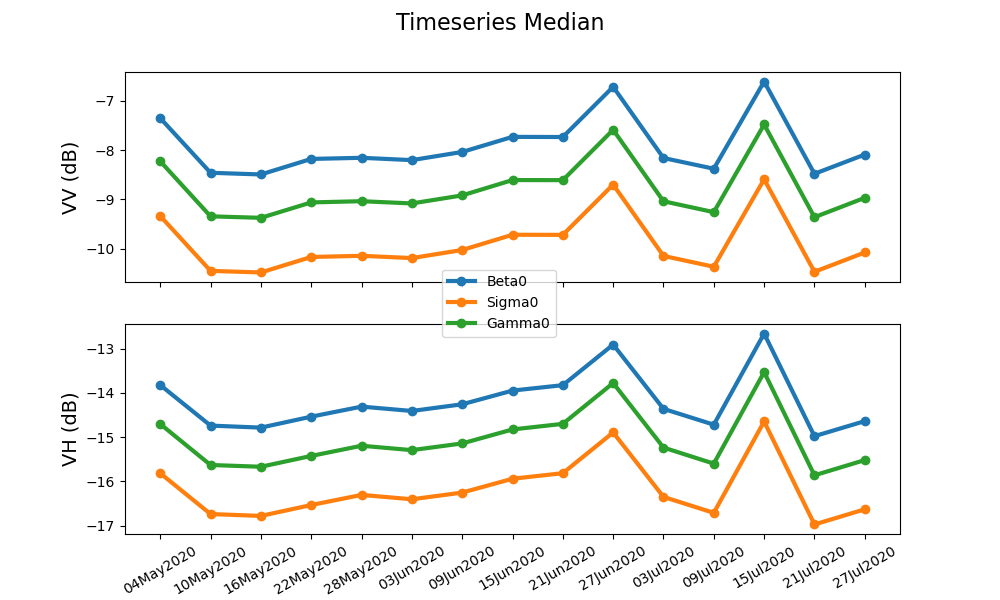
As you can see the effect of Min and Max curves (their numerical scale compared to the median and both percentiles) are so much that almost every variation within the nominal data is damped and invisible. Please take a look at the diagram bellow where I tried to isolate only the median Curve across Beta0, Sigma0 and Gamma0 and over VV/VH polarizations:
It is only after removing those Max/Min “outliers” that I can see the variations of the median curve.
I have your suggestion on top of my head for the second phase of work to see how does the statistics change when I isolate the parcel polygons based on the vegetation type. What I am looking for right now is to come up with a global-scale measure of change (something like a baseline of change for each polarization/ calibration coefficient) so that I can narrow it down for individual classes.

 And I very much appreciate your helpful responses.