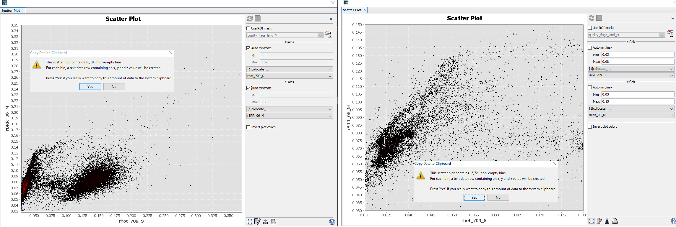
I am getting a strange issue when I am trying to copy the scatter plot data from SNAP to clipboard and then pasting that in Excel. For example, when my scatter plot x-y range (axis range) is higher and I copy the data then I get less number of pixels (let’s say 3000). However, when I change the range of x and y axis to see more variability at lower range, and then I copy the same data to clipboard then I get higher number of pixels (such as 8000). I thought it should be opposite because in second case, I am excluding high range of data.
Please see the attached screenshot for example and help me to understand this issue.
I think this is explainable.
If you look at the output you see that for each axis 512 bins are generated.
This means you have 512 * 512 = 262.144 bins overall.
Depending on your value range settings the bins are differently filled. and that’s why you have different number of bins in the output.
Even for a smaller value range it can happen that more bins are filled.
Thank you for explaining the issue. This makes sense. However, can you please suggest what would be the best way to get the consistent number of pixel numbers for doing scatter plot outside the SNAP?
Why do you want a consistent number? If you look at a different area of the plot you get different results.
Maybe it is easier to achieve what you want e.g. in Excel as Andreas Suggested.
Yes, I understand that from visual perspective. However, if I write a manuscript for publication and compare two methods, I have to mention number of pixels used to develop that model for example. If I have different number of pixels for two models in comparison, then reviewer will raise the question.
Yes, I am going to give a try what Andreas has suggested.