I have a question that maybe it is more technical.
I produced an image in SNAP by using (phase to elevation- InSAR method). I plan to label it to use in a manuscript but I have some questions about it.
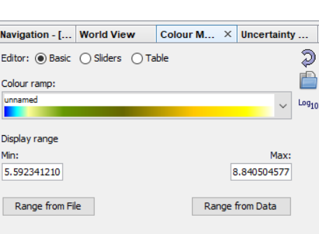
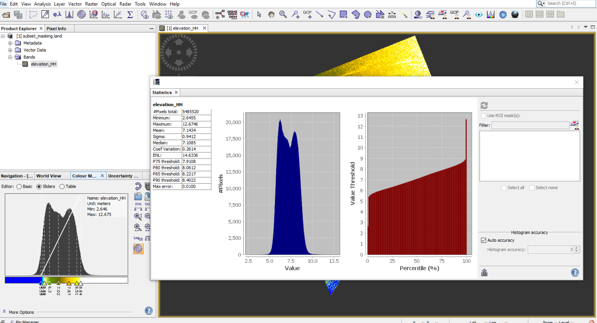
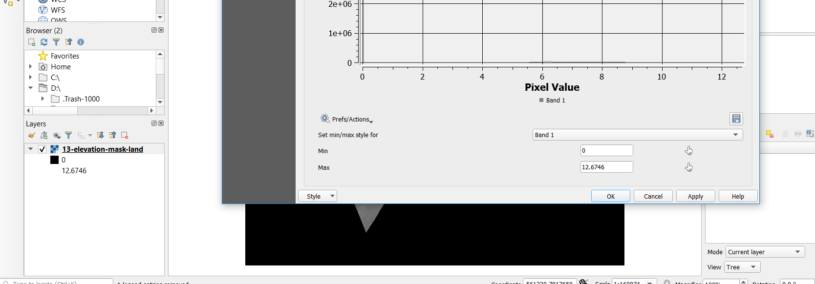
SNAP automatically lables image. In my case; it is from 5.59 to 8.84 (figure 1) but when I use (Analysis……statistics); then It shows me a min and max values that are from 2.64 to 12.67(figure 2)
this possibly changed your raster values, at least this is reported a couple of times in here.
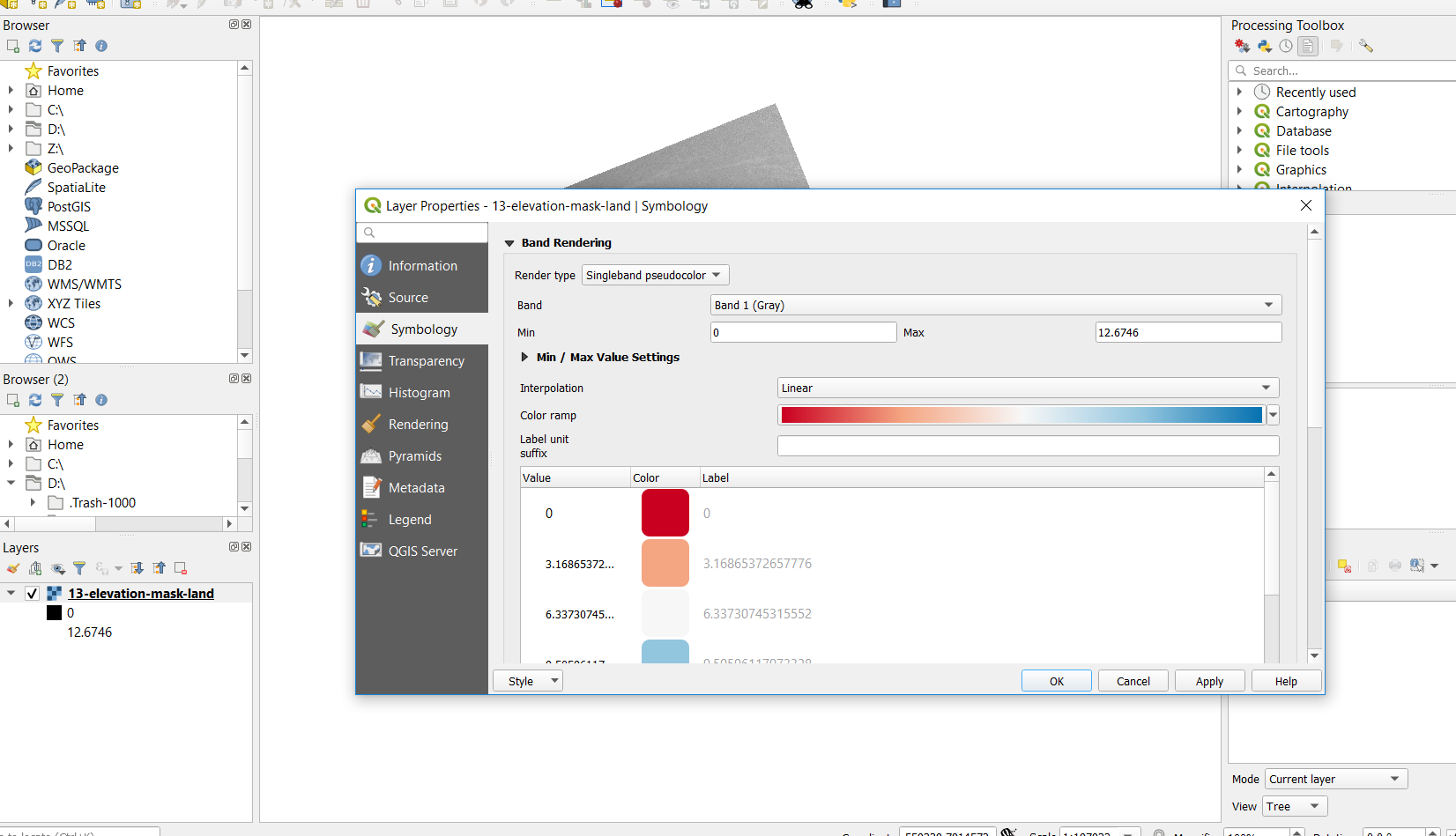
I suggest to directly open the img file in QGIS without converting to GeoTiff
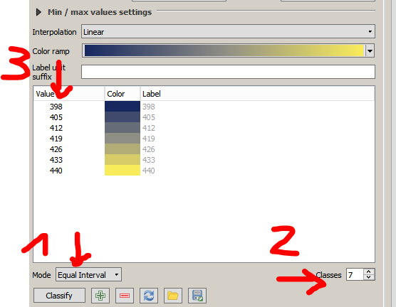
The generalization of the legend is heavily discussed. I prefer a more readable legend but some scientists insist on precise labels instead. Both has pros and cons.
the min/max values from the statistics menu in SNAP are correct. The color lables are sometimes clipped off (2.5%) to enhance the contrasts.
But when you look at same image; one time with min and max values and another time with clipped off (2.5%); it looks with clipped off (2.5%), image looks better to visual and to eye.
Is it possible to use it in our publications instead of min and max values?
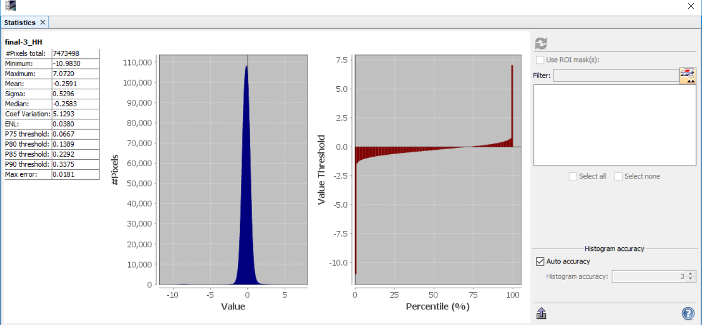
As you can see min and max values are between (-10.98) to (7.07) but based on pixel-value plot; most of pixels are between almost (-1) to (1). So what is your suggestion to use in visualization?
I’m sorry, I cannot give a recommendation here based on this alone.
Often 2 standard deviations are used (sigma=0.520) for the color range, so +/- 1.06 is probably a good start. But you have to play around with the values and test how the contrasts are and how well the image supports what you want to demonstrate with it.
It is probably a better idea to talk about this with your supervisor.

 . Thanks helpful man.