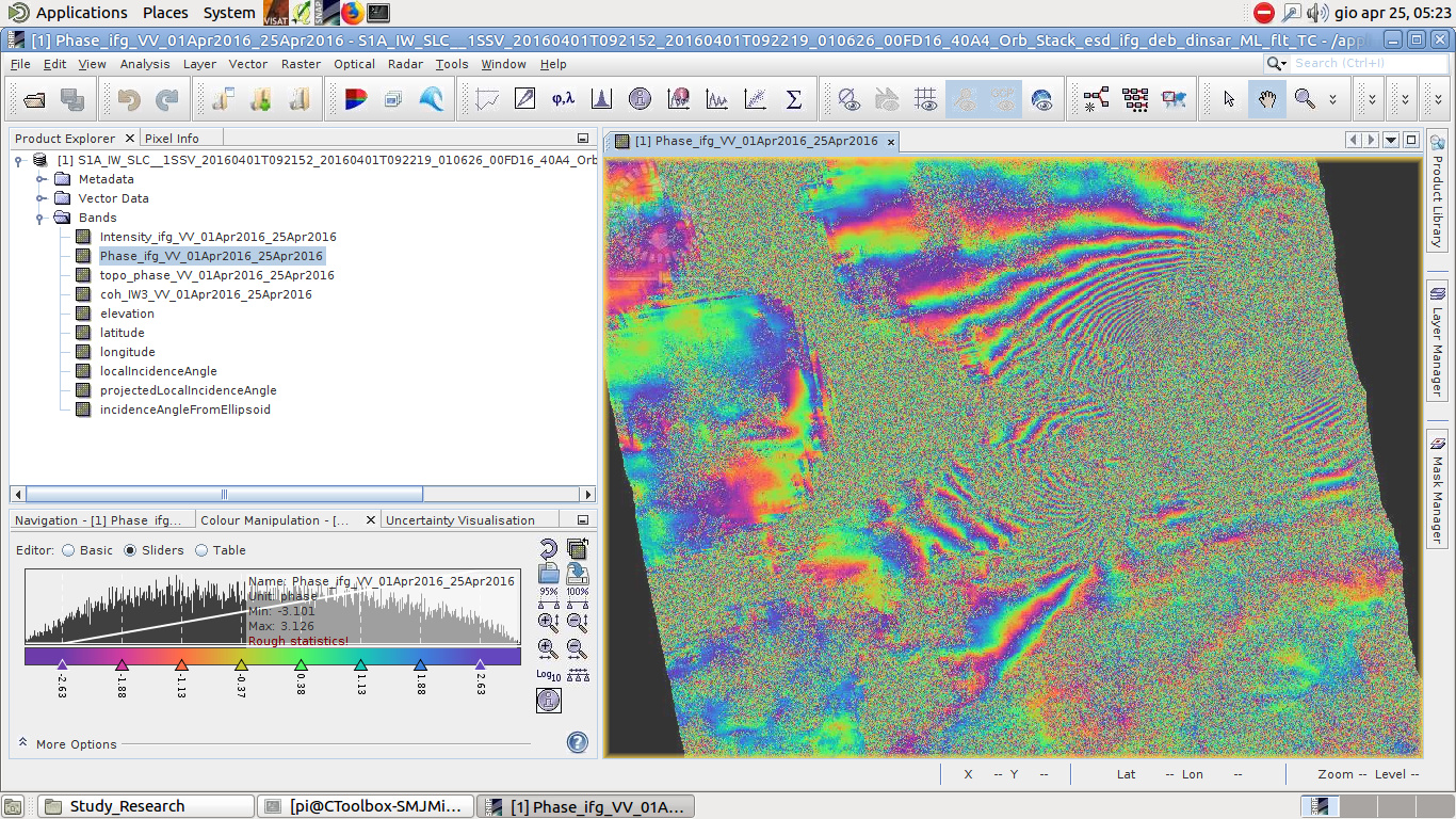
I processed two S1 images before and after the earthquake in my study area and produced an Interferogram but as you can see, it is very noisy because of vegetation cover, water, and also other reasons.
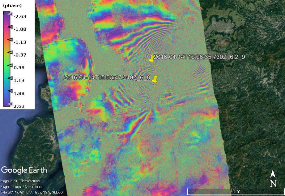
In addition, you can see the figure of my study area and the figure of the KML output on google earth. Could anybody please guide me on how I can fix this noisy product?
these patterns mostly come from temporal decorrelation. Please have a look at the explanations in this post Some explanations about concepts of fringes of interferogram and coherence
As you are opening quite much topics recently: Please try to use the search function, read a bit about the basics of radar imagery (two excellent materials #1 and #2) and try to put remaining questions in existing topics to help keeping this forum clean.
Phase information is very sensitive towards rapidly changing surfaces (canopies, lower vegetation cover). Unless you have a bistatic system (two images at one time) you cannot avoid that some areas in your interferogram will not contain proper fringes.
@ABraun Thank you so much for your hint about the forum. I work on the InSAR field based on my MS.c, and BS.c degrees on remote sensing and radar science. I need to only know guys suggestion of the values of parameters in multi-look or filtering steps to keep the earthquakes signals and also remove these noise.
I will try to search in the forum and then, post my new issue.
multi-looking is quite simple, you change the pixel size in range directon and observe how the pixel size in azimuth direction adapts accordingly and the spatial resolution is reduced. We cannot tell you a magic number which solves your problem (decorrelation cannot be removed), but if you try around a bit and balance the loss of spatial resolution with the increase of clear patterns (and a considerable decrease of file size which could also solve your snaphu problem) and see which one is the best for you.
The same applies for filtering: Have a look at your coherence values in these areas. You can supress the filtering in low coherence area (not mandatory) in the Goldstein filter. Run it with multiple window sizes and settings to see which fits best to your data. Again, filtering enhances structures in the image. If they are not already present before the filtering, they will not be there afterwards as well.
I know that it can be hard to get into SNAP for such topics but how should we recommend some settings for the tools for your data? You’re the one who knows it best. You know the study area, the perpendicular baseline, the wavelength, the height of ambiguity, the temporal baseline… All these things massively influence your interferograms. With a MSc in radar science you probably know that and the impact of the selection of suitable images. But you cannot expect that we can tell you which parameters to take to enhance the data subsequently, because the loss of fringes happens already before mult-looking and filtering.
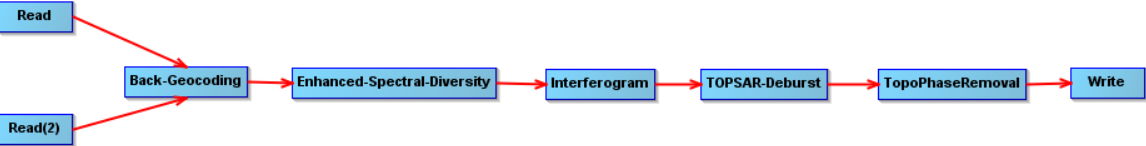
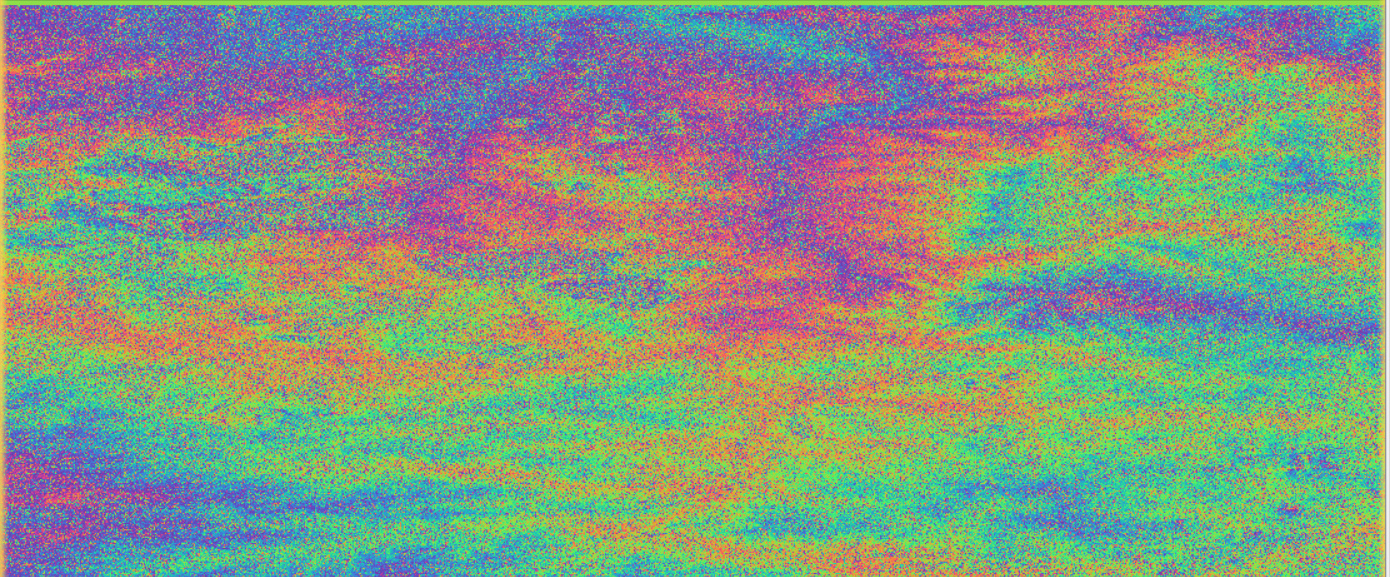
Hi, Abraun, I got the result of Figure 2 through the processing flow of Figure 1 below. But fringes does not appear in Figure 2. Is this the cause of too much noise?
figure 1
you applied Topographic Phase Removal. Are you looking for surface changes?
If you subtract the topographic phase, all topographic fringes are removed. What is left is the phase difference between imaged1 and image 2 due to surface changes.
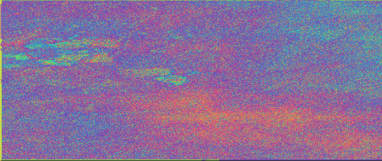
Yes, I am preparing for the next PS-InSAR. However, in the implementation of another process (see Figure 3 below), the results obtained are shown in Figure 4 below, and the results seem to be very noisy.
figure3
the advantage of PS InSAR is that you don’t need perfect interferograms, because StaMPS works with persistent scatterer pixels only. So your interferogram is fine for this purpose. Now you need 30 of them
What you said above is very correct. This is a problem that I found during the processing of the data, so in your opinion, is there any solution to make it look better (such as adjusting the pixel size) Thank you very much.
The only thing that helps is using the shortest available temporal baseline, and even that approach has it’s limits with C-band Sentinel-1. Some interferograms are better than others due to more favourable weather conditions.
I would say local environmental conditions more than weather conditions. Even if cloudy, the quality of the interferogram is measured on its coherence, which is a measure of changes (geometrical, temporal and noise). Interferograms covering urban areas are likely to look nicer than others covering agricultural or montainous areas.
Main decorrelation factors are due to geometrical decorrelation, temporal decorrelation and thermal noise.
As said, short temporal baseline helps to reduce such local environmental changes as changes that happen in 6 days are likely to be less than in 12,18,24,30 days or more, and hence to have interferogram that look nicer than with larger temporal baselines.
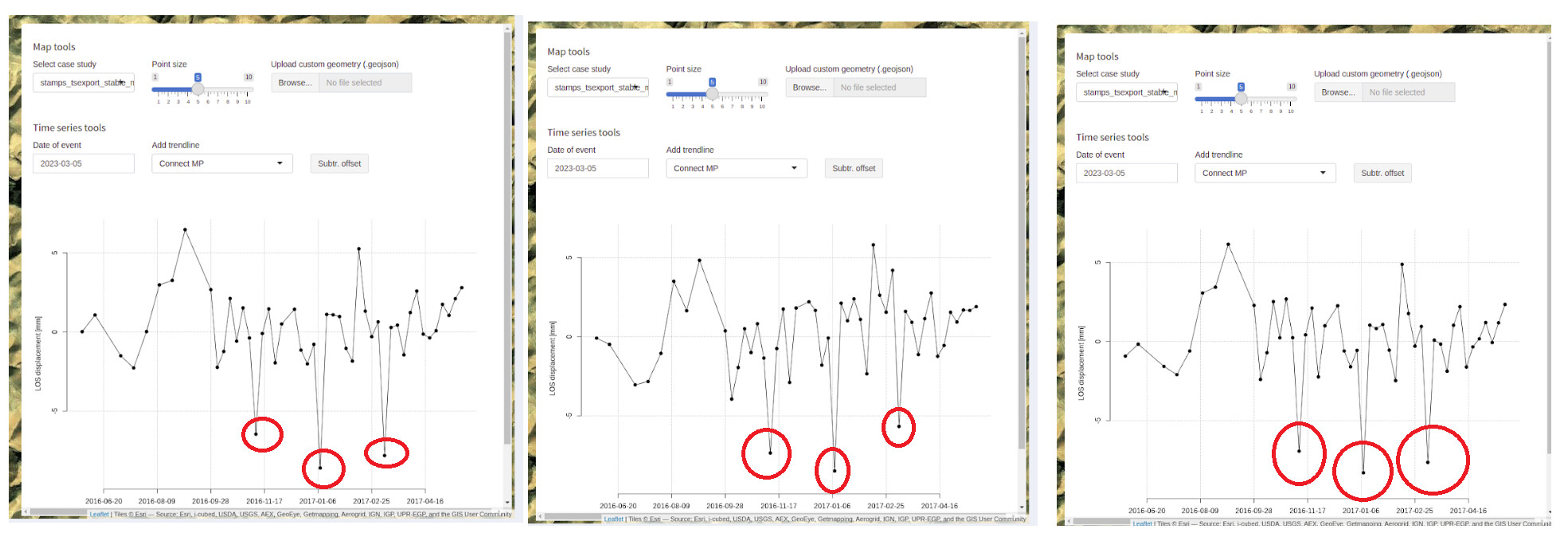
, can we drop those interferograms from StaMPS processing? If so, should those whole steps be repeated without including those particular interferograms during snap export to Matlab?
From my experience with time series post-analysis (generated by the SBAS approach), these drops can make by unwrapping errors. So, I strongly recommend you check these epochs’ unwrapped interferograms to see the problem.