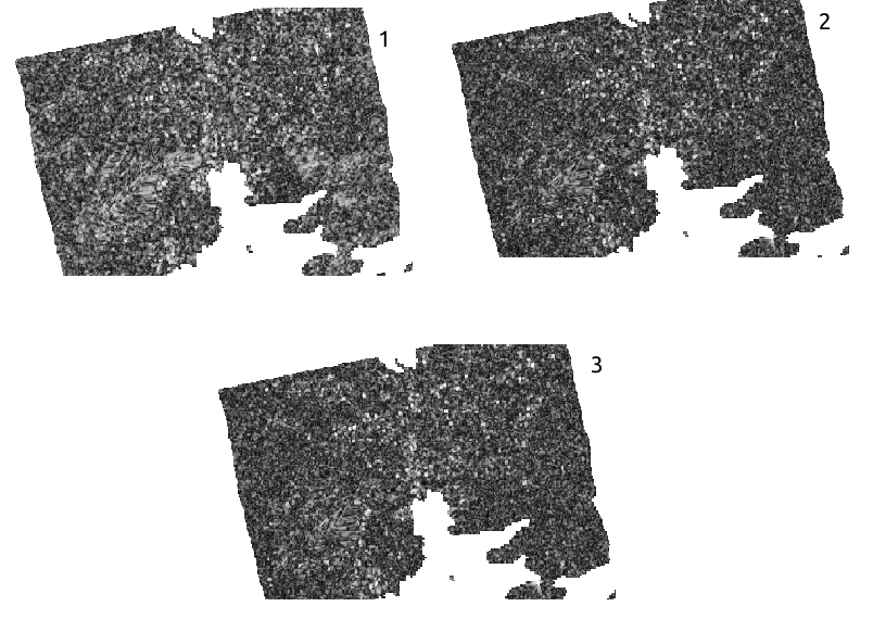
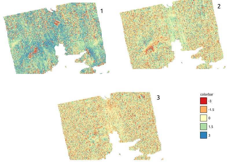
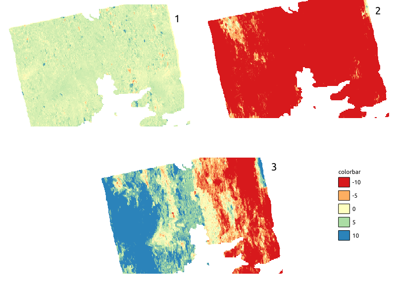
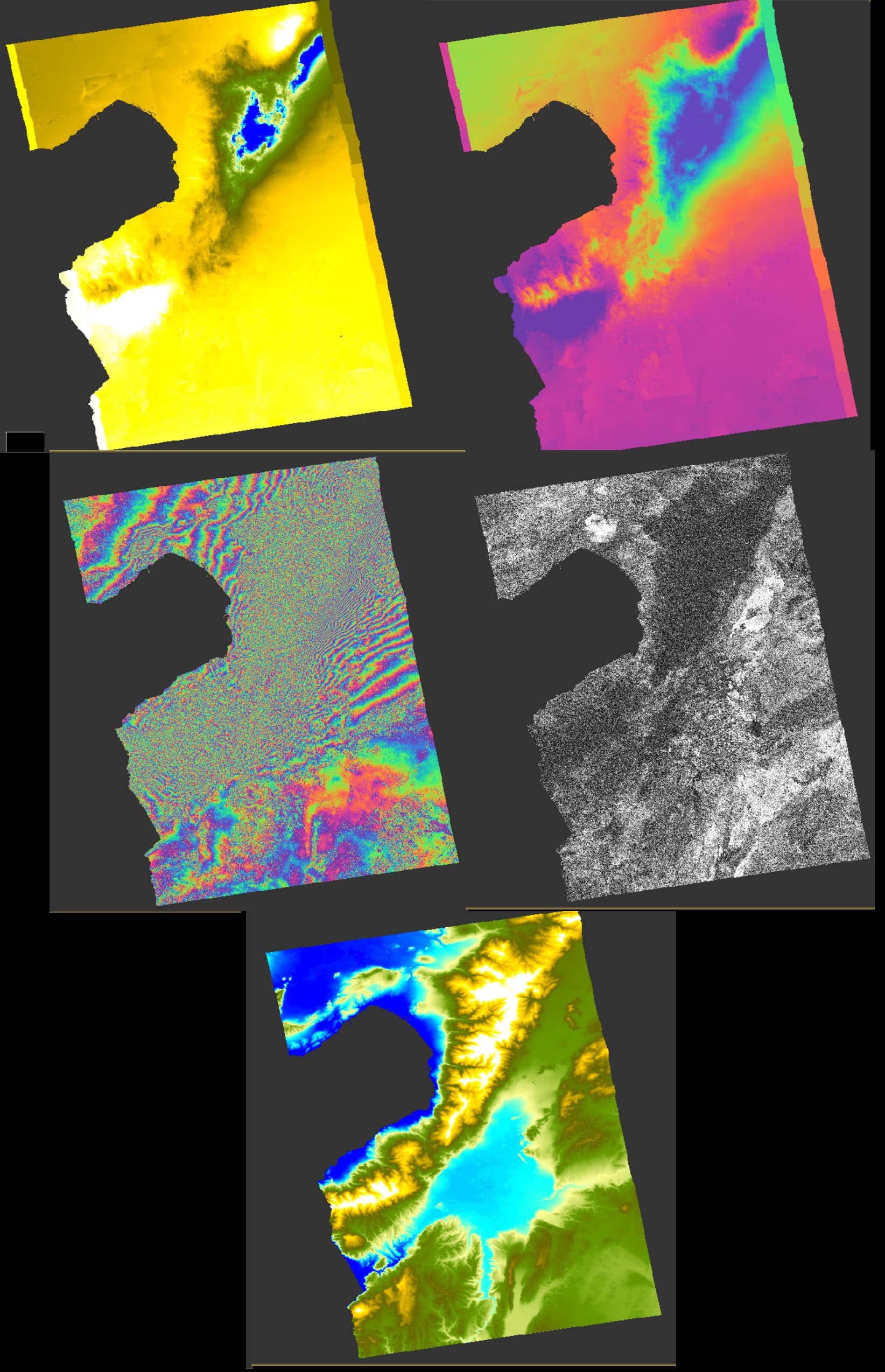
I am working on land deformation over a mining site using SBAS (MintPy). I have created 120 unwrapped interferograms where I am visually assessing them trying to discard the low quality ones (e.g phase jump). Below we can see the coherence, wrapped and unwrapped phase of the AOI where numbers correspond the the following dates. 1). 2021/01/29 - 2021/02/10, 2). 2021/01/29 - 2021/02/22, 3). 2021/01/29 - 2021/03/06
Looking at the unwrapped phase of (1) it looks good to me but for the other two, the unwrapped interferogram is completely different despite the fact hey share the same reference date. the unwrapped phase of number (2) is above -10 radians for the whole scene (it does not look normal to me) and for the number (3) we see lots of variation between -10 to 10 radians. Can this be due to tropospheric noise ?
My first though is to discard number (2) and (3) from SBAS processing in MintPy. I do not understand why there is such a huge difference amongst all three unwrapped interferograms. Does this has to do with 1) the low coherence of the area , 2) atmospheric noise or anything else?
There are quite a few interferograms in my analysis that look like the ones above. Am I right to assume that there is something wrong with those unwrapped phases and need to be discarded ?
One last thing, Does the positive values on the unwrapped phase indicate subsidence (signal travelling longer distance) and negative ones uplift? or is it the other way round
I would appreciate any comments or thoughts on this, especially by people that are more experienced in that filed such as @EJFielding@ABraun@qglaude
You are correct to be suspicious of the unwrapping of interferograms 2 and 3. The problem here is coherence is very low and degrades quickly with the time interval length, which is a typical situation in areas of significant vegetation cover. Your interferogram 1 has a 12-day interval and acceptable coherence so the unwrapping is reasonable except in a few small areas. Interferograms 2 and 3, with intervals of 24 and 36 days have very low coherence, and the unwrapped phase is not usable. You can see that the wrapped phase looks like almost pure noise, so the unwrapping has no information. It seems that only the 12-day intervals in this area are usable. You can try to make a MintPy time series with only the 12-day pairs, but it will not be very accurate because there is only one pair connecting each date.
Because the interferograms have low coherence, it is difficult to see whether atmospheric effects are having any effect.
Thank you very much for your response.
I suspected that coherence might be the major issue on getting good quality interferograms. I suppose, there is no much I can do given that I cannot collect sentinel-1 data more frequently than every 12 days
for my AOI.
You may be able to extract some pixels with high coherence with one of the persistent scatterer InSAR (PS-InSAR) methods. I have not done that processing myself, but there are many who do that. The SNAP stack processing can be loaded into StaMPS that is one of the PS-InSAR systems.
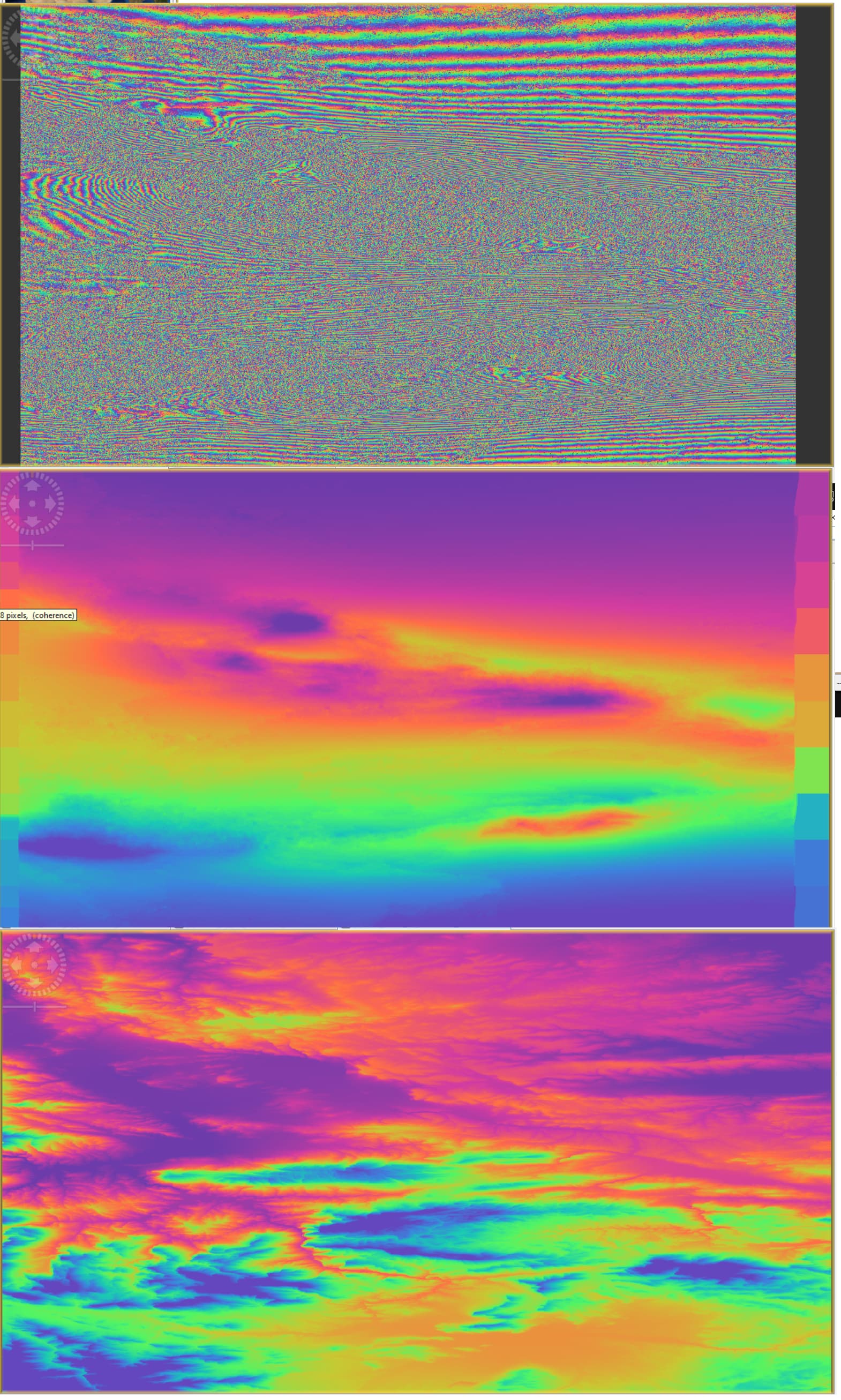
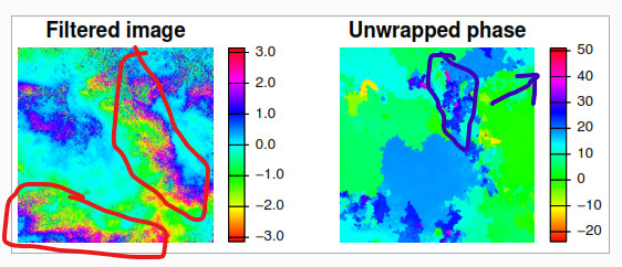
This is the wrapped (top image )and unwrapped phase, the transitions between colors in the unwrapped phase (middle) looks smooth with minimal noise nor wave-like atmospheric patterns, also I see minimal resemblance between the wrapped, unwrapped phase pattern and the topographic phase pattern (bottom image).
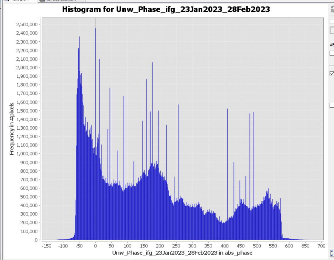
Please correct me if I am wrong, I am not expert in assessing the quality of unwrapping and also I am not sure why those square areas were added to both sides of the image of the unwrapped phase, I have aligned windows vertically while synchronizing all views and those squares represent blank regions on the equivalent wrapped phase
Also those individual spikes in the unwrapped phase’s histogram looks weird, what error could they reflect?
The spikes in your histogram of phase are caused by the areas of zeros on the two sides of your interferogram. The SNAPHU program unwraps those areas into a series of steps.
Your wrapped interferogram looks very strange with the huge number of fringes. It cannot be correct. Maybe the coregistration in not good.
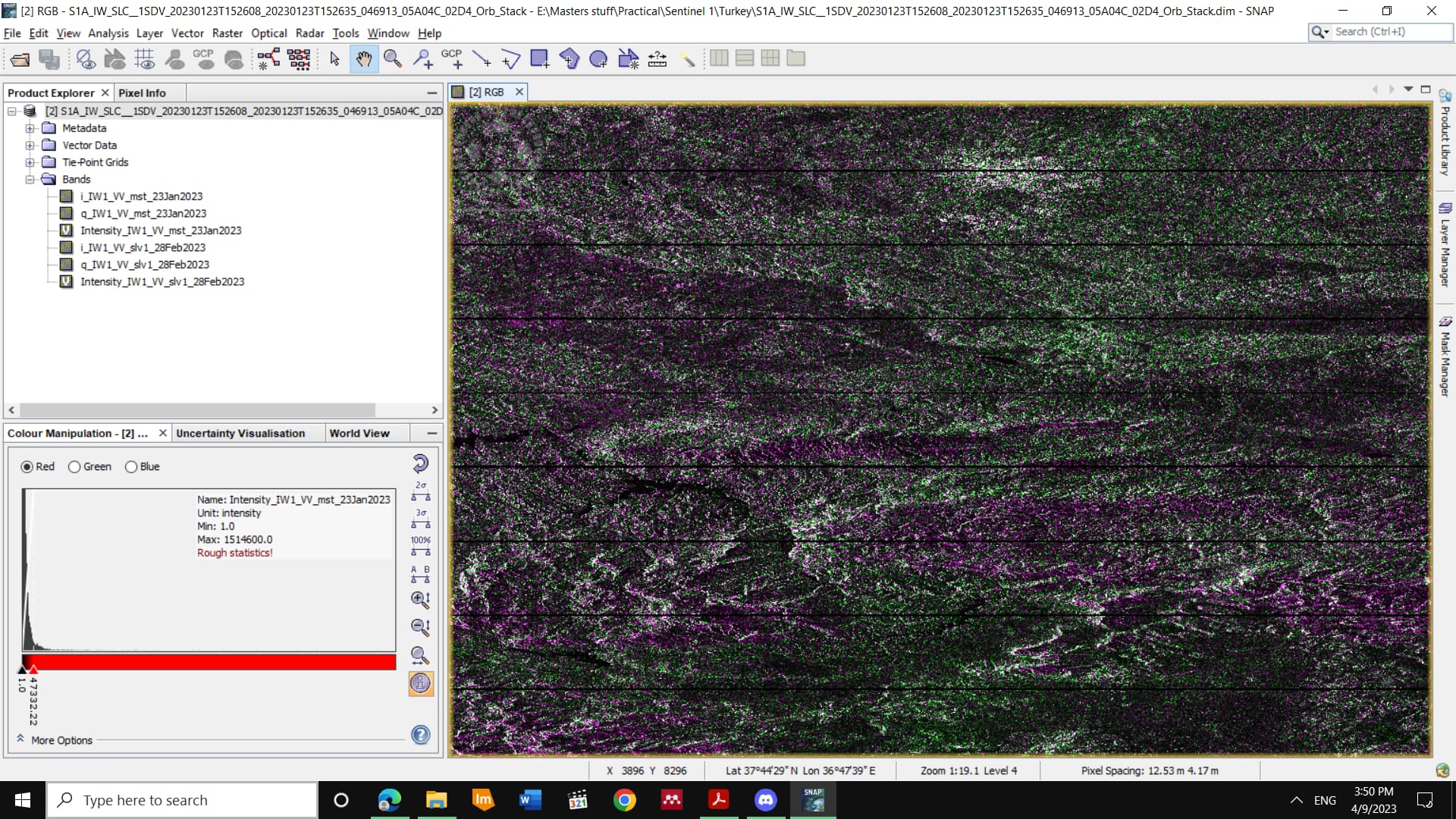
This is how the RGB composite of the slave and master intensity images look like.
Master>> Red
Slave>> Green
Master>> Blue
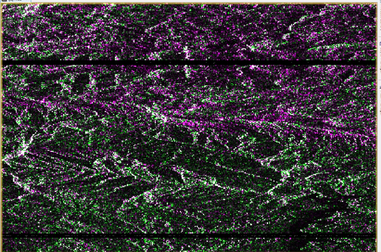
I see a lot of pixels highlighted with pure green color which means the coregistered stack is dominated by the intensity from the slave image. Should I retry doing the coregisteration separately instead of including it in a graph builder ?
That other interferogram does not look correct either. The very large number of fringes in the along-track direction is a symptom of bad coregistration. Are you doing the Enhanced Spectral Diversity (ESD) estimation? It is possible that the low coherence is not allowing an accurate ESD estimate. It has been a while since I ran SNAP on Sentinel-1 data, so I don’t remember the details.
It would be a good idea to try processing one pair with the regular set of steps instead of the Graph Builder.
yes
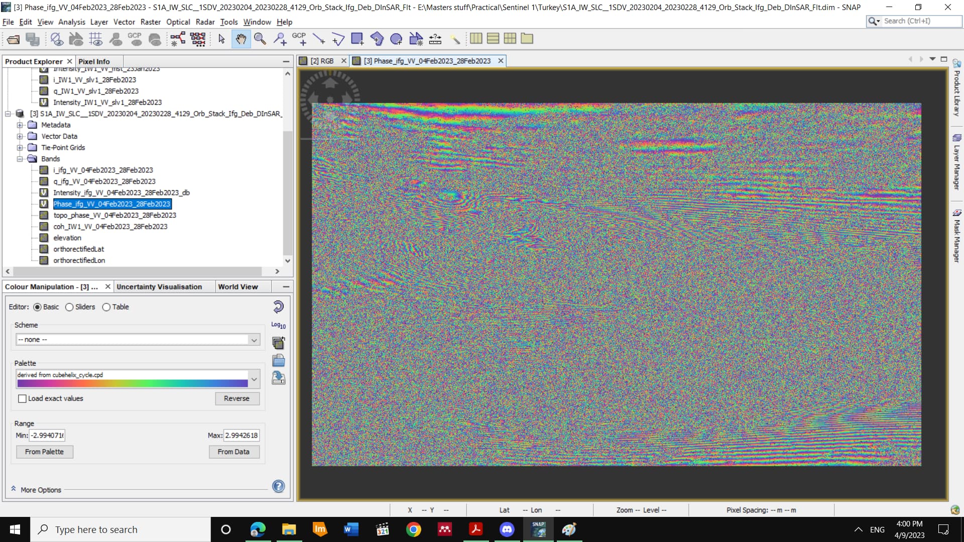
I did regual set of steps and got the same results actually. The earthquake happened in this area along the Anatolian fault was 7.8 magnitude of Richter scale and it was really destructive, Maybe that’s why there are so many fringes and also reason for low coherence.
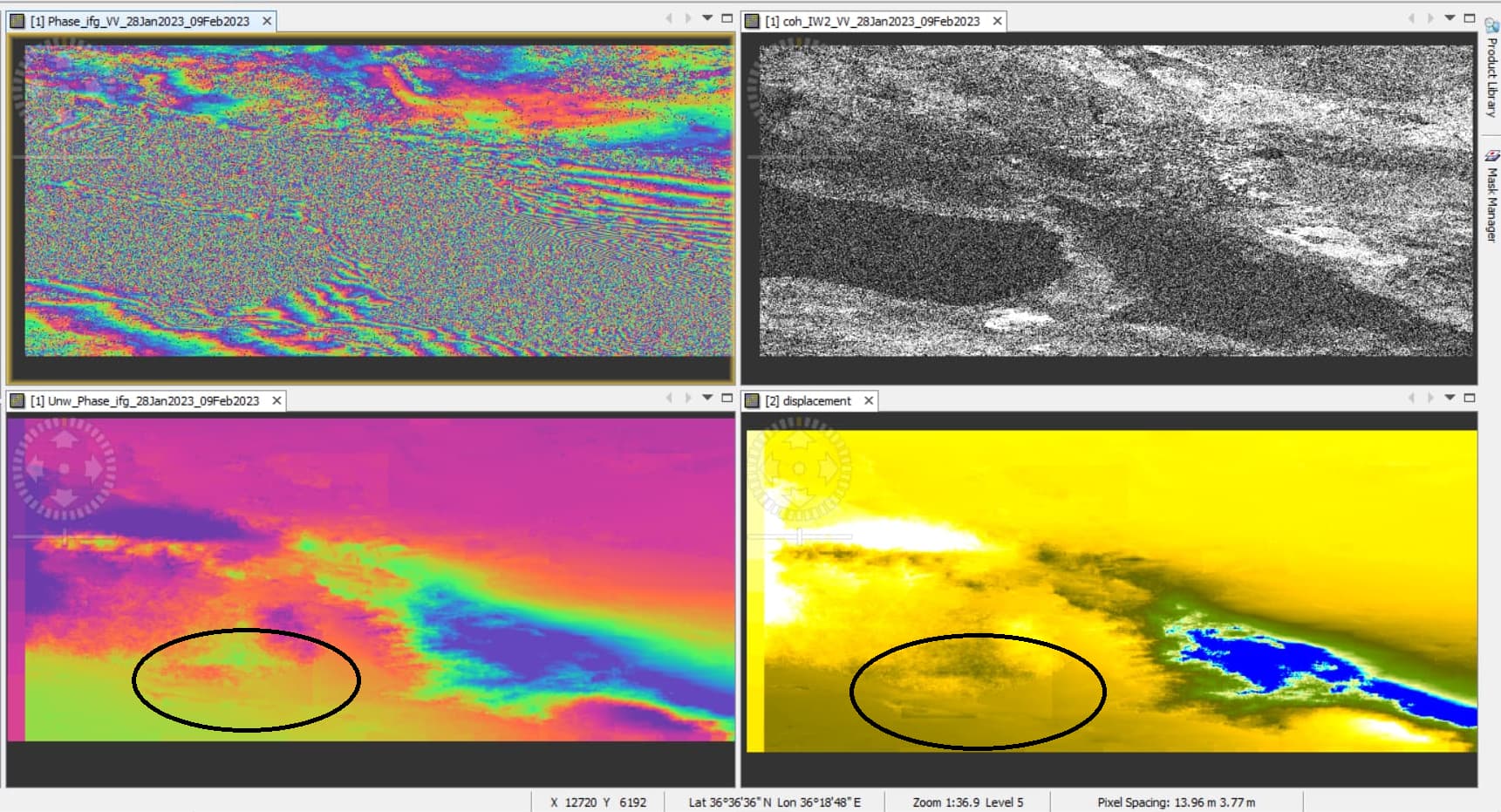
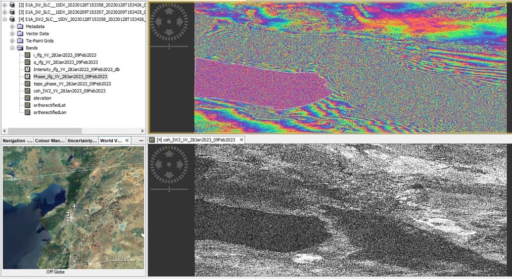
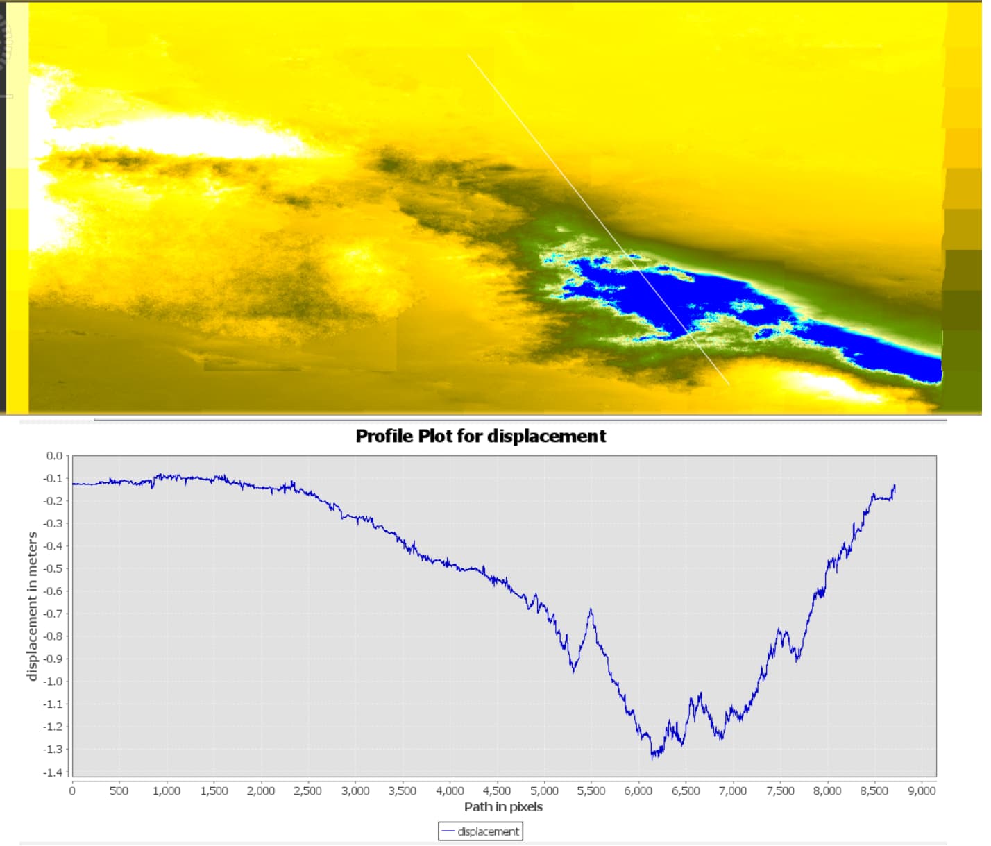
Here’re the results from a different area affected by the same earthquake movements, I suspect unwrapping error at the area inside the ellipse shape
Even though I have created a subset using a mask to isolate the zero date on the image borders from the non-zero data but still got grid like pattern on the sides of the unwrapped phase.
I set a value of 200 for both row and column overlap.
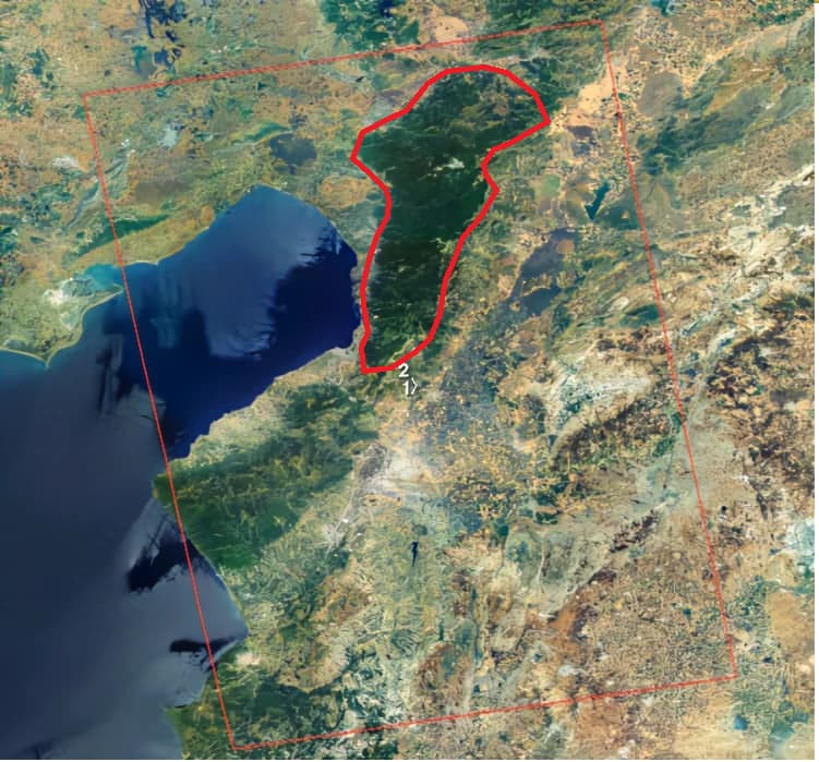
I didn’t know how to mask out this area which is a part of a water body (inside the pink polygon) before creating the interferogram so if you have got some idea, would be appreciated.
I see now you are trying to unwrap the Sentinel-1 interferograms for the 8 February 2023 Mw 7.8 and Mw 7.5 earthquakes. That is why you have so many fringes. I don’t think it is possible to correctly unwrap these interferograms because there is too much displacement. You might have seen that people have run pixel offset tracking on the coseismic Sentinel-1 pairs, and there is over 6 meters of displacement on the northern fault that ruptured in the Mw 7.5 earthquake. Since a C-band fringe is a little less than 3 cm, there would have to be 200 fringes to measure that displacement, but the fringes near the fault were aliased or lost, so the unwrapping will never be correct.
Very strong notice! I appreciate it. I was wondering why most if not all the unwrapped phase have observable error. Maybe that’s why ongoing projects for Turkey’s February 6th are working on L-Band ALOS PalSAR data pairs
Welcome to the forum.
It is not easy to define a metric for unwrapped phase quality. I have learned to recognize the quality by looking at the unwrapped interferograms and at the coherence maps. The interferometric coherence is a metric of how well the phase is measured at each location in the interferogram. Where there is a lot of noise and low coherence, the phase unwrapping is likely to have low quality. Where there is pure noise and zero coherence, then phase unwrapping is impossible. The threshold for what is adequate coherence depends on what coherence measurement is used.
Thank you very much for your attention. I will tell you what is happening to me. I am working on the implementation of filter for phase noise and need to unwrap and from there assess the quality of the unwrapped phase. For this process I’m using python.
import numpy as np from
matplotlib import pyplot as plt
from skimage import data, img_as_float, color, exposure
from skimage.restoration import [unwrap_phase]
Following are the filtered and unwrapped image. As I am new to this area I am not able to analyze visually, so I wanted to use metrics to assess the quality of unwrapping.
One metric for phase unwrapping would be some kind of measure of smoothness. Your unwrapped phase has a large number of discontinuities with large jumps in phase. For most interferograms, there should be no large discontinuities. The exceptions are where there was a large earthquake or landslide motion or some other big displacement. Your wrapped phase has 1-2 fringes, so the unwrapped phase should only vary by up to 18 radians.
This image is from the 7.8 magnitude Kaikoura earthquake that occurred in 2016 in the South Island of New Zealand. The ruptures occurred in multiple faults, leading some experts to describe it as “the most complex earthquake ever studied”.
Yes, the magnitude 7.8 Kaikoura earthquake in New Zealand had many surface ruptures where there are large discontinuities in the displacement. The small subset you show in your figure must be far from the fault ruptures as it has little phase change.
Are the red circles what you mean by fringes? And is the blue circle that has upwards of 50 radians variance in a couple spots problematic? Or is it the green/blue splits that are the tell tale sign of a problematic dataset? Is the fix to find a different satellite scene because there isn’t anything that can be done to fix it? I have been working with these images for awhile, but I have little understanding of how what’s bad, I can just recognize patterns that are different than what I’m used to seeing. Thanks for your help!
Yes, your red circles outline the two fringes in this interferogram. You can see the whole color progression from cyan to dark blue to red to yellow to green and back to cyan across each fringe. This means that the total phase change from the cyan in the top right corner to the cyan in the middle should be 2*pi or 6.28 radians. The pixels in between should stay within that 6-radian range and form a smooth surface with some minor noise. It looks like your phase unwrapping algorithm is extremely sensitive to noise and producing crazy results. Your black circle outlines the worst errors, but the other sharp discontinuities of phase all over the unwrapped phase map are also errors.