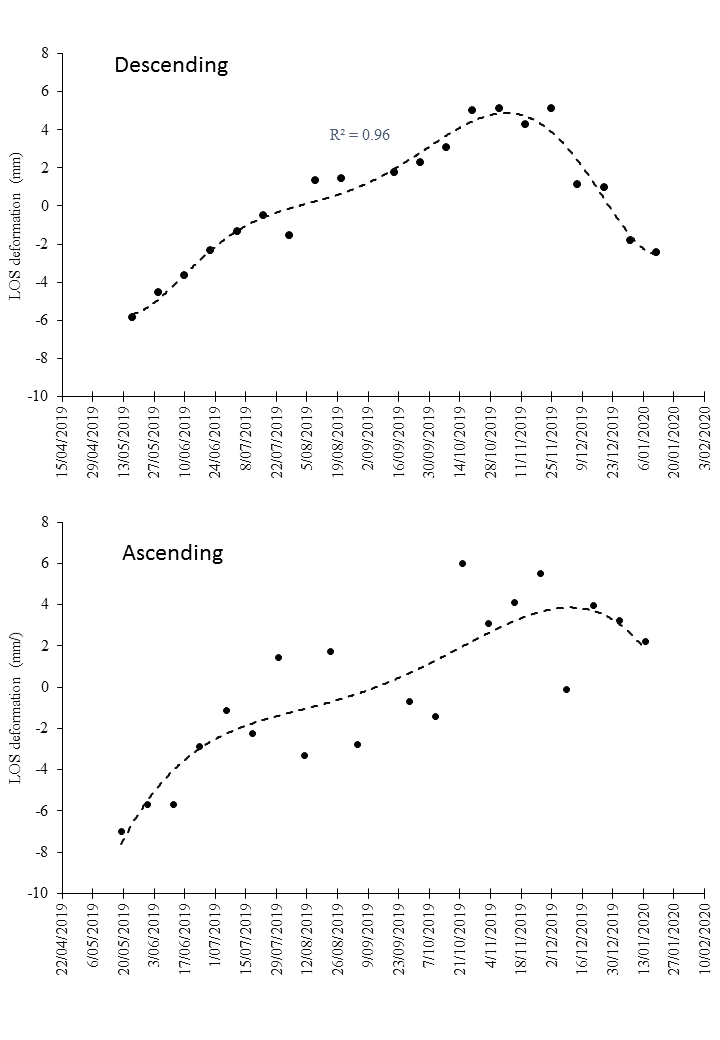
I have a question I hope someone can help with. I have processed both ascending and descending Sentinel-1 data for a volcano. The processing worked great as I can clearly identify inflation on part of the volcano for both datasets - a great result. Then I selected only the inflating area (about 300 PS points), and averaged these time series into a single time series for ascending, and another for descending . I notice the descending data provides much better “smoother” average time series curve (below). Can I ask what are the possible reasons for the poor quality/scatter in the ascending time series? Could it be atmospheric effects, or something about that orbit? Is there anyway to analyse the data for an explanation? I would like to explain this.
Concerning my thoughts of forshortening and layover:
Ascending (south north) looks (always right) downslope the area you use for the plot
Descending (north south) looks (also always right) “against” the slope (foreshortening/layover)
Hence, Ascending should provide better results, but in your case it performs worse (taken the displacement plot). Why?
Here I am not sure, but my thoughts on that are:
The slope is not that steep (as you already said) hence the orbit direction (and therefore foreshortening and layover, where the last my not occurre at all) is not crucial in your case, therefore other contributions affects the phase signal
surely, atmospheric effects could be one point, it would be random, that just the ascending images are affected but it is possible though. Anyway, imagin the case, where the master (since it must be different for both time series) of ascending is highly affected by an atmospheric phase contribution…that could lead to overall more noisy phase signal in the PSI approach, when the atm phase can not be identified correctly during processing.
What about the amount (number) and distribution (equal or clustered) of PS compared of ascending and descending images…when there are differences in both or one of these aspects, that may be another answer, since your timeline seems to be an average of the area.
Do you use the same reference point for both? (I assume that, but just to be sure, but anyway, where is it, I am interested and a sign in your map would be helpful )
These are my first thoughts on that, hence PS processing can be very case specific, there are some more details to think about but it is hard to tell, without seeing the interferograms.
The suggestion of a atmospherically disturbed master acquisition for ascending mode could make sense indeed. Would be worth a try to select a different one.
I am confused by your question - what do you mean by reference point? The time series y-axis is not relative to any reference point. It is LOS distance specific to the orbit path (average of all PS distance is set to zero for each observation in the time series).
I assume you process in StaMPS (and if not, still, I think also this is a sota thing to do in each PSI or SBAS like processing). Before processing, you should define a reference area in your study site.
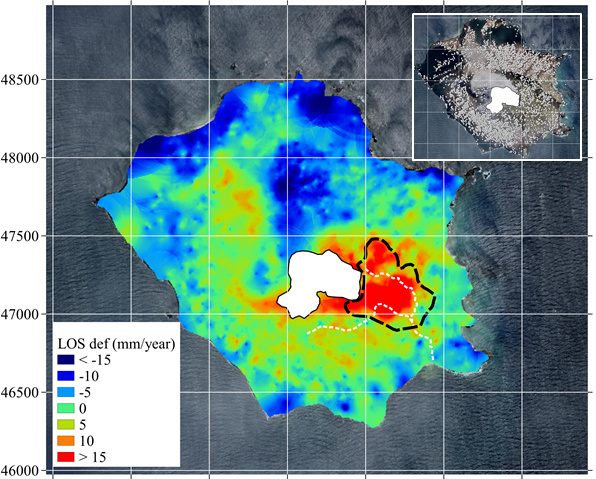
A reference area is an area you consider to be stable. This can be found by knowledge of the study area or by producing a first set of ifg and checking them. Looking at your map, the greenish areas in the eastern part or on the most southern part might be such areas. Those areas are used for reference for displacement. Imagine the case (I think your case) where every single point enters the reference, then, extreme values are also part of a reference value which might lead to strange results…When we now come back to your case, it might be that in your ascending images, you have more extreme values, which then might lead to a more unstable displacement signal, when used for reference…
Hello there,
Dear @thho and @ABraun and other mates, need your advice please.
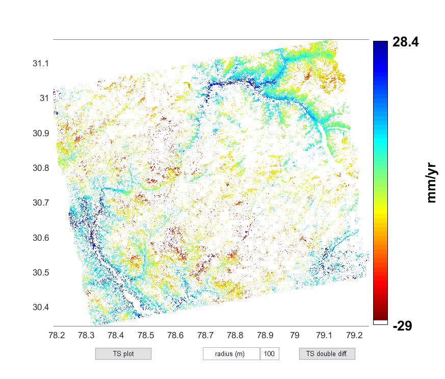
When I plot v-do (In matlab) it shows range -29 to 28.4 mm/yr (2nd attachment) but excel in stamps visualizer shows range -40 to 40 (3rd attachment). I don’t understand why in matlab and visualizer legend range is different.
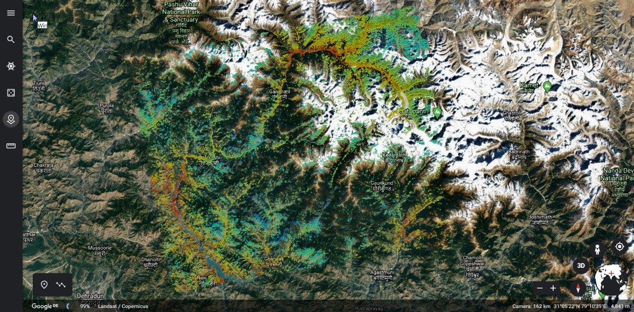
Second thing is kml exported results for GoogleEarth (1st attachment) are showing inverted colors (blue and red color ramp is inverted) compared to Matlab plot for v-do.
Just a guess, but just because the legend ranges between -40 and +40 it does not mean that this is the minimum/maximum of the actual data. And the image you show in the third screenshot is from Mexico (the preconfigured data) while your data in the first screenshot (your data) is from the Himalayas.
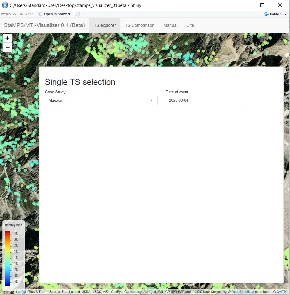
Dear @ABraun, the 3rd attachment is using exported csv which I saved in the Maoxian folder.
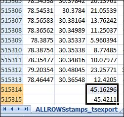
I have attached the updated csv screenshot here… it contains total no. of PS and shows the min. and max. from the 3rd column (ph_disp).
But why the range in case of csv/stamps-visualizer (-45 to 45) is different from matlab plot (-29 to 28.4)
I’m not 100% sure, but it is possible that StaMPS does filter outliers, which makes sense to give the points presenting the overview of derformation a better resolutions concerning the color range…You could check the plot matlab scripts of StaMPS to validate this assumption.
However the visualizer does not exclude outliers, therefore it arranges the color ramp to min max of the mean velocity. Hence the export provides the same data as used in StamPS, be sure that you do not miss anything in the visualizer…I made this app due to the fact that some details are not presented when using the plot functions in StaMSP matlab implementation, therefore I am happy to see that you recognized this difference, since the visualizer should exactly do that: make you aware of extreme points or trends in your data
 )
)