That is why we have this topic: StaMPS - Detailed instructions - #2 by ABraun It should be pinned actually…
It summarizes the current findings (including the one you mentioned) and where people could start.
Great… perhaps then we can lock this thread…
Hi @ABraun and @mdelgado
I did the whole process and it makes me doubt if this message in all the images (27 images distributed from 2017/12/03 to 2019/01/27) is an error or a good result.
Number of pixels with zero amplitude = 0
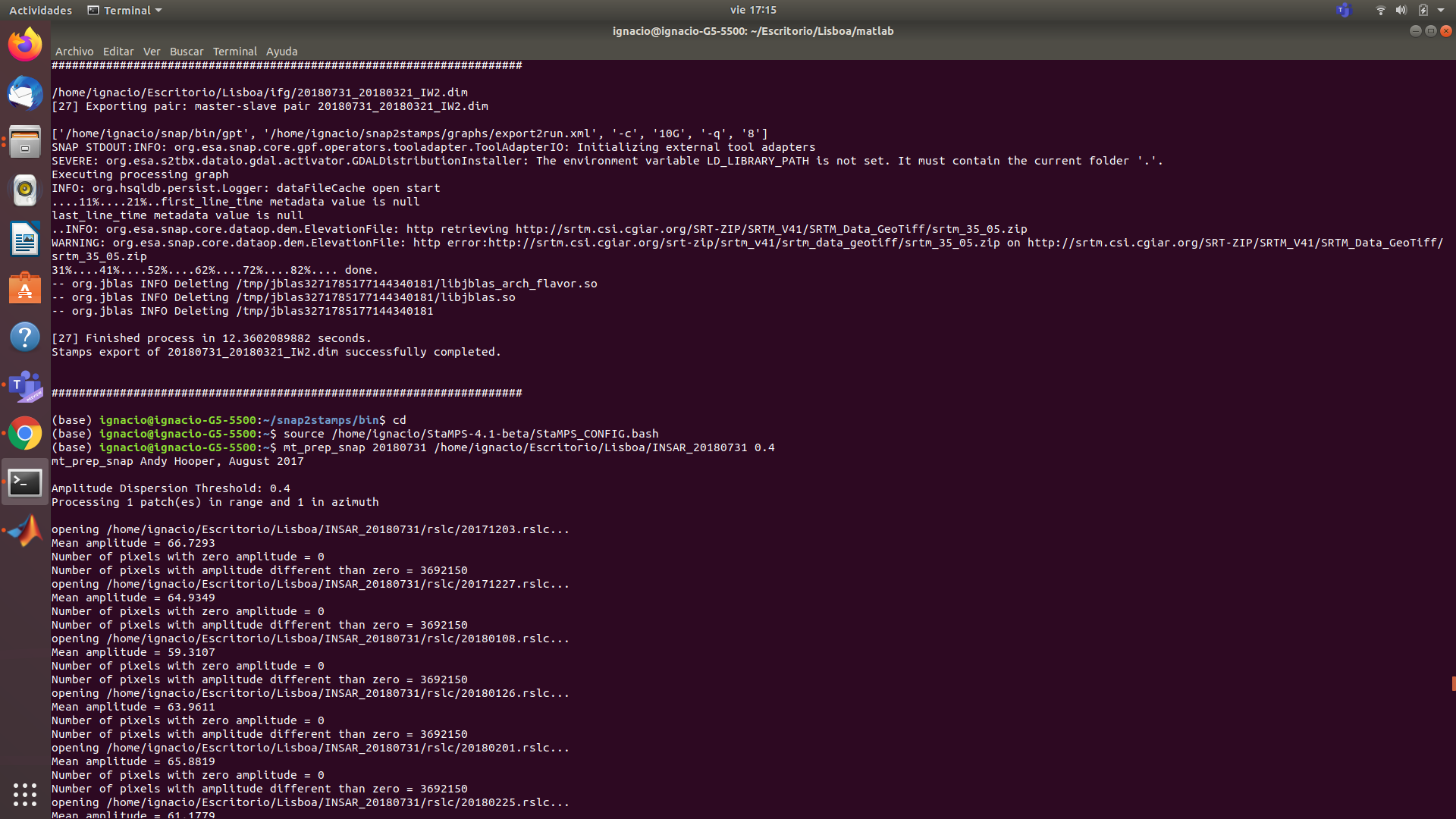
I have checked on SNAP and it seems that everything is correct. However within StaMPS
the results I get do not seem realistic to me:
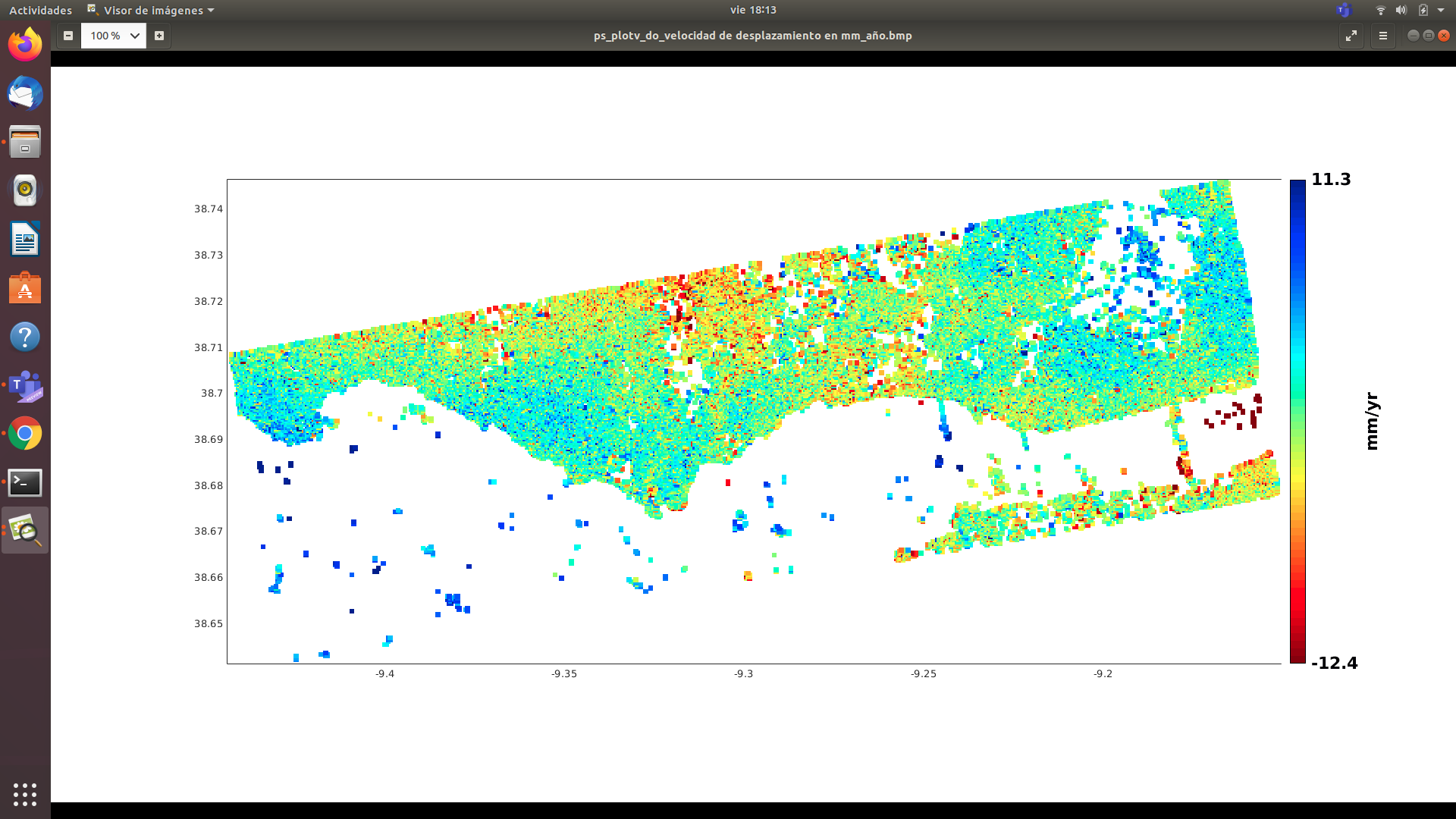
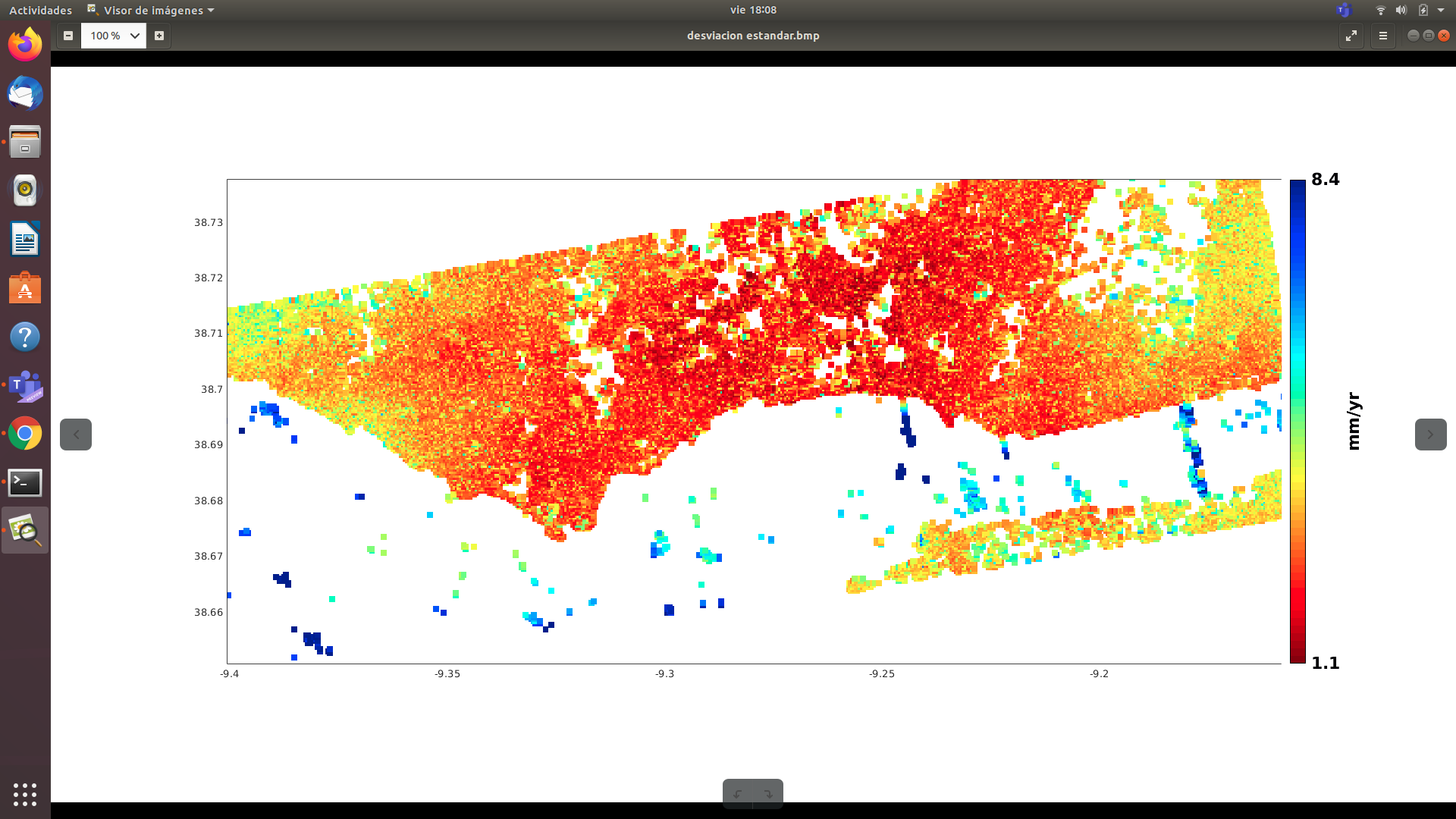
As you can see, the standard deviation is too high
good job so far!
Please use ps_plot(‘v-do’, ‘ts’) to plot the time series for some selected areas. This will give you a good impression on the temporal variability of the results and if they are following a trend or not.
I thought the message Number of pixels with zero amplitude = 0
it was a mistake.

So what does it mean for all of them to be 0 and for other jobs if there are pixels?
Even so, I do not believe that my work has a correct functioning, since I have obtained values greater than 15 mm for a single year in infrastructures such as buildings.
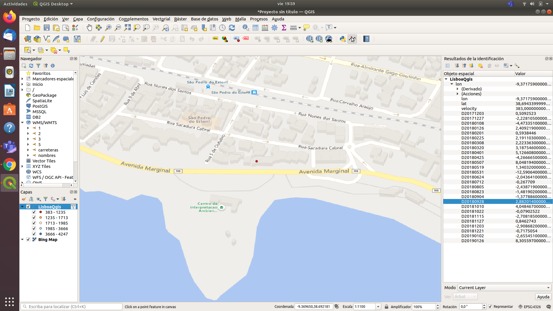
As you can see I have values such as: 383mm / year
actually, the opposite is the case, too many pixels with zero amplitude indicate an error or invalid data.
In your screenshot, you show a single point with no neighbors. It is unlikely that such an isolated scatterer has a reliable value. PSI is most effective when there is a dense network of PS. Also, the temporal variation of the single inteferograms is quite high (and random), so the sum is not a realistic representation.
Again, please check the time-series plot for areas of interest and feel free to share them here. It will help us interpret if the values are feasible.
1 Like
Hi. Thanks for the reply.
The capture that I sent, it was simply selecting one of the most unfavorable points, so that it was understood that the values are too strange.
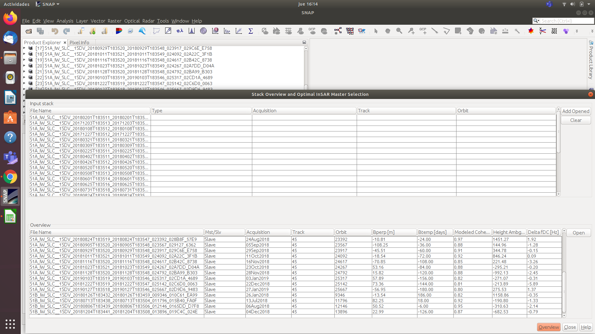
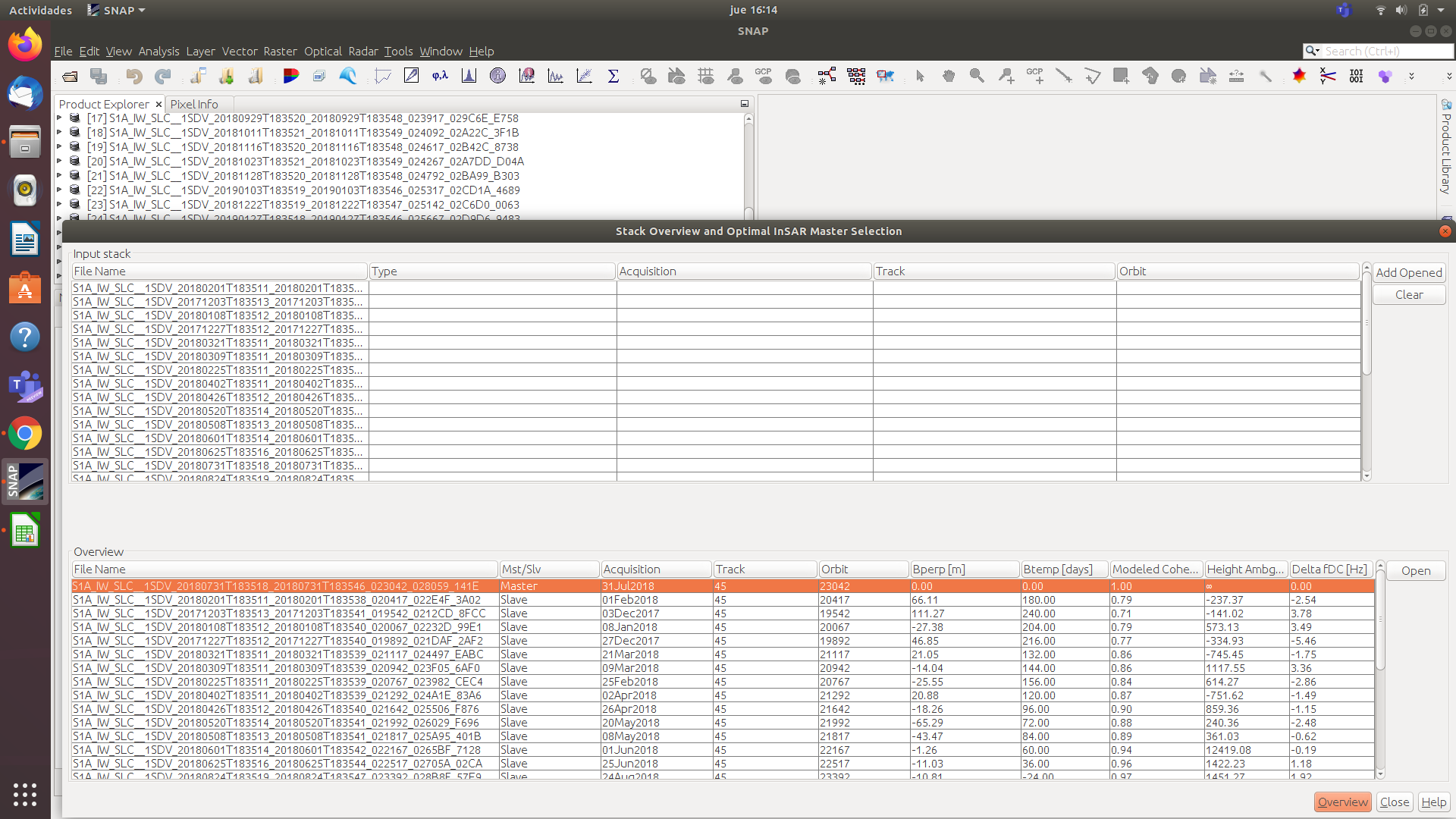
My study is as I said in previous messages for 27 descending images distributed from 12/03/2017 to 01/27/2019 with a separation of approximately 20 days. From what I understand I should apparently get some good reliable results.
I send you the capture with all the unfiltered data so that you can see that I did get a large amount of PS and also the contiguous time series point plots so you can see the trend.
As for your message
I have not understood it well, it refers to the consecutive values that I have obtained for example 0.509mm/year, -2.228mm/year, -4,473mm/year, etc or simply that it refers to the separation that I gave to the acquisition of images temporarily (that is, approximately 20 days)
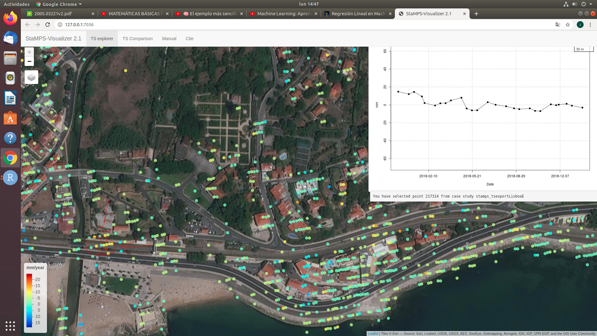
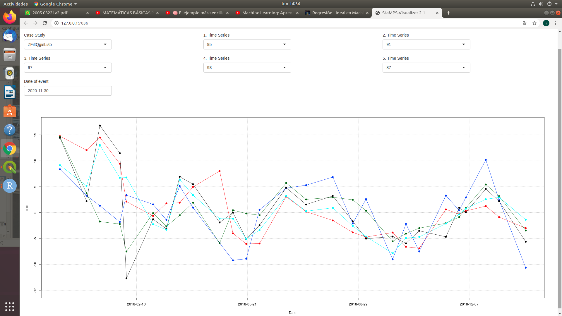
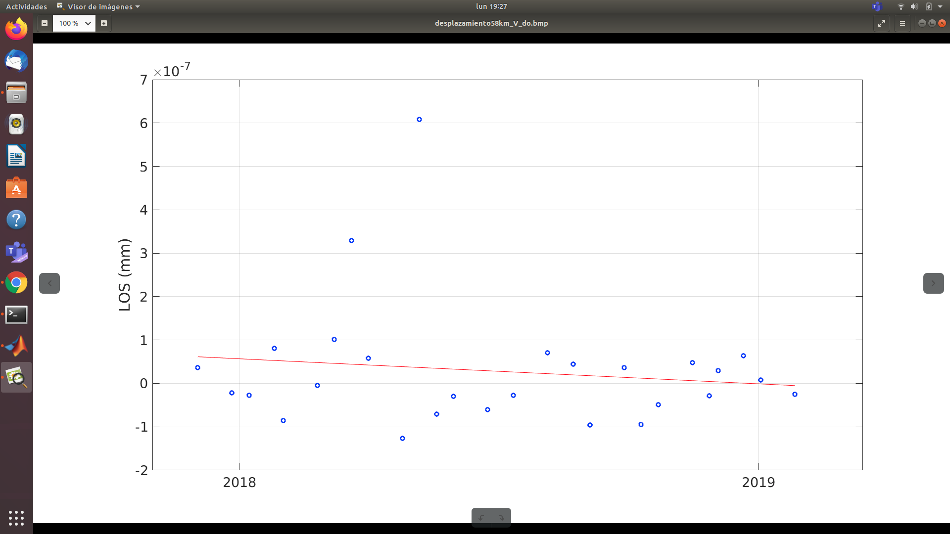
What is the difference between the black time series (looks good to me) and the second plot with the colored ones?
In the first graph, the black time series is simply the choice of any point within my study area (in particular, it corresponds to the number 91 in the second graph).
The doubt of all this discussion is that it seems impossible to me that there are movements in a single year of study in the entire area with values of for example -10mm / year to -20mm / year in buildings or roads, since presumably the real values They should be stable like for example 2mm / year.
On the other hand, what does it mean when you says Also, the temporal variation of the single inteferograms is quite high (and random), so the sum is not a realistic representation?
Regards
The blue line, for example starts at around 8 mm and ends at -11 mm. So that’s a total decrease 19 mm for this period. The time series is plotting the relative height of a point over time, not the current subsidence rate.
If all of the inteferograms show different patterns (indicates atmospheric noise) why should their sum lead to an accurate representation of the average displacement?
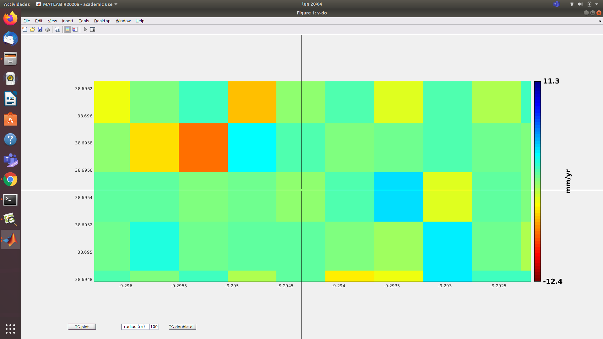
Having an average for the entire period (colored map) only works well if the single interferograms represent the correct displacement of the corresponding date.
okay. I think I have understood.
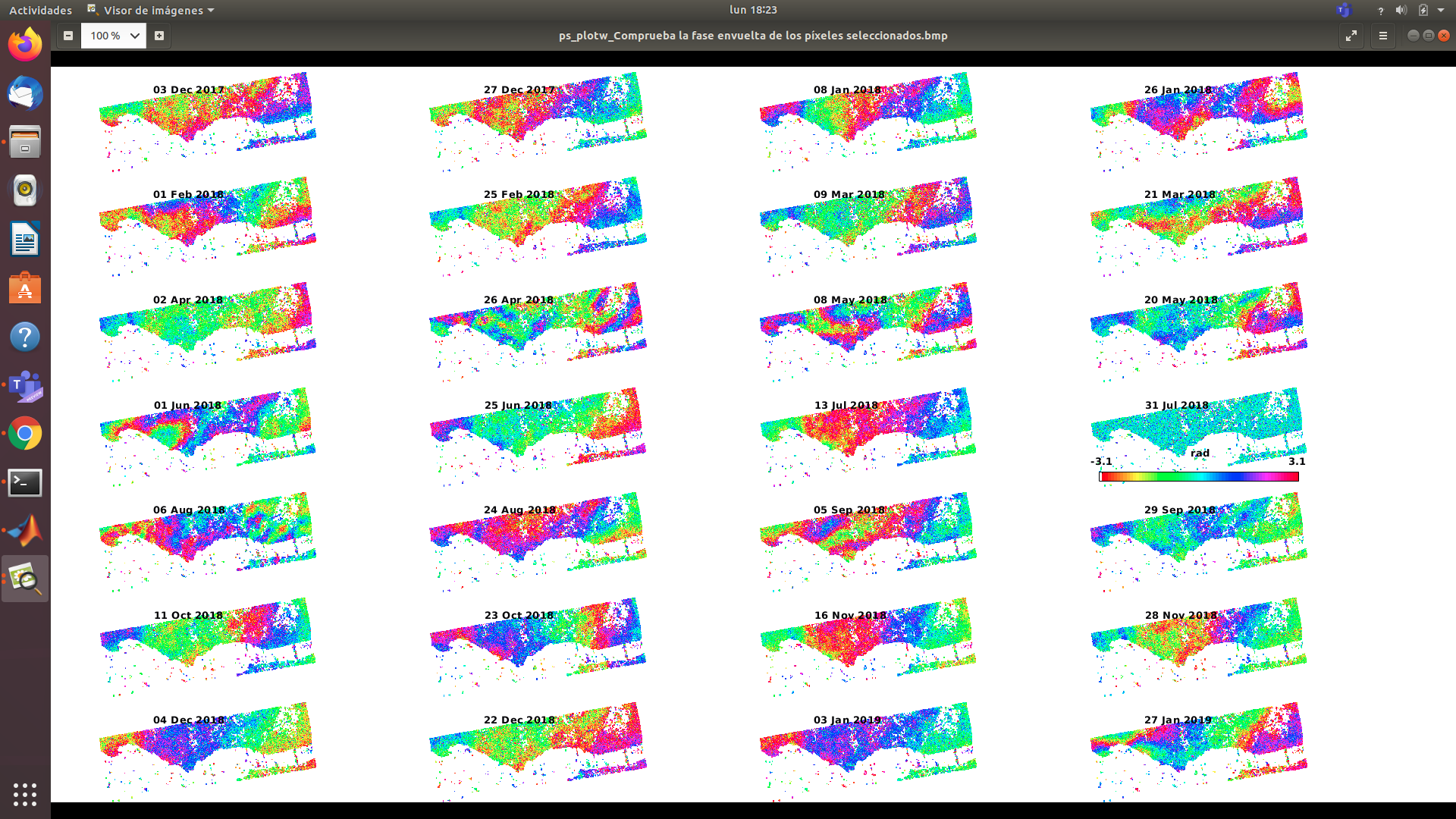
here I only show my wrapped phase of the selected psplot (‘w’) from the stamps step (5, 5) in case it might give a clue to my error
this atmospheric noise, is it possible to detect it before choosing the files, that is, is it my mistake in downloading files from Sentinel-1 for not choosing the images well? Or.
Is it that my error was not having eliminated the incorrect interferograms generated (I understand that it is in the stamps step (6,6) when using the ps_plot (‘u’) command) I should have eliminated those of date: 8 - jan- 2017 ,26- april- 2018, 8-May-2018, 1- Jun- 2018, 28 - Nov, 2018, 27 - Jan - 2019, that visually we see that there are phase phase jumps in space which are uncorrelated in time?
thank you very much for all the guidance
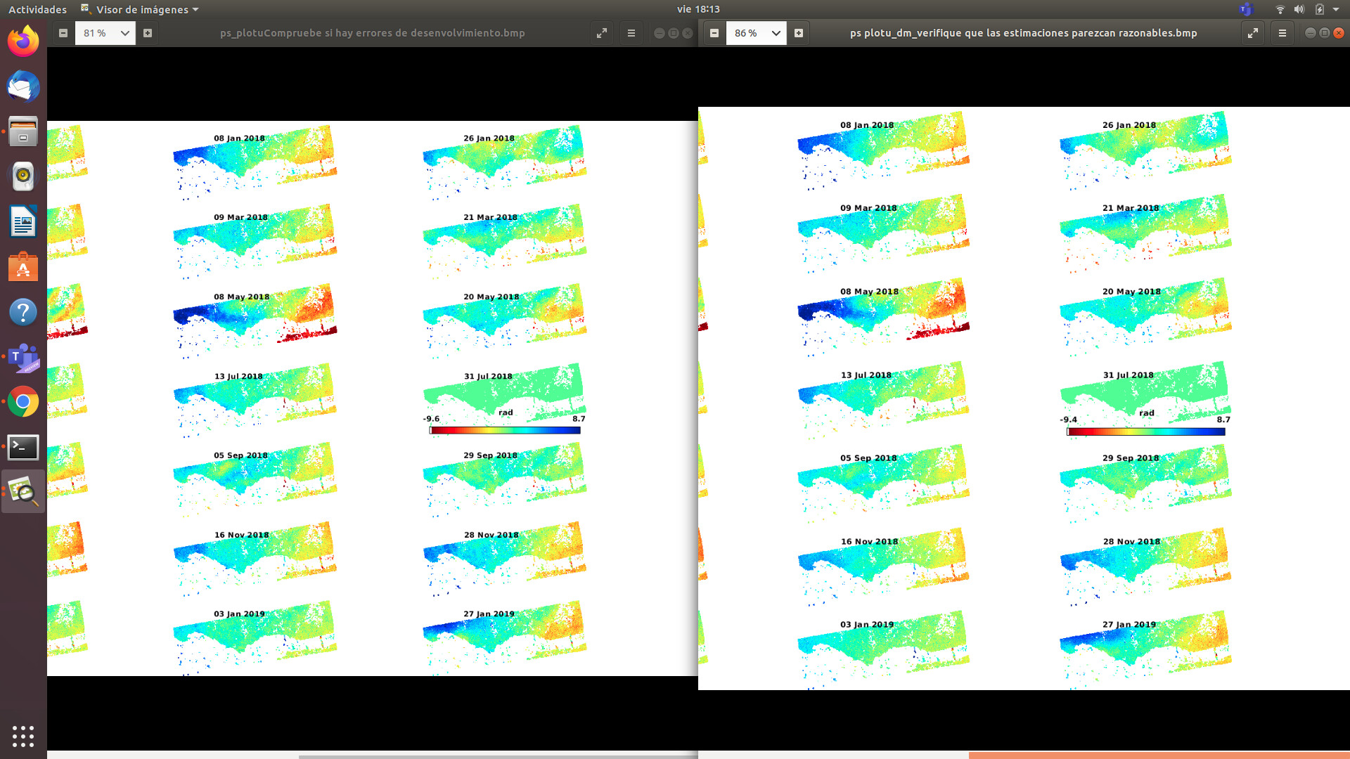
you have limited influence when selecting the images, because you need the dense and consistent time series. But looking at the wrapped phases, they all show a gradient from left to right. I can’t tell if this is feasible in your area or a systematic error. If 31 Jul 2018 is the reference image, it shouldn’t be used for interferogram generation with the same date (no phase change).
It is weird that all interferograms look different. This either indicates a quite unsteady and non-linear motion or a large impact of atmospheric noise. Where is your study area located?
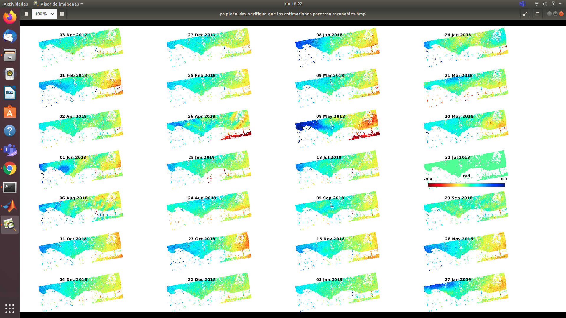
On the other hand, the patterns of the unwrapped interferograms are quite homogenous, so I wonder why the time sries does not produce more stable results.
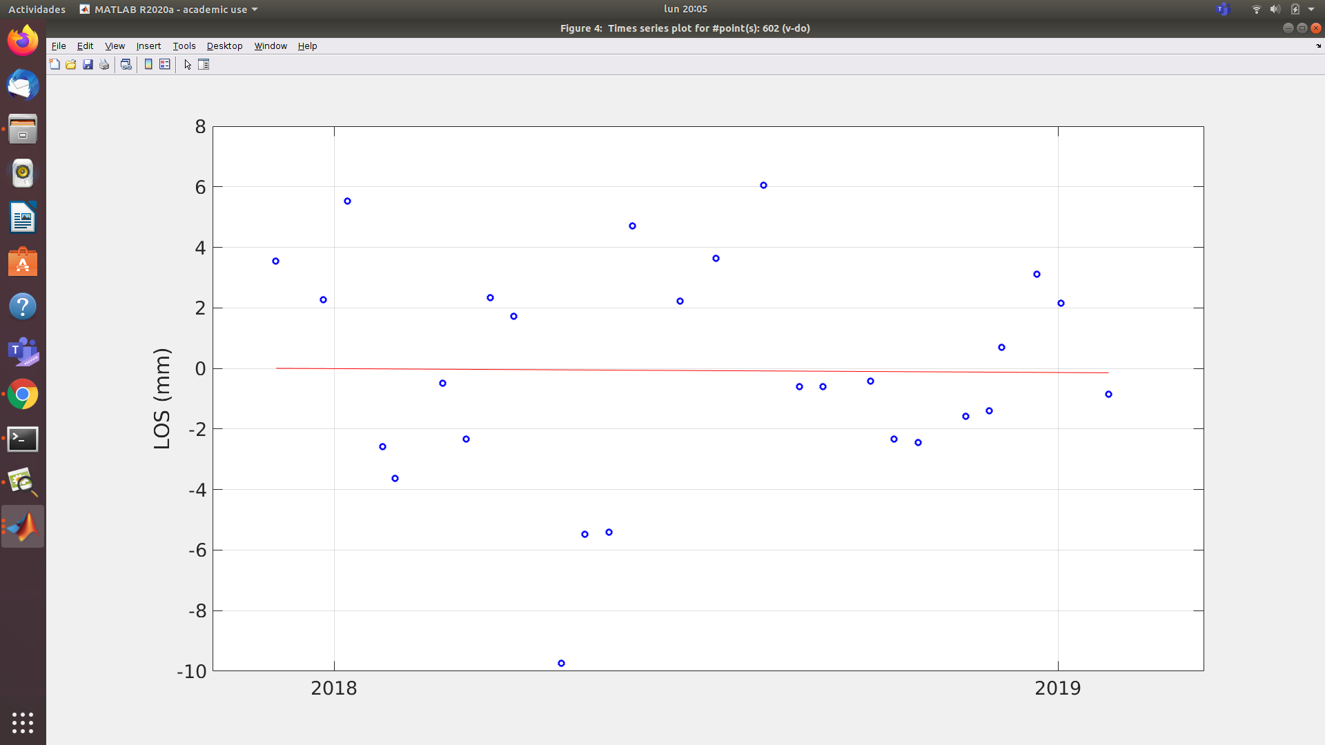
Have you tried the ps_plot command which plots time-series based on all points within a radius of 100 meters (predefined).
Did you select a reference point?
1 Like
That’s right, I selected a random point, which would visually have a shade as green as possible because I understand that this shade is close to 0 (this visual random choice is chosen because I don’t have previously data of stable areas) but I used 58km to cover all my study zone.
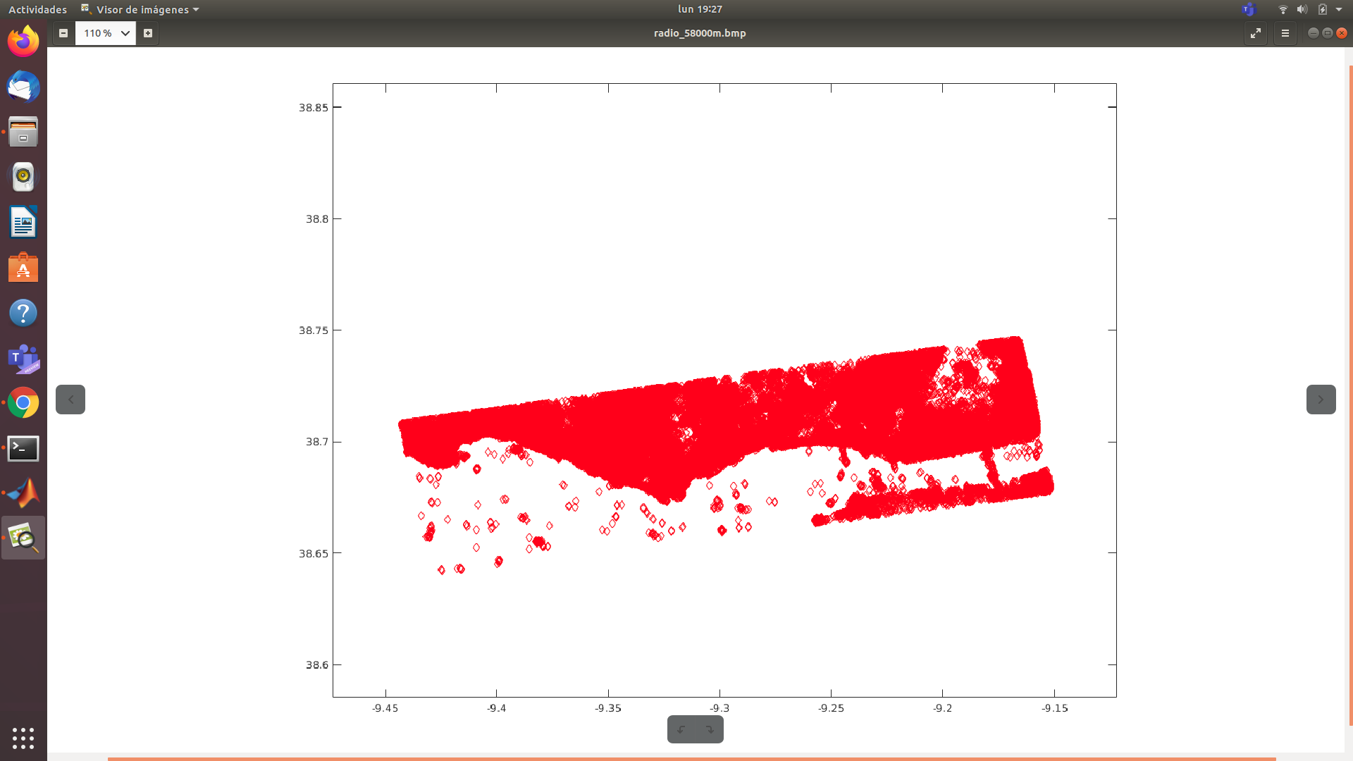
My study area is Lisbon for the year 2018.
These are the data of the images that I used
I think I made a good choice of data, since I reduced the perpendicular base as a maximum value of 111 and temporary base with a maximum value of 240
the time series plot you showed uses all available PS in the area. Yet, it confirms that at least two interferograms from early 2018 are strongly deviating from the rest. The fact that all points together result in a quasi even trend is good, because that means that the area itself does not underly a systematic pattern which would indicate a computational bias.
Can you please try to use a smaller radius?
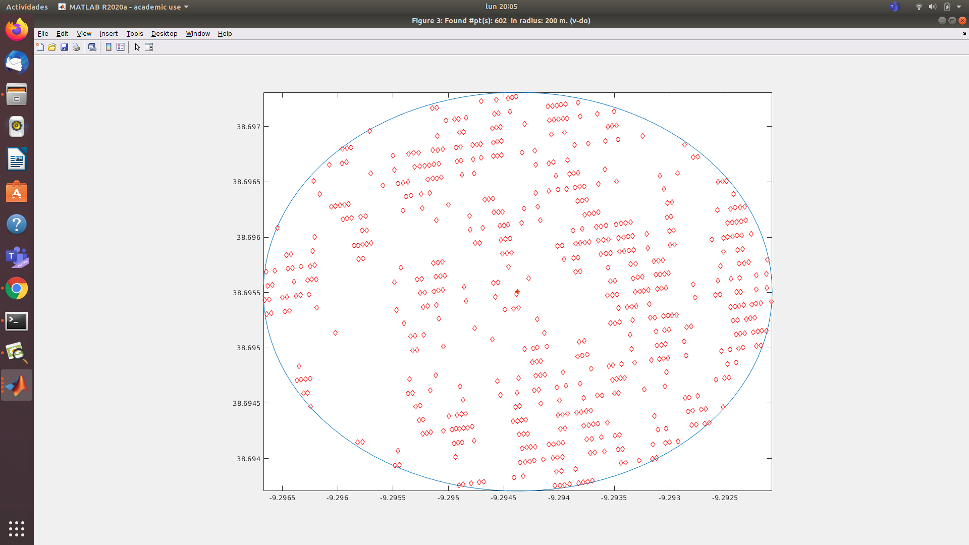
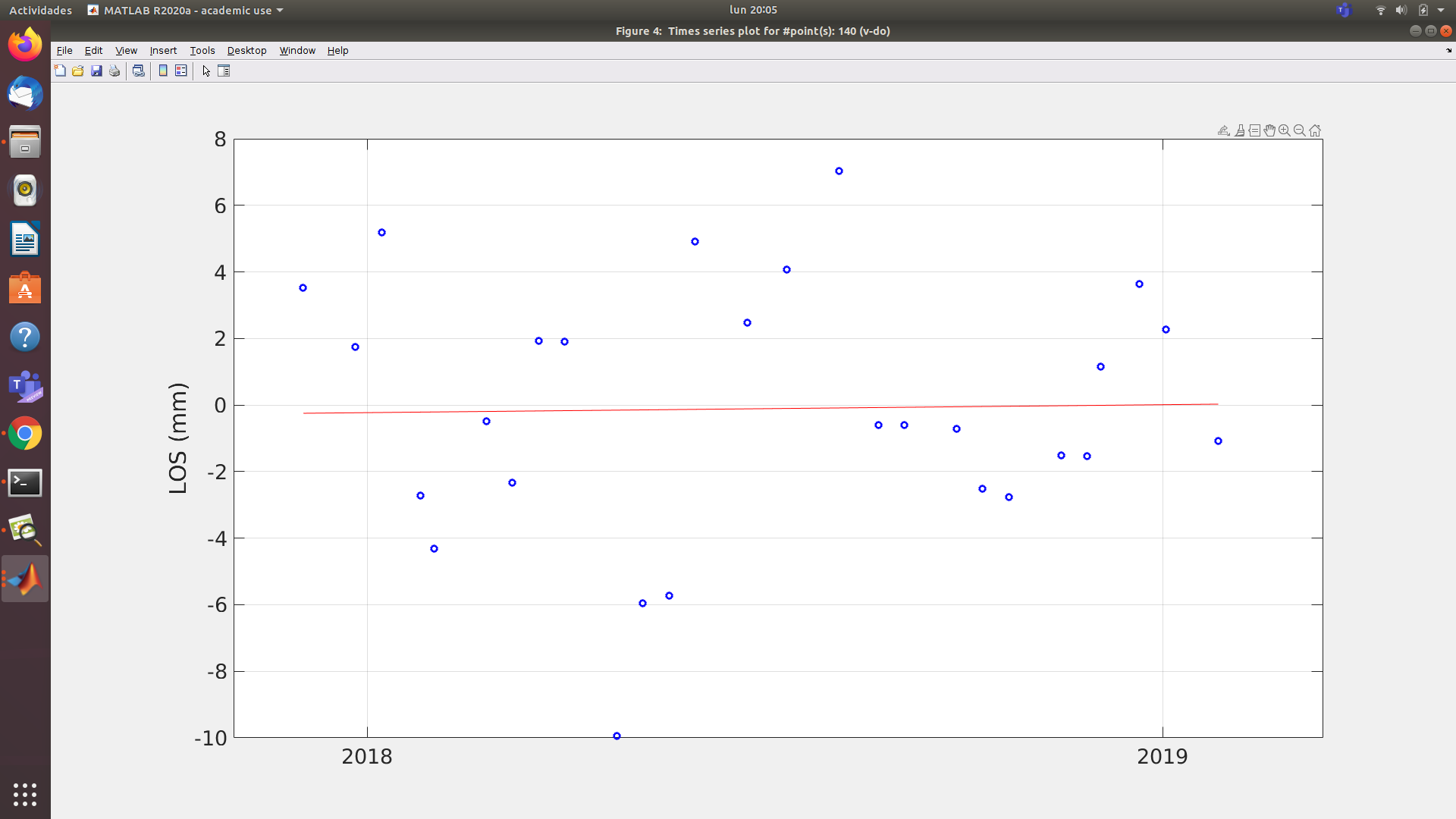

so I conclude from that that the error of single interferograms largely lies between +/- 4 mm, but still a stable trend emerges from these inaccuracies.
Excuse me for this final question, because now I am probably more lost than at the beginning ![]() hahaha
hahaha
this difference around + -4mm means that my inteferograms show different patterns (indicates atmospheric noise) ?
Depending on what we are studying this can be a slight or severe error, in my case I am studying the displacement on the road; from what i understand + -4mm is high error. or maybe my results are really reliable?
Even so I do not understand how this difference causes it to have displacements of 383mm / year
this is simply what I infer from looking at the time series. We would expect that all points lie exactly on the line, but they don’t because of unwrapping errors, phase noise ect… But still they form a trend which looks reasonable (to me, statistically - but you are th expert in the area).
I don’t have an explanation for the 383 mm, these don’t make sense to me as well, looking at the data.
If I eliminate those two interferograms, do you think I would produce more reliable results?
So far, I have to appreciate all your guidance.
Regards
maybe a bit, but as the other points are already quite stable, I would not expect much difference. The plot rather shows that these dates should be interpreted with care.