@Ramos keep in mind, that the ref area can have a considerable impact on your results! Best practice is (depending on your knowledge about the study site):
process without ref area
look for stable areas (stable time series, not just 0 velocity which is an ambiguous value)
check if this area is an area which you know is stable or for some reasons is an area which can be assumed to be stable (a bit tricky)
decide how large the radius for your ref point is around the location, do not make is to large, to avoid having unstable ref points in this area.
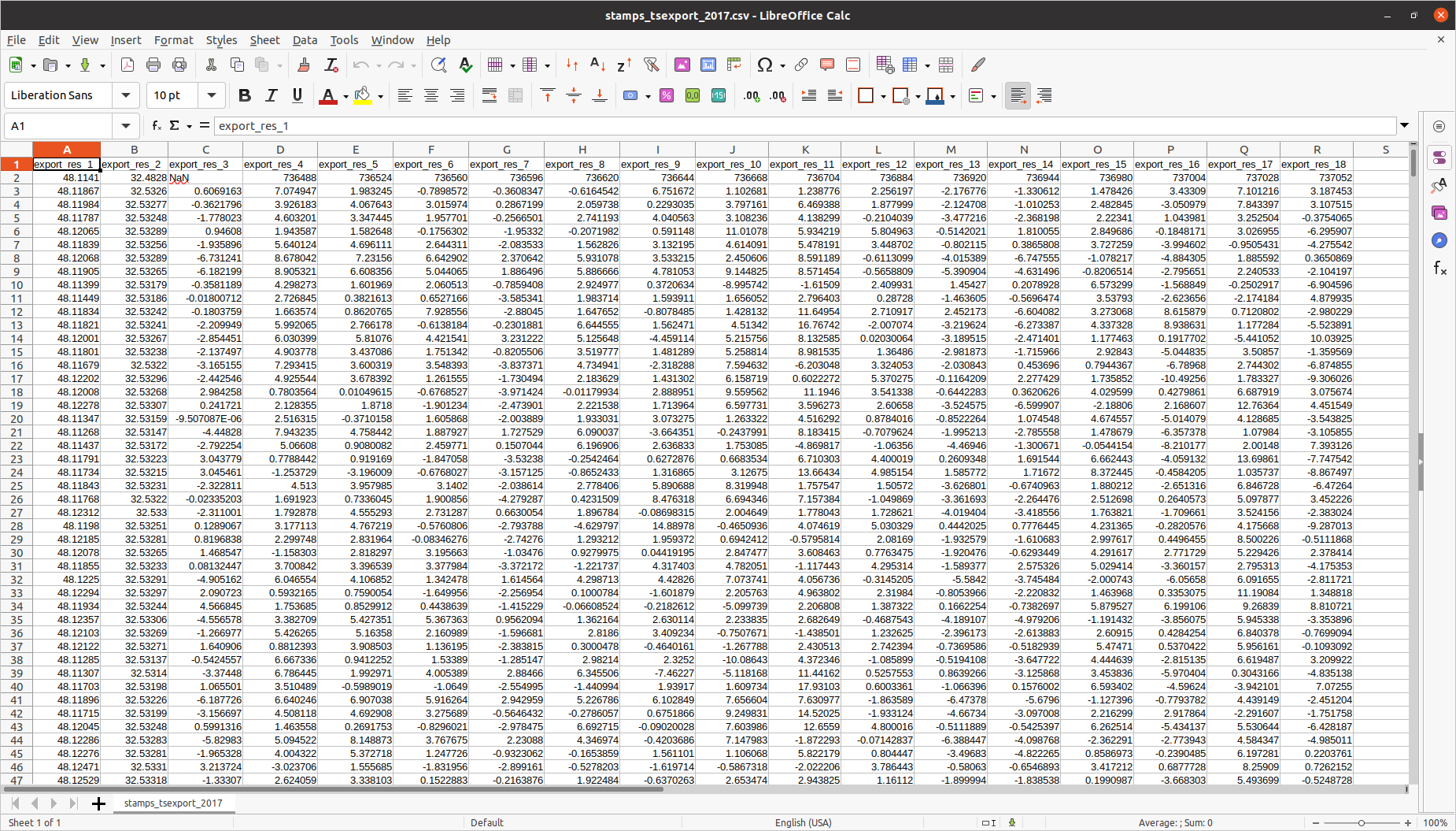
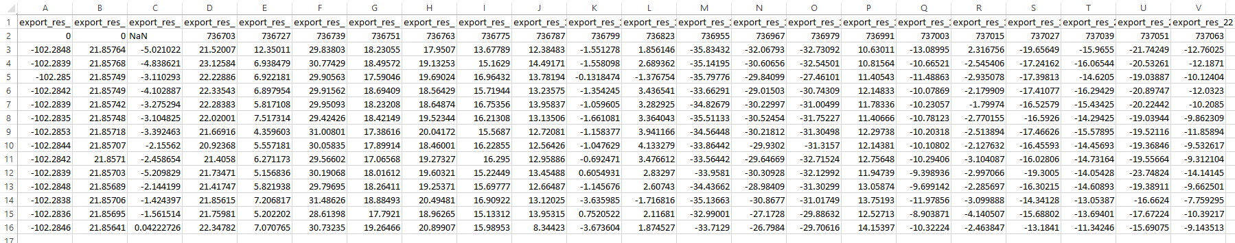
Hi dear @thho@ABraun and thanks for your help. I’ve done the PSI method with sentinel-1 data and the results seem fine (the first image is my stamps export), however, I have some questions:
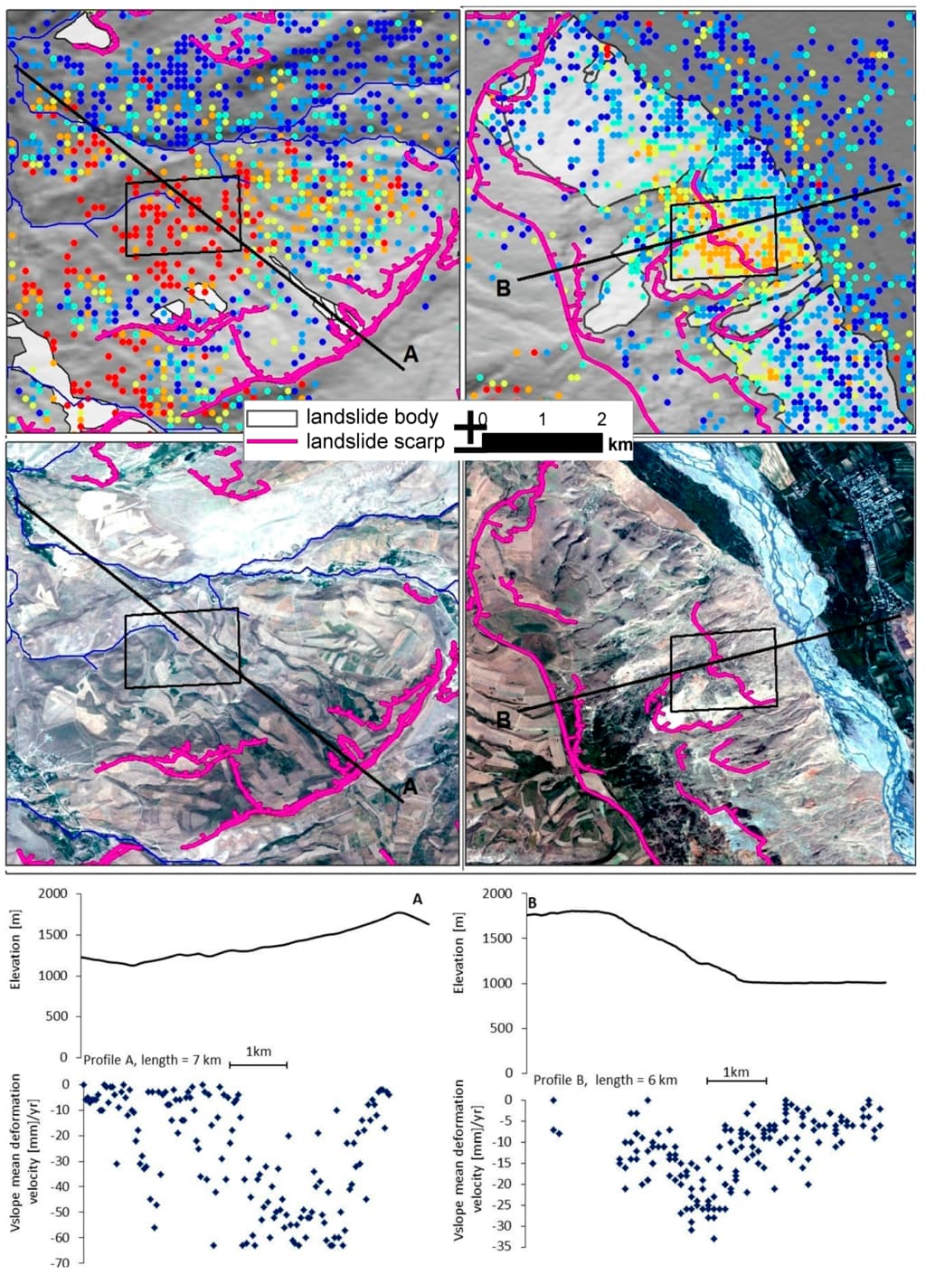
1-How can I draw a profile on my results to show a specific point like the second image?
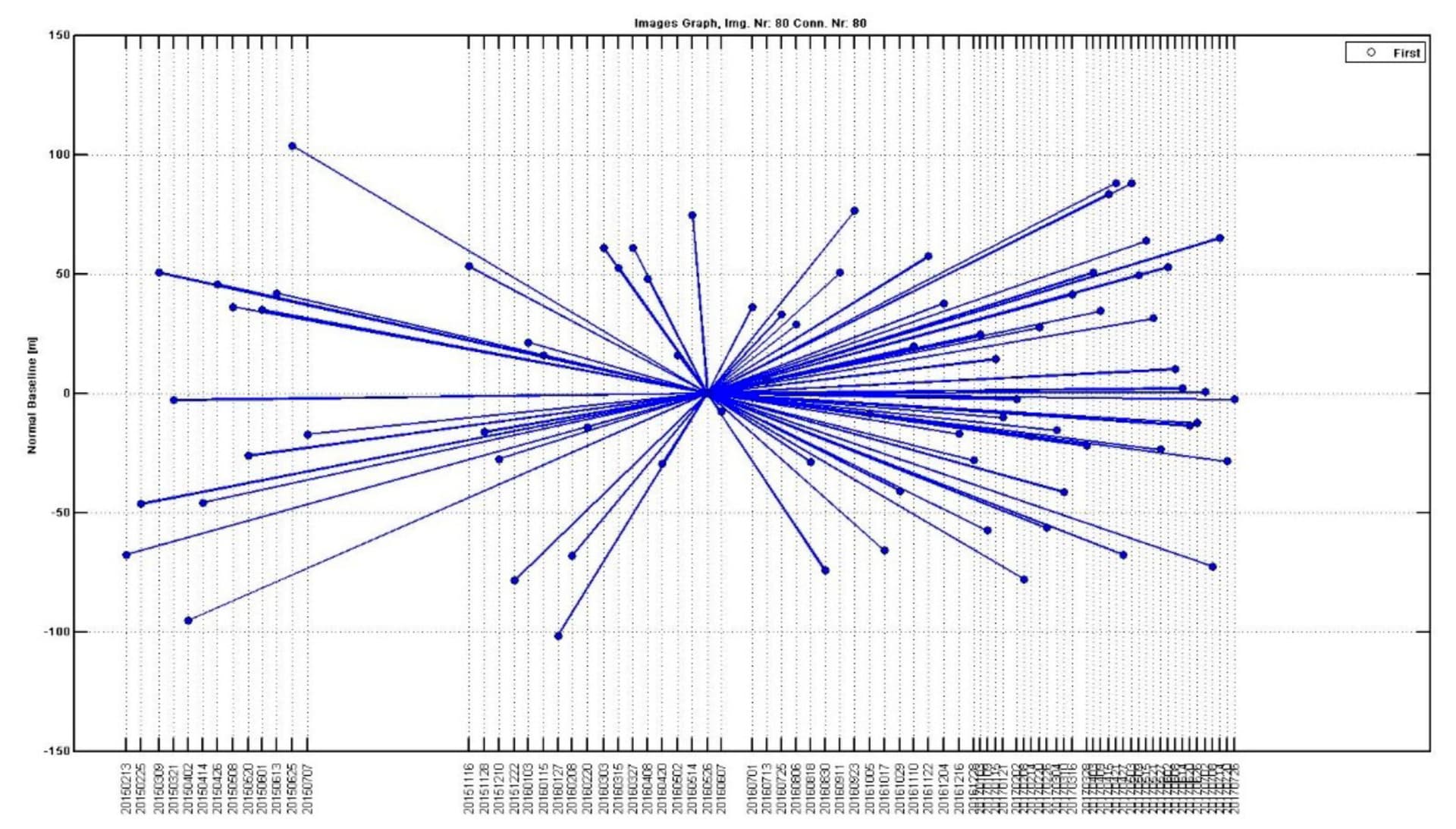
2- How can I draw a Star graph to show the temporal/perpendicular baseline distribution of data (the third image)?
3-Is there a workflow to do PSI with ALOS-PALSAR (2007-2011)?
thanks for your guidance.
About the other two questions: there is no general way to do it, the profile plot is probably done best in a GIS by digitizing a line and intersecting it with the displacement imported as points from the csv file.
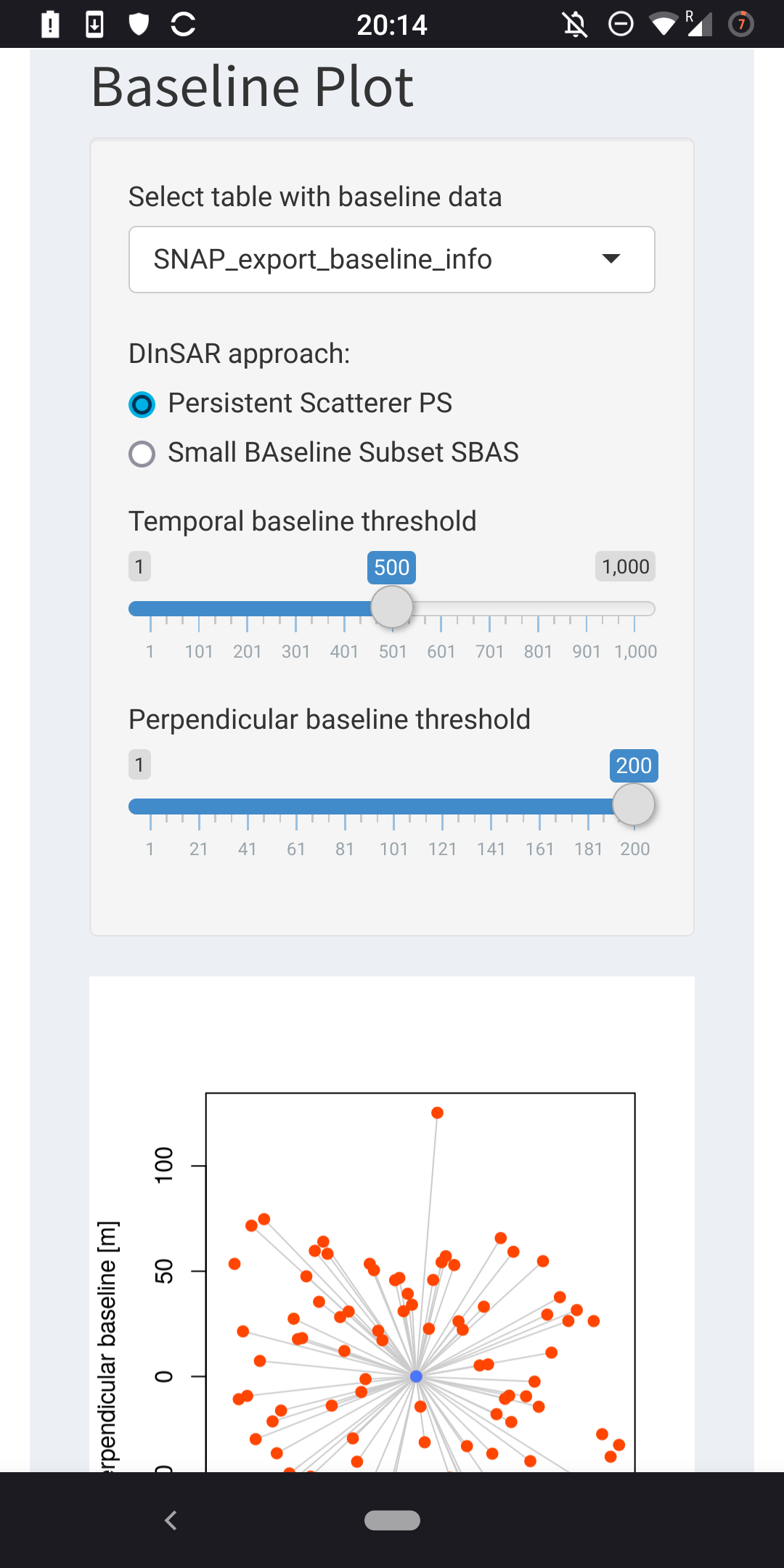
@masoodhp concerning the baseline plot or star plot, you can do this in the visualizer too. Have a look at the second tab called baseline plot. To export your own data from snap and import it to the visualizer, there is a step by step guide in the manual tab of the visualizer.
Hi @thho I am new and just discovered this tool. I have done the steps, but I only have 16 lines, is this normal? In the matlab image I have many points …
concerning your table: Normally, the Matlab export script should export all points within the radius you have set in the pop up window when you run the plot command in StaMPS. There you can set a radius and select (by clicking in the plot) a location where this radius should be applied to select your measurement points. When there are fewer points in the table as you expected, check if you have set the radius in the StaMPS plot properly and selected a location that has many points close to it. There is no way, that the export script exports fewer points as you select in the StaMPS plotting processes
Anyway, and therewith we come to your second point, you use an outdated version of the visualizer, probably the one of the first post here. Many things have changed functionality and layout and you should use the latest version which you can get here:
In it, you will find under the Manual tab a new and updated export script which I highly recommend over the one of the first version. Also you can select an export script to match your StaMPS version, all explained in the Manual tab.
In the linked Github repository you also find an installation guide, which I also highly recommend to follow closely to avoid package sorrows and to save time and nerves The renv installation is the best way to set everything up nicely.
Hi @despina98 most probably you have to create this on your own.
load a point layer or whatever you have into QGIS
rightclick the layer and go to Properties
go to Symbology and select Graduated in the top selection drop down
the value in your attribute table should be the velocity column, you have to define that in the second drop down
now the ramp, click Color ramp and First check under All Color Ramps if there is something you like
if not hit Create new Color Ramp and select Gradient
now you are on your own, since I have never done that properly: hint you can double click in the gradient to set a new color point therewith it should be possible to generate that manually
Matlab or StaMPS handles outliers in an other way than Qgis, go to the Properties of your raster layer in Qgis and change the min max values manually. Btw, when you import the values in the visualizer, it will also stretch the ramp to the full min max, unlike the StaMPS plot, which surpresses outliers…but the values are also there even in Matlab / StaMPS what you see is not what you get here
@thho@ABraun Thanks for your answers.
1- Dear @ABraun I tried the GIS with 3D analyst tools but I couldn’t draw a profile plot. Do I need to convert the .csv file? Do I need to enter anything else?
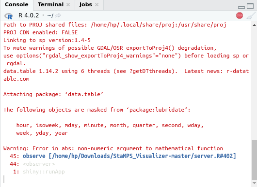
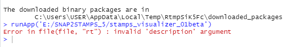
2- Dear @thho I tried the baseline plot but as soon as I try to enter the input file the software crash.
3- which polarization of radar data is more suitable for monitoring dam deformation?
the csv table, or the upper 5 rows if you do not want to show the entire table of the file you punt into the StaMPS_Visualizer/input/baseline_info folder
a screenshot of the error message that is shown in the R console in Rstudio
Thank you very much I have already understood the part of how to export to a csv file.
I want to export my study area in a rectangular shape, but when I select a larger radius it generates an error. Is there any way to export the entire studio area with the same format csv?
Hi @HugoLuVi , without knowing the error I would suggest the following:
proudce the stamps plot and select a very very large radius to include all points
run the export script, but be sure to use the one from the latest version in the Manual tab since older export scripts had problems with something called the horzcat error or so.
use some R (rgdal) or Python (geopandas) tool to convert the table to a geoformat like geojson or shape file
create your rectangular area in a GIS Qgis or Google Earth should do, The exported coordinates are WGS84 CRS 4326, save the new geometry alike
select by location all points within your rectangular geometry
convert the new point vector file back to the format that is needed for the Visualizer
hello,everyone,
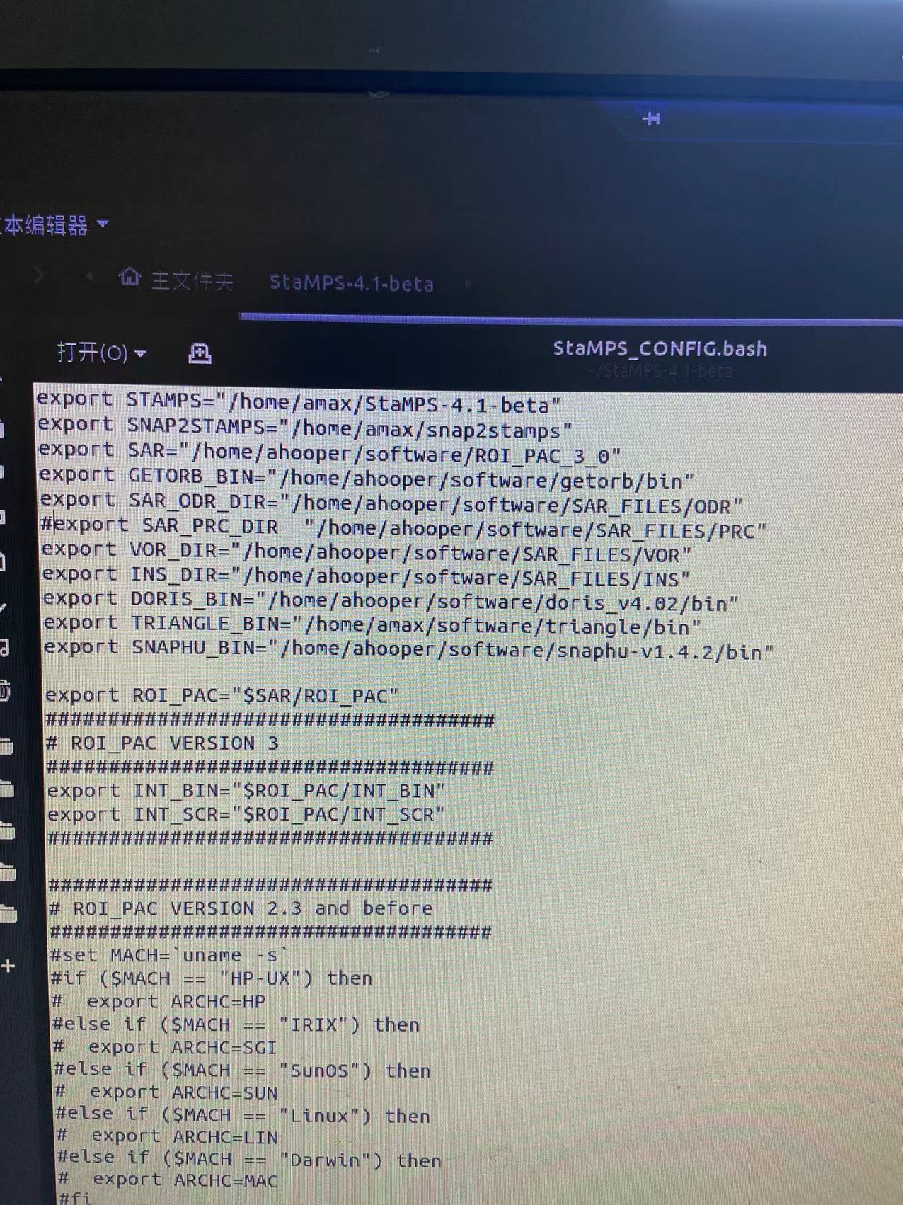
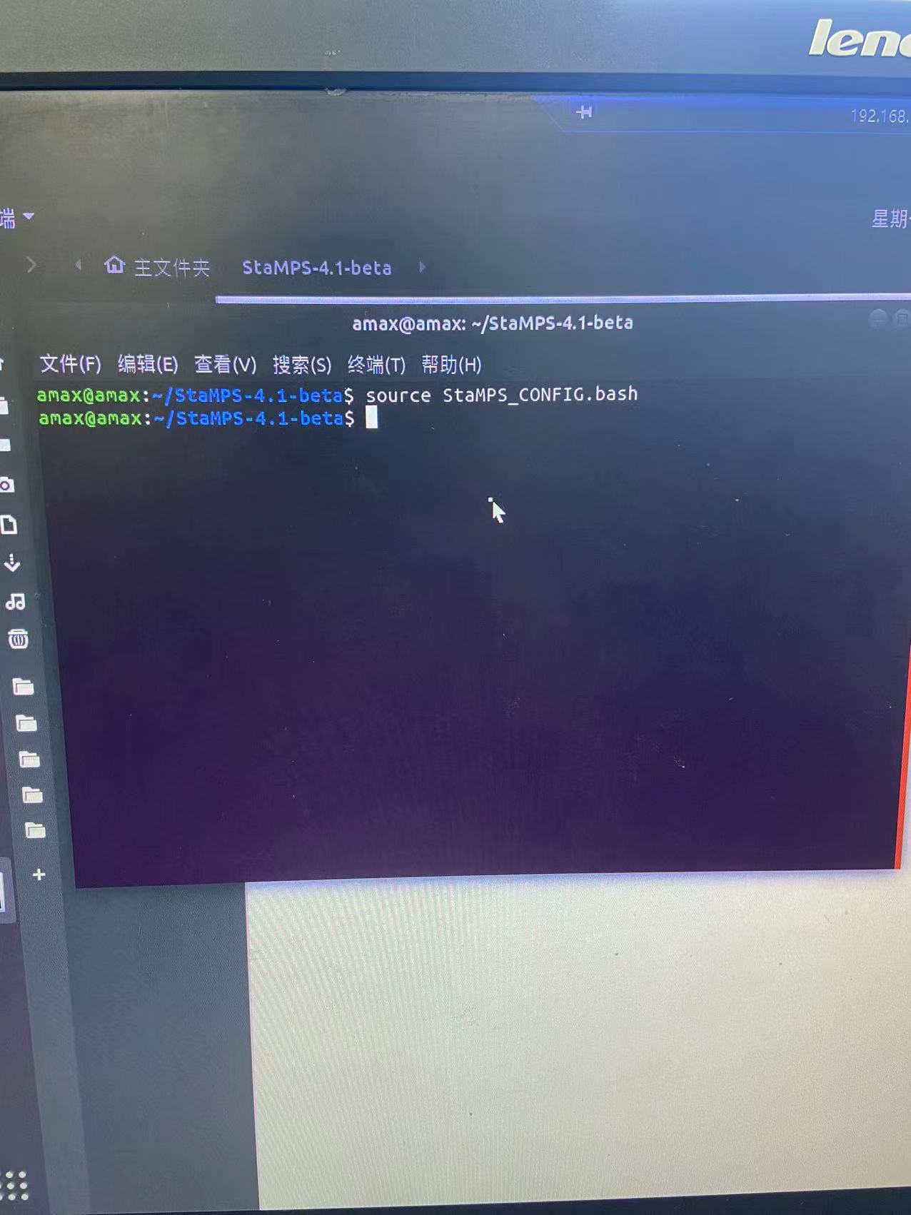
Sorry to bother you,I had a problem importing stamps data, when I used the mt_prep_snap command, I was prompted not to find the command, and then I re-examined my configured environment and re-used the source command, but the system still couldn’t find the command, and I found that there is a .tcsh file in my stamps file directory, I don’t know what the specific role of that file is, if you are free, I hope you can help me answer the confusion, thank you a lot
Hello good time. Is it possible to get the subsidence rate for 2005 with SNAP software? Other than Sentinel data, SNAP software can process data from any satellite
@masoodhp the csv file you use is thw wrong one. Your file is the export from StaMPS/Matlab with the displacement data. What you need is the export from SNAP with the baseline data. In the manual tab you fine the section: Export custom data from SNAP (baseline plot)
please follow this guide closely and this should work out.


 The renv installation is the best way to set everything up nicely.