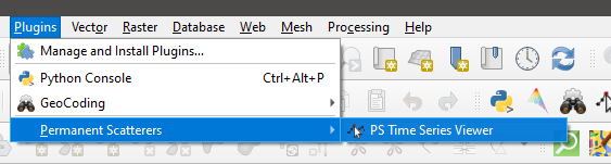
hi @thho , How can I have the same amount of MATLAB-related color ramps in StaMPS-Visualizer?
you install it via the plugin manager
I mean, how do I see it? In which tab is it installed?
it’s not that hard 
Dear @ABraun , Thank you for your kindness and also for your valuable and constant guidance. 

cheers
1 Like
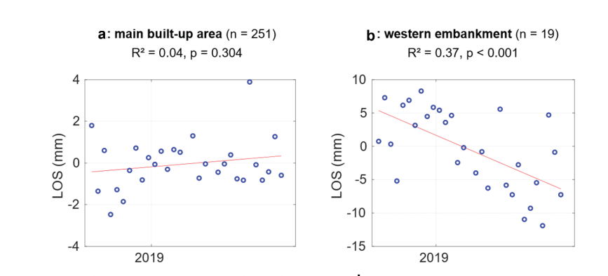
What does this chart mean and how do I interpret it?
Hi dear @ABraun , What factors can reduce the number of scattering points? In this article
, what were the main reasons for the reduction of these points?
Whenever the scattering mechanisms of a surface change, the signal becomes inconsistent. This happens over vegetation or water, but also if surfaces change (e.g. buildings collapse).
StaMPS selects PS based on their amplitude dispersion, which means the stability of backscatter over the observed period.
In the mentioned study, the moisture of the island caused lots of loss of usable PS.
1 Like
Hi dear @ABraun , Thanks for your helpful explanation.Excuse me, I do not know the meaning of these? How and in what software did you create them?
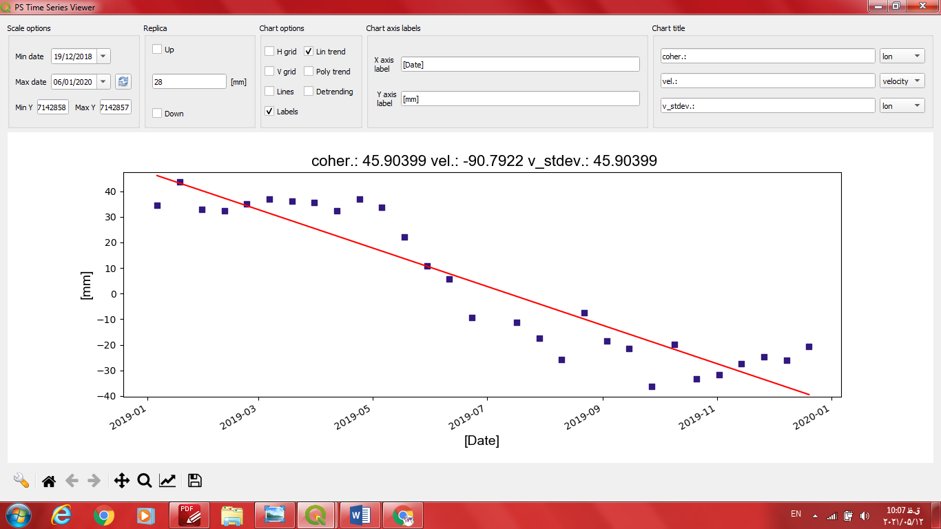
Is this what I created??
So where are these values( n , p & R2?? I do not know. Thank you for guiding me in this regard as well.
Thank you
The first ones are made with StaMPS, the one below with the QGIS plugin on PS time series.
n is the number of PS used to create the plot (average displacement), R2 is the coefficient of determination and p is the statistical significance of the line being different from zero. These are all explained in the paper.
Yes, I created that one(in QGIS) myself, but how do I have the values R2, n and p values in QGIS?How many of these values should I express in the graphs I have created?
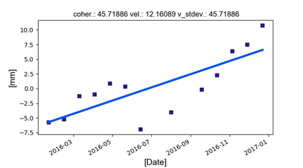
In general, how do I interpret these diagrams and maps so that they are related to each other?
this cannot be done in QGIS, you have to calculate them yourself in MS Excel or R, for example.
- Linear regression in MS Excel: https://www.youtube.com/watch?v=JoLpTefCIzk
- Linear regression in R: How to Interpret Regression Analysis Results: P-values and Coefficients
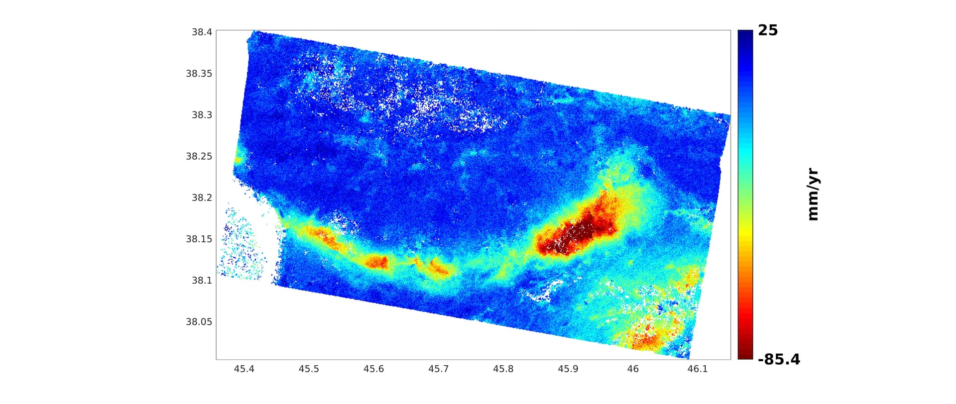
This is your job ![]() Only you know your study area and can tell if this all makes sense or not. The map is the spatial variation of average displacement over the entire time. The line plots are the displacement of a small area over time. As you have selected this area you know which part of the map is represented.
Only you know your study area and can tell if this all makes sense or not. The map is the spatial variation of average displacement over the entire time. The line plots are the displacement of a small area over time. As you have selected this area you know which part of the map is represented.
You can compare how other studies have interpreted their results, they all look similar (maps and plots).
You have gotten so far and did a great job in processing the data, so please invest some more time in understanding what these results mean. At this point, the technical part is finished and you have to get active.
1 Like
Thank you very much dear @ABraun , you are kind to me, but how do I create them in R before interpreting?Do you mean R is the same as stamps_Visualizer?
No, R is simply a scripting language for statistical analyses.
To calculate the R² of your line you need the values of your time-series in tabular form.
X is the date
Y is the displacement
Then you can calculate a regression line with an R² as described in the link above.
Please keep in mind that you have to explain any calculation or statistic you present in your work. So this only makes sense if you can tell your audience or reader why you did it and what you infer from it. Simply repeating methods like a recipe can bring you into trouble when you are then asked questions on your work which you cannot answer.
2 Likes
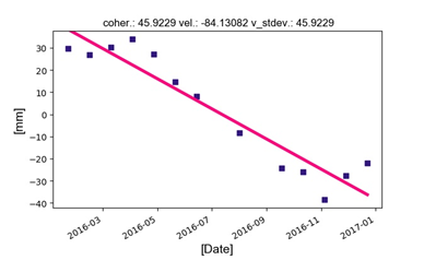
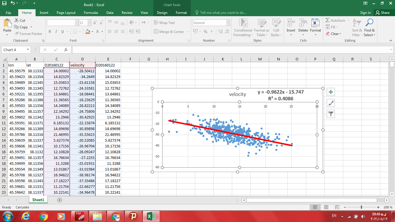
hi @ABraun , Did I draw correctly? Did I choose the data correctly?What exactly do the X and Y values indicate?
1 Like
X has to be the date, Y the displacement.
I don’t know what X is in your case, sorry.
X is D20160122, and Y is Velocity.And this is the original file.

wkR2ZqRLa0R3iH7.png)
But that makes no sense. ![]()
This is a two dimensional plot. You cannot display temporal values of all pixels over time. This plot intends to show the displacement of one pixel (or the average of a small area) for every interferogram of the observed period (just as the ps option in snap does).
Please, first try to understand what this all does, why you want to do it and what the data as you process it means. My feeling is that you blindly apply techniques without knowing their purpose. Especially for a technique like DInSAR which is prone to so many error sources you should be aware about how you created these results and how reliable these are. There are wonderful materials around, please use them, like you successfully did so far by applying StaMPS.
1 Like
Yes that’s right.  But I want to know what these are for and I want to learn how they work. Has anything been written about this in this forum?
This forum is full of StaMPS stuff  Maybe a bit too full, so it’s not always easy to find the answers, but in general plotting a time-series over time is discussed at multiple places, and it can be done in various ways.
- There is the StaMPS manual where the plotting option
tsallows you to display this time-series. - There is the StaMPS Visualizer which does this based in R
- There is the QGIS plugin for displaying time series from PS (also explained here)
- An interesting tool has been provided by Matteo Berti which takes CSV data and visualizes and classifies them.
- @Gijs has compiled a nice collection of instructions and examples on his GitHub
- @m477h145 provides excellent explanations on all parameters and how you make use of the results, including plotting in various forms
- Lastly, you can check some among the many studies which are dealing with this topic and how they display, analyze and interpret their results
3 Likes