thanks a lot @ABraun ,I have the StaMPS Visualizer on my pc. So can I create them in StaMPS Visualizer? it’s true?But you said before that this is not possible in QGIS ??? !!
The StaMPS Visualizer is executed in R, the plugin in QGIS is something different. Both help you to display time-series data but the actual statistics on these trends are better done in MS Excel.
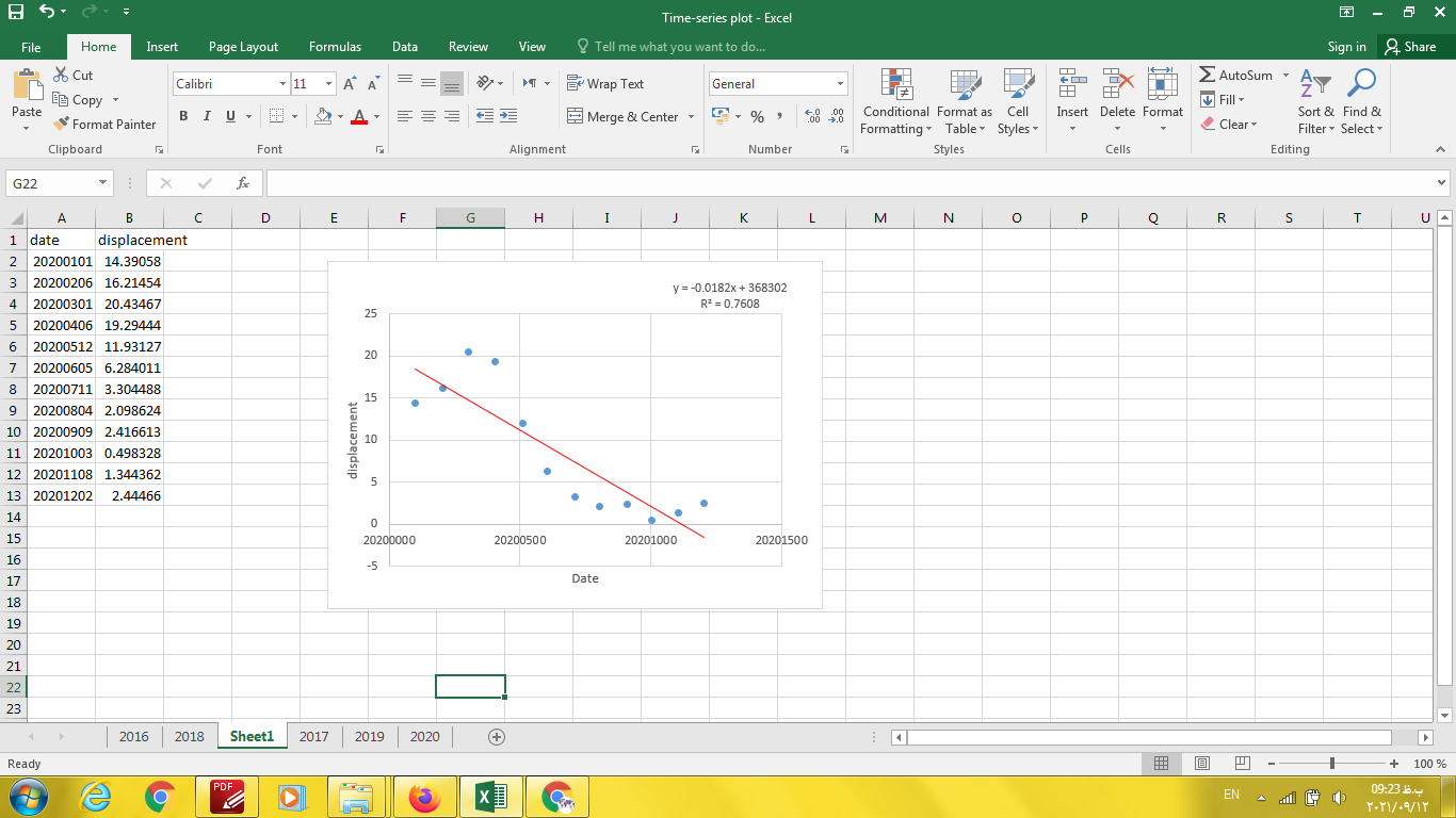
line 1 is the date (X) and line 2 (or any other) is the displacement (Y).
You can plot a single line based on the coordinate of the point or merge several points which are close to each other. Therefore, having them in a GIS helps you to select them. Then you just need to transform the two lines into two colums (e.g. in MS Excel).
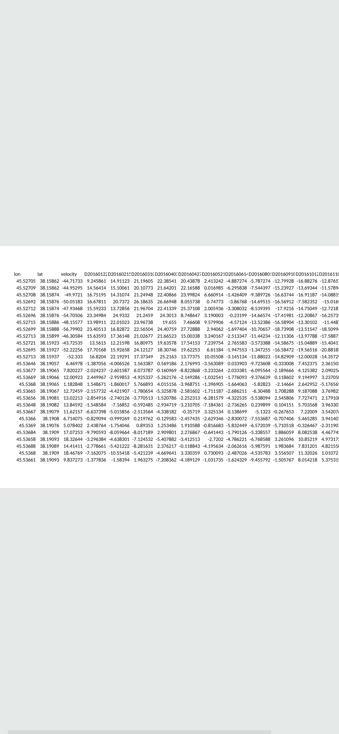
@Gust your objects lon and lat (especially lat) are not created properly. I think there are issues from their parent object pnts. check the structure of pnts and figure out why lat has no data in it.
Hi Dear @ABraun ,I followed your instructions. And then I merged a few lines together into two columns of displacement and time and plotted it in Excel. Is that right now?Thank you very much for your guidance.
Sincerely
1 Like
Yes, very good! Congratulations on getting through it.
Now it is the same as in the publication of the island.
@ABraun ,It is my pleasure… In fact, your work was excellent and number one. thank you very much
Thank you very much. How can I make instructional videos on getting subsidence?
I’m not sure if I understand you correctly, can you please specify your question?
How can I make a credible tutorial on how to estimate subsidence with SNAP?
You could first check those which are already available and think of what information is missing or what kind of examples would help people understanding the concepts better. This one is also already a good start: Workflow for PSI-based ground deformation study using SNAP and StaMPS at Fringe2021
Dear all, I did a PSI-Analysis, but I noticed something weird. It is probabely not connected to the visualizer itself, however I just noticed it now.
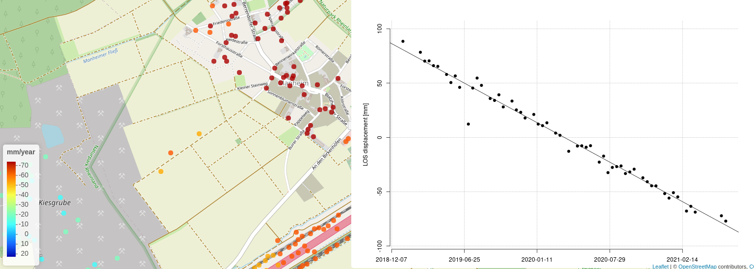
As you can see I have a) pretty high LOS displacements, furthermore which is even more worrying: in all of my data I have the same trend. Meaning the displacement values start and end with the same values, except change the sign. However the values on visible on the map indicate no mean of “0”. I’d be most grateful for explaining this phenomena.
Hi @simonericmoon, I am not sure if I get everything right, but I had some thoughts when reading your post.
First of all, the point color in the map canvas and the corresponding legend show something completely different as the trend in the LOS displacement vs time plot.
- the map and legend represent velocity
- the trend and plot show displacement
Therefore you can not compare a mean or something similar of those two things, especially not when checking for consistency of the data itself since you rather should expect them to be different instead of similar.
The mean of “0” you referr to in your post is no mean, it is the relative displacement of the measurement point to the prime image, this is often in the middle of your time series and therefore the trend crosses 0 at this point…see this post for more insights:
However, you also said, that your trend data of every point is the same, if this is the case, please provide a screenshot of your exported csv table with some rows that we can get an overview of your problem.
Good job on recalculating it. To me these are just colorful images. I can’t tell if the result makes sense or not. The PS density is surely higher and there is surely a spatial trend in the datra. Most of the values should be 0 mm (blue), but the negative values of -12.7 cm per year seems a bit drastic to me. Is it feasible?
Maybe the 1m changes are snow covered mountains (to me it looks like that). If this is the case @despina98, I think you should increase PS weeding since you nearly include all points, which is not the idea of PSInSAR…since most of such points would not be persistent at all, thus an interpretation of them could lead to wrong conclusions. However this is all hypothetical and really depends on your study site @despina98.
1 Like
You are fully right, sorry. 12 cm per year is still large. Can you please plot the time series displacement for this area (‘ts’ flag at the end of ps_plot)?
you’re welcome, @ABraun , It is now 7 cm. It is not 12 cm. 
@despina98 I have roughly checked the site on Google Earth
What you can clearly see is the lake in the lower left corner and to me, it is a very good indicator that the “Before” / left result is better than the “after” / right one, here is why:
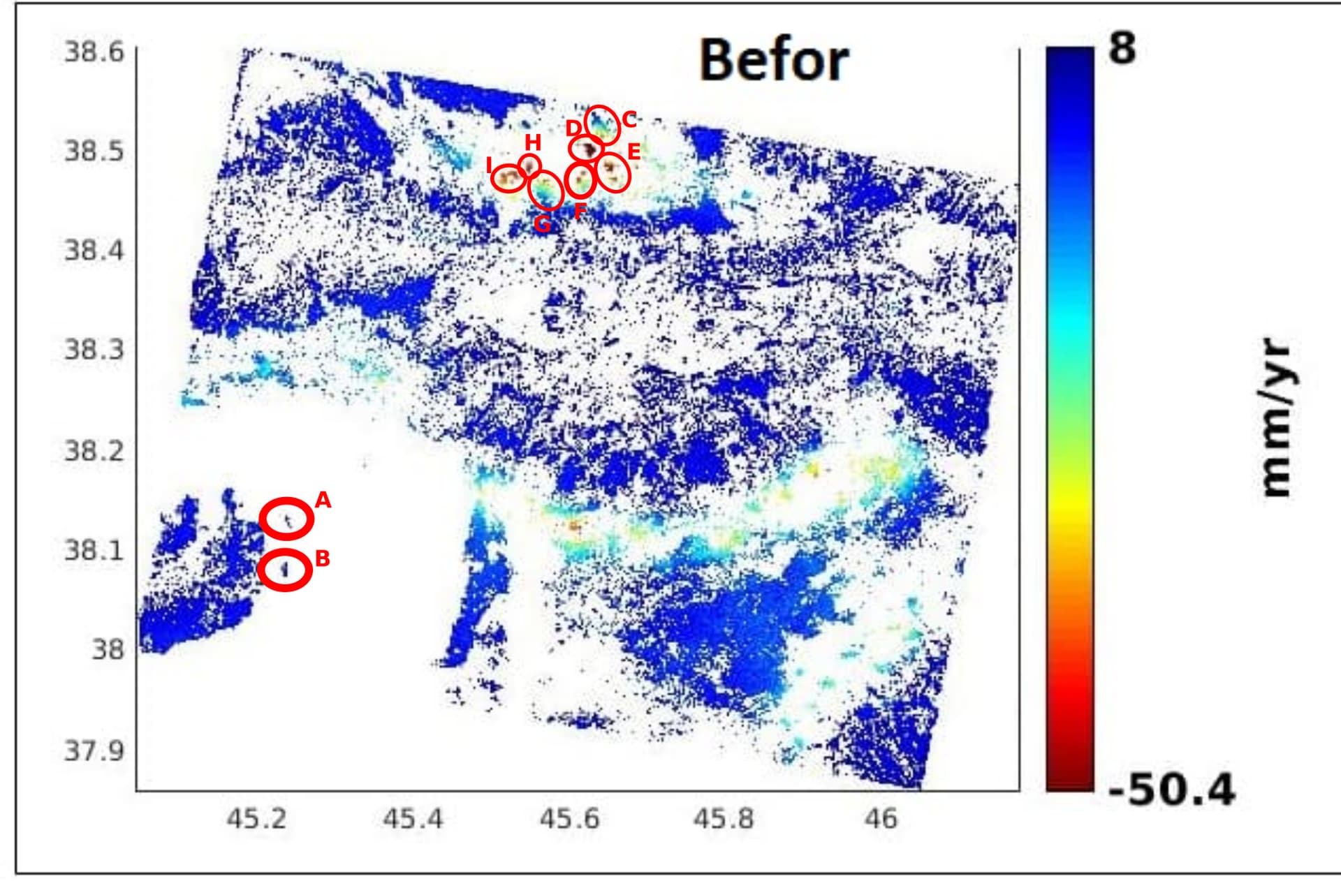
The lake water surface should not have a single PS as it appears in the left result. The right result most probably is too insensitive during PS weeding and accepts PS with a high temporal variance, that way you include water pixel which are normally excluded during PS processing (especially so many as in your “after” result). In the Before result, there are two PS clusters in the lake near the left bank, which are the two islands
- A: Jazireh-ye Dash Ada
- B: Jazireh-ye Yasa Ada.
They are correctly distinguishable in the before results but not in the after, another indicator that the before results are better.
Let’s move to the north. In your image I marked some areas from C - I. In my earlier post I thought that might be snowy mountains, but I have not checked the area in Google Earth. I have to correct myself, the clusters are cities. And together with your information of an earthquake, that make much more sense know. Let’s see why:
The names of the cites (if I got that right from Google Earth) should be:
- C: Yamchi
- D: Markid
- E: Yalquz Aghaj and Ilate-e Yalquz Aghaj
- F: Darvish Mohammad and Dizaj Hoseyn Beyg
- G: Koshksaray
- H: Qarajeh-ye Mohammad
- I: Ersi
Why do we see them as clusters? That is because buildings as double bounce scatterers are very strong and also stable reflectors of the radar signal. Again, it is very promising that they are detected correctly in the “Before” results. So why are no or less PS around the cities? In Google Earth I can see that there are many vegetated fields and farmland, which typically are bad persistent scatterers. Thus, again the “Before” result is in my opinion a better PS processing than the after result. Because “before” rejects none persistent scatterers. Our goal is not to find as many measurement points as possible but to find as many measurement point as possible which provide an accurate estimation of displacement.
So why are the cities red clusters? Most probably this is because of the earthquake you talked about. In your time series displacement plot, you should find an abrupt change in displacement around the date of the earthquake.
Overall, all that is much more easier to find out, when you use the StaMPS-Visualizer and make an layover of your points with basemaps of satellite images and OSM. The Visualizer was made exactly for that application. Also you can simply plot single time series of the displacement values there, which will help to make very detailed interpretations. The velocity maps are very ambiguous, e.g. We can not tell if the velocity is because of an earthquake or a steady process over the entire time series. Hence I recommend to export your points and start looking at them in the Visualizer. And I would use the “Before” results ![]()
To me, your results are very promising to investigate that earthquake. However, to find out, where the epicenter is, I would do a simple single interferogram by using two images, one before and one after the earthquake. Here is an example how to do this:

2 Likes