Well analyzed, @thho! 
1 Like
Some more thoughts @despina98. From your study site location I derive that you might put a focus not on the northern cities but the ridge system close to the center of the image. If the earthquake epicenter was located there, it might be that the earthquake was so strong, that the displacement was very high and the phase signal disrupted which ends up in a rejection of PS…that can be an explanation, why the cities (double bounce scatterers) were not found there. However, you can find that out easily by using the Visualizer and check where your PS really are and how their displacement time series look like 
@thho ,Thank you for your excellent analysis. I’m not very familiar with StaMPS-Visualizer and I’m almost too bad at it. Can I send you a sample of my export so you can specify it for me?The subject of my research is actually land subsidence due to groundwater decline, not earthquakes.It was my own analysis that the cause of this great change may have been an earthquake… Do you mean that my later results are not generally correct?Isn’t the amount of displacement obtained in it correct? But previous research has obtained the same value.
@despina98 , give the Visualizer a try, I think you are almost there and the last step, the analysis of the data, is the most exciting one, you should do that on your own
Feel free to post one or two screenshots of the visualizer and your analysis here, then we can discuss it. I think the groundwater extraction is still possible to see in the data, since until now we have just looked at velocity and that is never really helpful. E.g. ground water extraction might be a cyclic event of extraction-refillment periods of the groundwater body, which can easily cancel out the signal when only looking at velocity, but on displacement time series you might be able to see them…so get the visualizer running and dive into your data 
1 Like
Also, now that we know that ground water extraction is what you are looking for and not an earthquake, you should export and visualize points from both of your results. That is because, StaMPS tends to reject time series of PS which “jump around” e.g. relatively high positive displacements following on relatively high negative displacements. But depending on your ground water level cycle, that can exactly be what you are looking for. In that case, a lower weeding as you did in your “after” results could preserve these signals, at the cost of also including less accurate measurement points. So you have to find out which processing configuration matches your research topic by investigating both results closely regarding their displacement time series.
1 Like
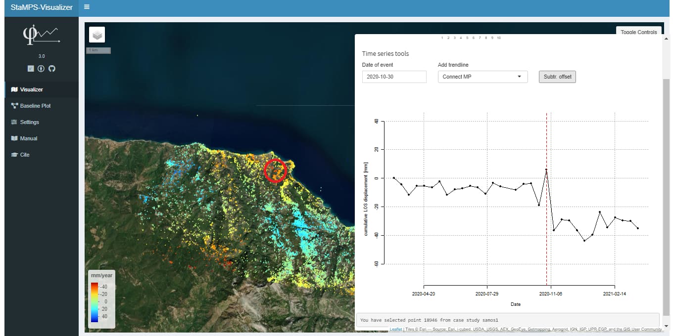
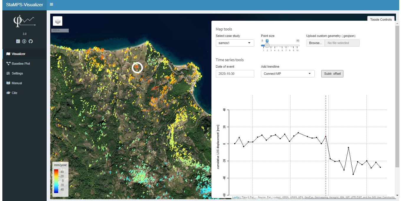
This is an example SAMOS earthquakes datasets on 30 october 2020. İts give us some ideas about waht is look likes an earthquake with StaMPS-Visualizer.
Thank you thho.
3 Likes
Very good work and thanks for sharing @suat! It always helps to have a reference 
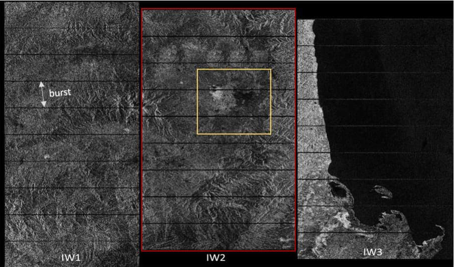
Hi@Abraun, how can see bursts and subswaths of my case study on sentinel-1 image without download it?I have not snap on my pc. Thanks
You can try this one, works with python (without SNAP) Python S1-TOPS-SPLIT Analyzer
I also do not have Python, unfortunately. Is there such a service online?
I’m not aware of any, sorry.
@ABraun , ok. many thanks. I just want to define my area like this.
I dont know any burst-selection-by-area tools, sorry.
If you have a Google account you can also use Google Colab for free.
Here is a notebook that is set up to run the top split analyzer. Just enter the scene ID and your Copernicus credentials so you can connect to the API:
You can save the SHP to the local directory in Colab and download it to your computer.
Hello,
I’ve made a quick web app for STSA here. Unfortunately it is for viewing only. I will add download options soon. I hope it is okay for everyone ![]() .
.
If you want a quick demo. Here is a scene ID to use:
S1A_IW_SLC__1SDV_20211228T224808_20211228T224835_041215_04E5E7_534C
For future readers: the scene works as of writing. But it will eventually be taken offline by ESA
1 Like
Dear @panjibrotoisworo , thanks a lot:blush: , Your work was great, thank you.
How to plot bperp-temporal baseline map in StaMPS?
Just upload your SAR images to SNAP–> Radar–>InSAR_Stack_overview (Your will get master image as well as slave images Baseline plot information). Just copy those values in CSV file then try to plot in StaMPS visualizer.
1 Like
Thanks. I haven’t installed StaMPS visualizer yet. I’ll try it later.
In the option of ps_plot, is there any difference between ‘u-dmo’ and ‘u-dmao’? I understand that ‘a’ is the external atmospheric correction of all images, and ‘m’ is only the master image. Isn’t ‘ma’ repeated?