@despina98 , give the Visualizer a try, I think you are almost there and the last step, the analysis of the data, is the most exciting one, you should do that on your own
Feel free to post one or two screenshots of the visualizer and your analysis here, then we can discuss it. I think the groundwater extraction is still possible to see in the data, since until now we have just looked at velocity and that is never really helpful. E.g. ground water extraction might be a cyclic event of extraction-refillment periods of the groundwater body, which can easily cancel out the signal when only looking at velocity, but on displacement time series you might be able to see them…so get the visualizer running and dive into your data
Also, now that we know that ground water extraction is what you are looking for and not an earthquake, you should export and visualize points from both of your results. That is because, StaMPS tends to reject time series of PS which “jump around” e.g. relatively high positive displacements following on relatively high negative displacements. But depending on your ground water level cycle, that can exactly be what you are looking for. In that case, a lower weeding as you did in your “after” results could preserve these signals, at the cost of also including less accurate measurement points. So you have to find out which processing configuration matches your research topic by investigating both results closely regarding their displacement time series.
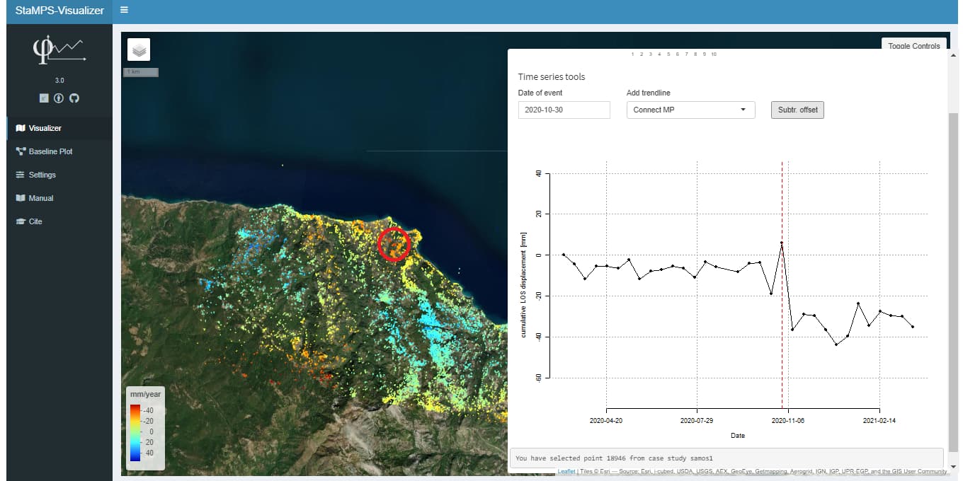
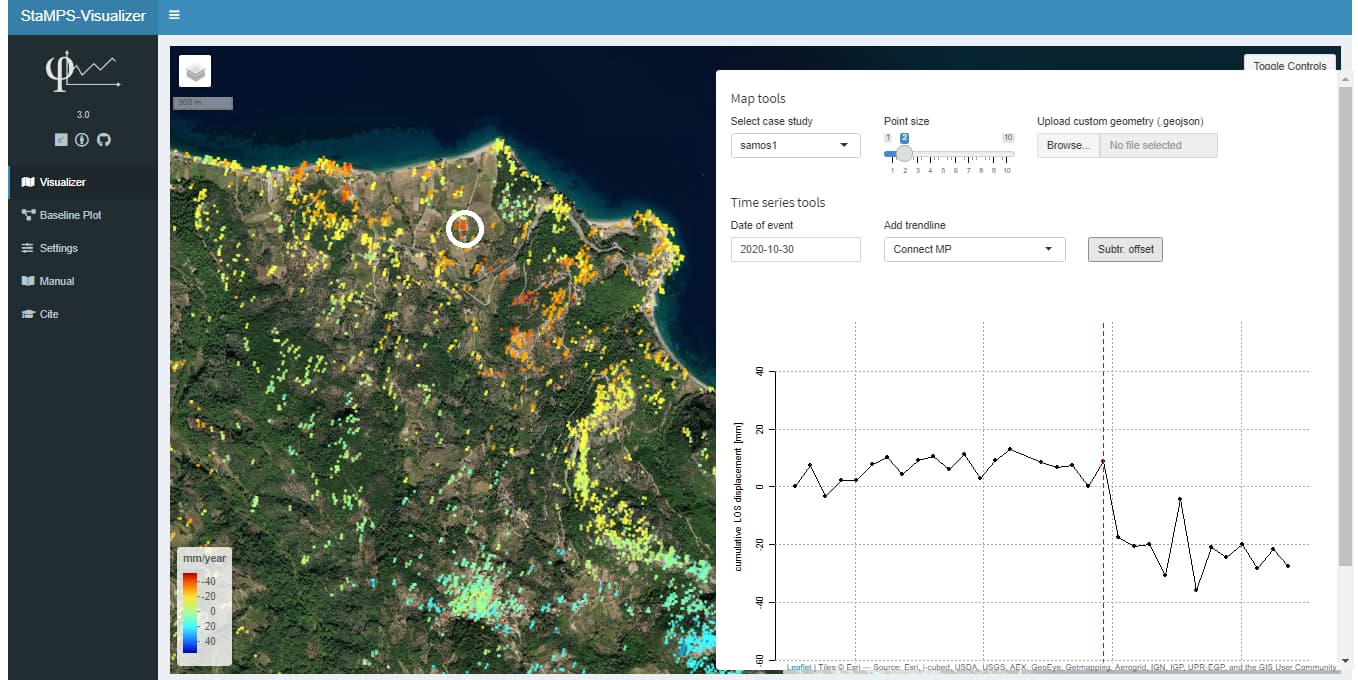
This is an example SAMOS earthquakes datasets on 30 october 2020. İts give us some ideas about waht is look likes an earthquake with StaMPS-Visualizer.
If you have a Google account you can also use Google Colab for free.
Here is a notebook that is set up to run the top split analyzer. Just enter the scene ID and your Copernicus credentials so you can connect to the API:
You can save the SHP to the local directory in Colab and download it to your computer.
Just upload your SAR images to SNAP–> Radar–>InSAR_Stack_overview (Your will get master image as well as slave images Baseline plot information). Just copy those values in CSV file then try to plot in StaMPS visualizer.
In the option of ps_plot, is there any difference between ‘u-dmo’ and ‘u-dmao’? I understand that ‘a’ is the external atmospheric correction of all images, and ‘m’ is only the master image. Isn’t ‘ma’ repeated?
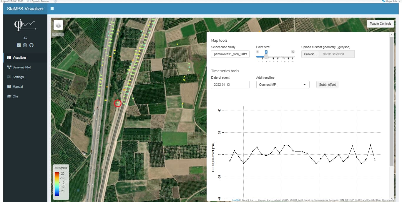
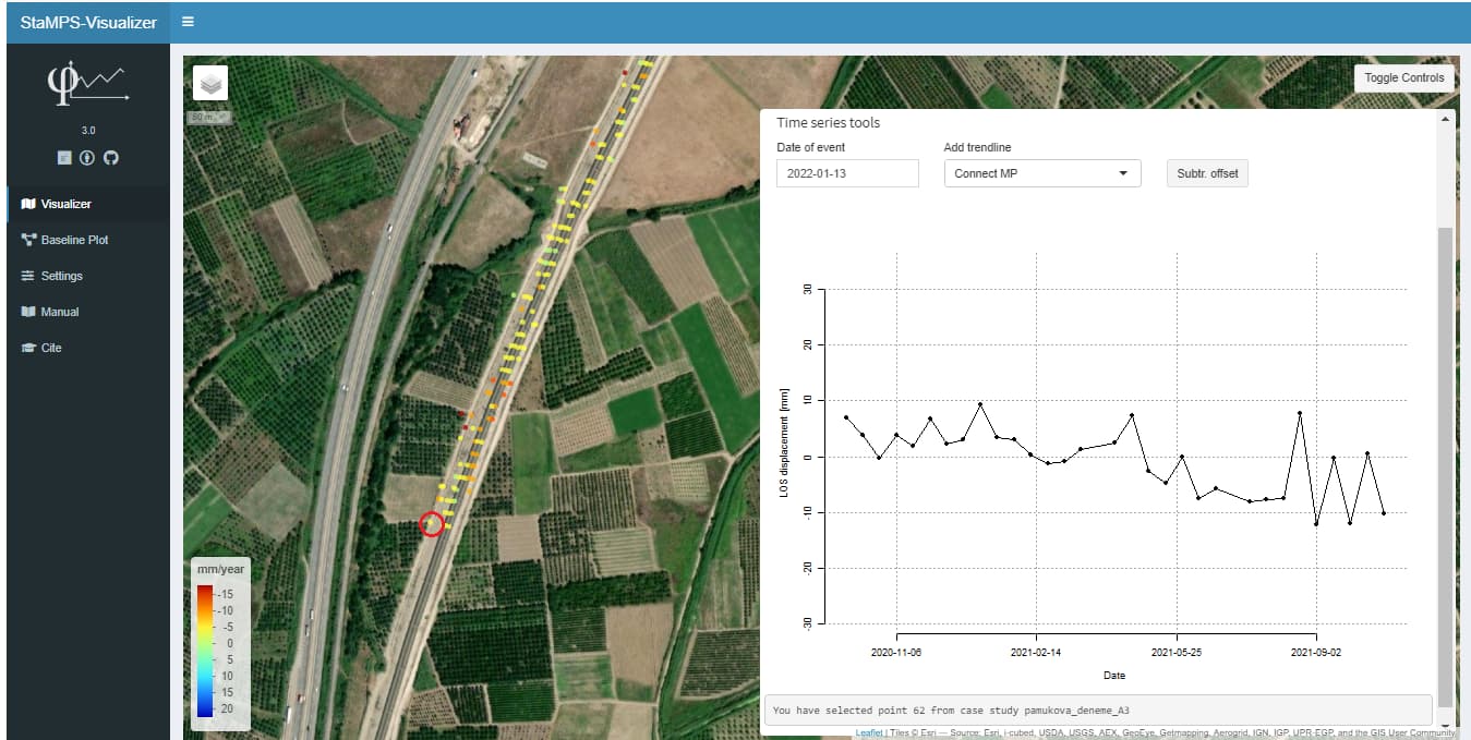
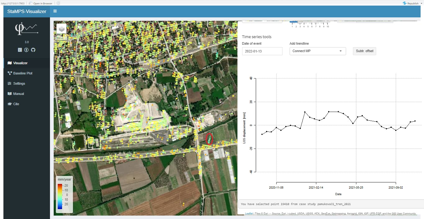
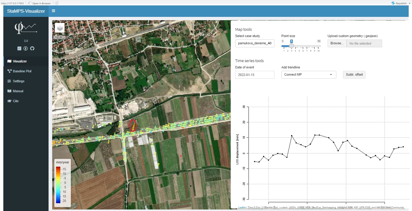
İ have a case study about railway subsidance. I created a dataset for my area. But i want to use PSI points for specific area. So that i clean my master .csv file with global mapper and export it again. When i opende it with visualizar i saw some intersting things. My master.csv file and seperase.csv file have the same value but visualizar dosent show the same value with the same points. Do you have any idea about this problem?
No thho they are the same points. I make this compartion many points and i tool same results. Do you have time to look csv files in visualizer? I think you can understand me better.


 I just want to define my area like this.
 .
. , Your work was great, thank you.