Thank you very much for your reply. I encountered a new problem. The CVS file I exported only contains 25 PS points. What is the reason. Thank you again for your reply in your busy schedule. Thank you.
Hi @luo, mst probably you have to chose a lager radius in the initial ts_plot in StaMPS. When you call this plot first, you can enter a radius, which defines the area. The default value is not that large and thus you have to mage it larger, just add some 0 
Hello @thho , I want to ask that in order to mention area’s names in stamps visualizer map do we need to download .geojson file of area being studied? Moreover, from where can we find out this file for our area. My study site is Karachi, Pakistan.
Hi @Bazgha, the idea is, that you run the Visualizer locally on your machine. When you toggle the control panel you can select a .geojson file from your machine. The Browse... button will fire up the file explorer of your system and you can navigate to your vector file. Of course, you have to download it beforehand or create it in some GIS software like QGIS. If your download is some other file format, like ESRI’s .shp file or whatever, you have to convert it to .geojson, again you can use QGIS or gdal translate or the rgdal package in R, there are many options to do this.
The reason I decided for .geojson is, that by default the CRS is WGS84 EPSG 4326, which is necessary for the automatic reprojection in the visualizer. Please be aware of this when you convert your vector file to .geojson.
1 Like
Hi @kaquisado, I’m interested in your work, I’d like to show my results using your tool, however, I tried to upload the file and this error (see image) appears. Can you give me a hand with this, please?
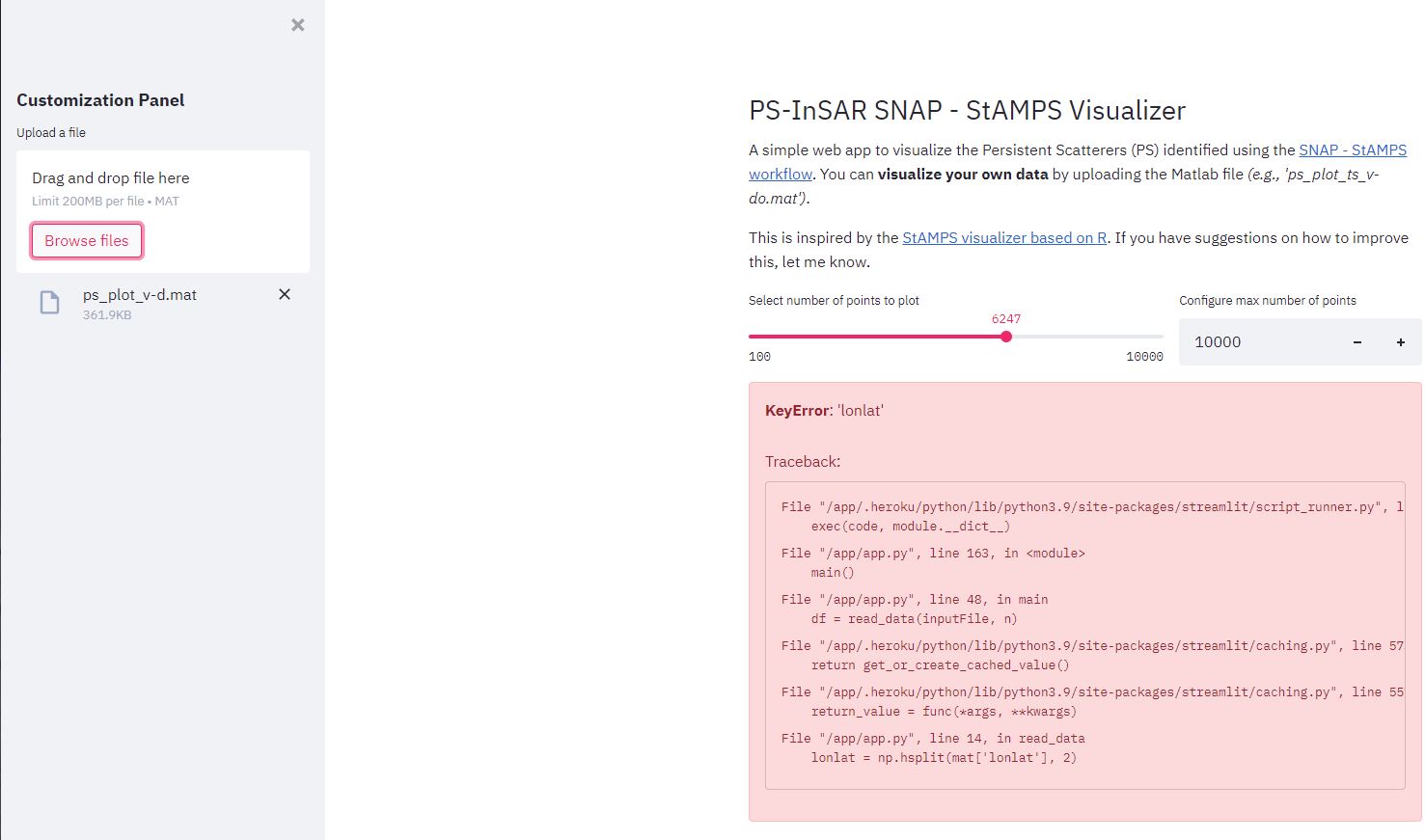
@Gust Can you send the file you uploaded so I can inspect it?
Sure thing, thank you. I tried to upload the following files:
ps_plot_ts_v-d.mat (259.2 KB)
ps_plot_v-d.mat (113.2 KB)
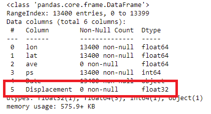
@Gust you should upload the file, ps_plot_ts_v-d.mat. The only problem is that all values of your ph_mm are NaN (check image below), so you encounter an error when plotting the time series. Everything should be fine when you fix the NaN values, might be from the processing.
1 Like
Thank you @kaquisado
No problem. Let me know if it works when you fix the NaN values.
Hi,I have the same problem as you. But the difference is that I run load PS_ plot_ After v-dao.mat, lon2 still has only four decimal places. So when I import into ArcGIS, the points are biased. I also try to convert KML to SHP for import, but there is no information in the property table. How to solve it, or is there a better way to show it in ArcGIS.
Hi@thho
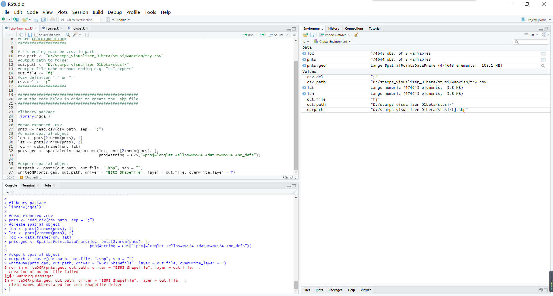
I’m trying to convert the CSV to SHP file for display in ArcGIS. After running the shp_from_csv.R script, I encountered this problem
Hi @ZHeng,
line 37 change out.path to outpath… I think I wrote this R script some time ago…its not very good tbh…
1 Like
Thank you very much. It’s solved in your way. I’m glad to be able to show the results in ArcGIS with the correct geographic coordinates.
1 Like
Hello, can please someone confirm for me this. I have used 7 images to perform PS-InSAR and I have displacement values for each PS point for each date aside from the master date. Do these displacement values reference wrt the master image? Thanks
Hi @wadewattts , roughly, yes they do. For a more detailed explanation check this out ![]()
Very good explanation. Thank you!
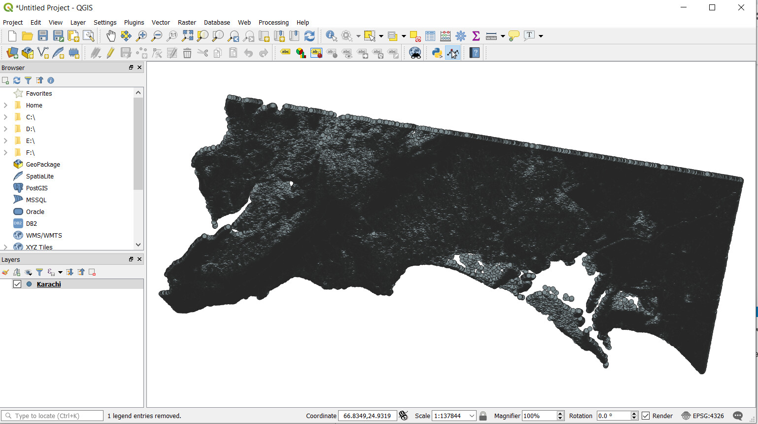
Hello @ABraun can we display same color coding of PS in QGIS as it is displayed in MATLAB figures after stamps processing? I mean my data is shown as below in QGIS:
can it be displayed as follows:
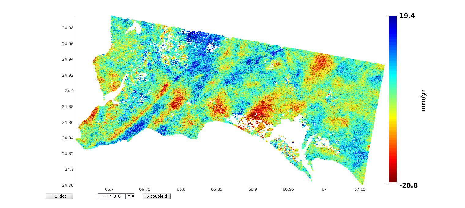
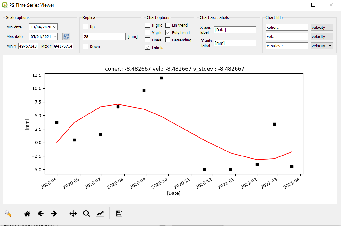
Otherwise, it is awesome I don’t need to create subsets of my data in order to view its time series deformation. I am getting following time series graph of a point
In the raster symbology, select “graduated”, then the attribute which contains the velocities, under Symbol reduce the point size and remove the outline, then select a color ramp and click “classify”
1 Like
Thank you so much for your quick replies all the time. QGIS has this interesting feature that one can view PS with one velocity range at one time and hide the PS with other velocity ranges. Moreover, since one can overlay stamps output on any map in QGIS so it was very beneficial for me that I could see areas names with PS.